Author Archives for Ellen

Looking straight ahead

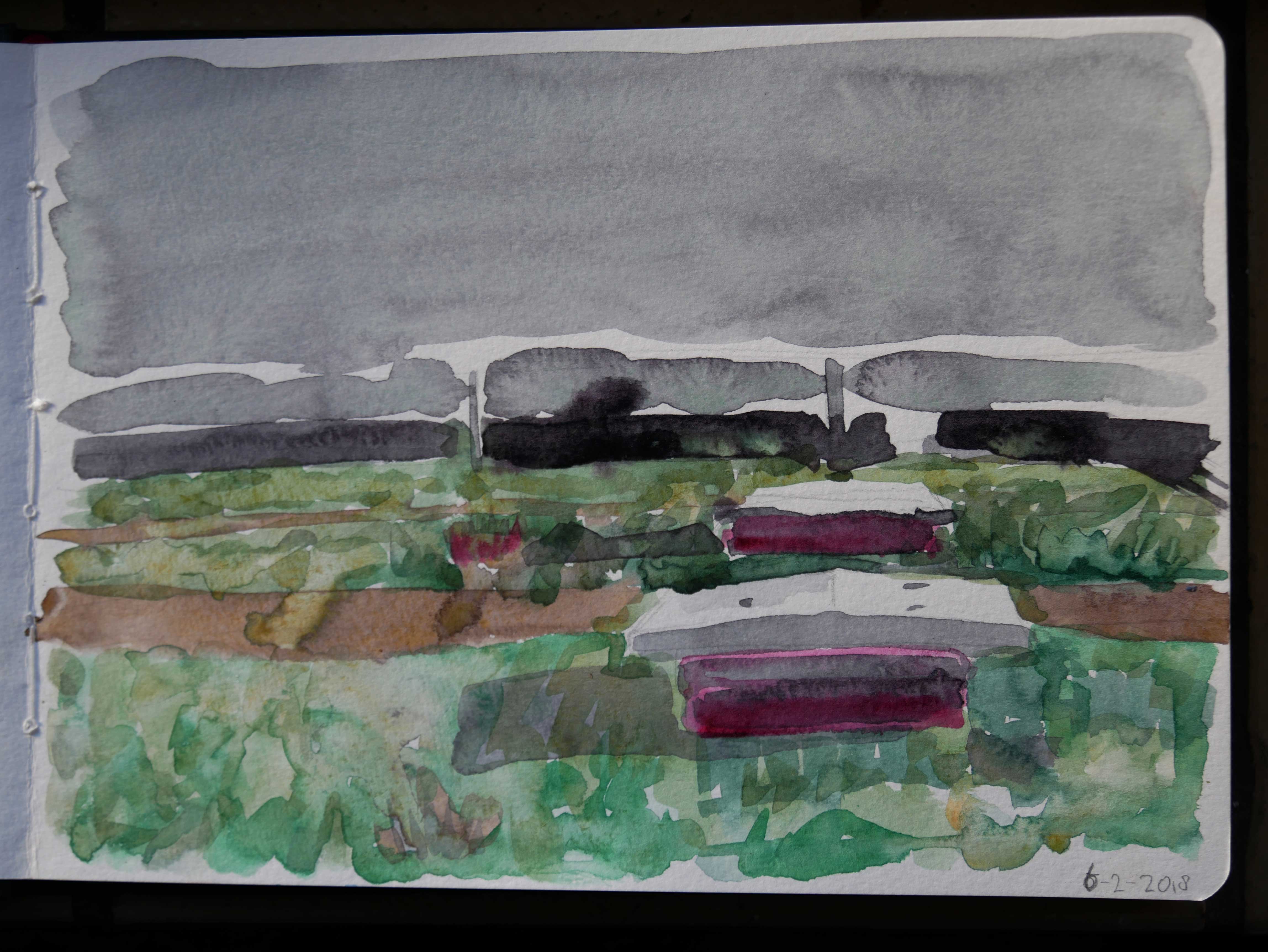
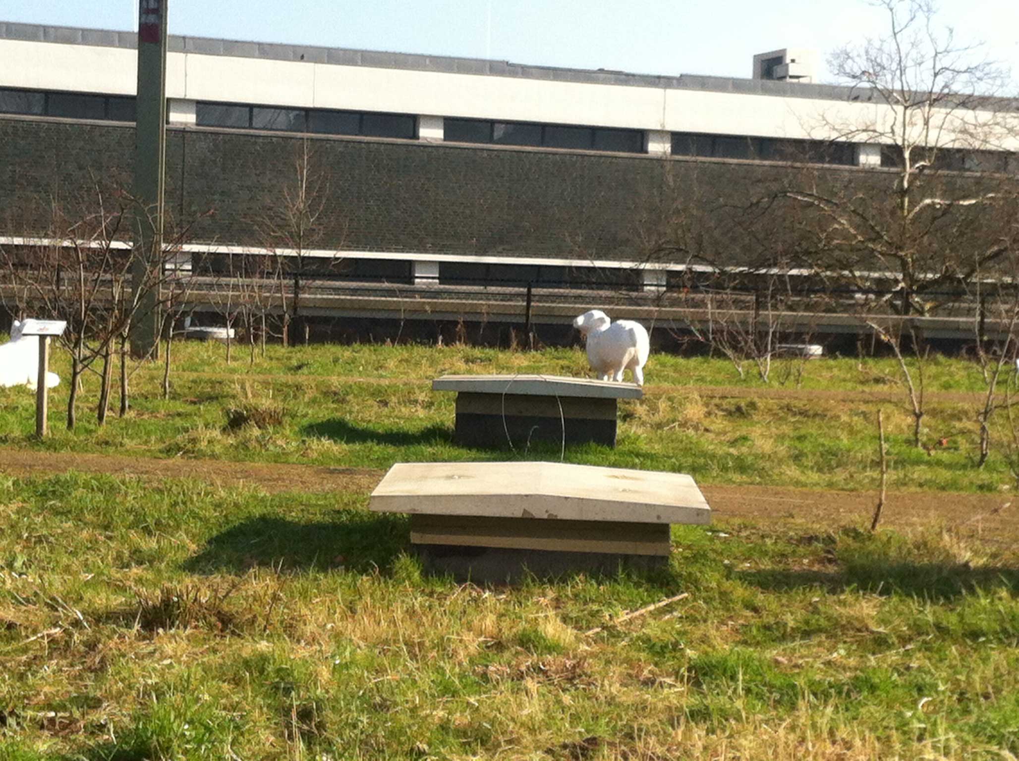
I made another drawing in the garden. Looking another way now, straight ahead. The colours i used are Quincacridone rose, phthalo green and yellow ocre. I started with making black with the rose and the green. I wanted to try using only these two colours, but i gave in. With the yellow ochre and the green i could make beautiful warm greens. At the end i did use a bit pure rose for the shadows. Just because i like it.

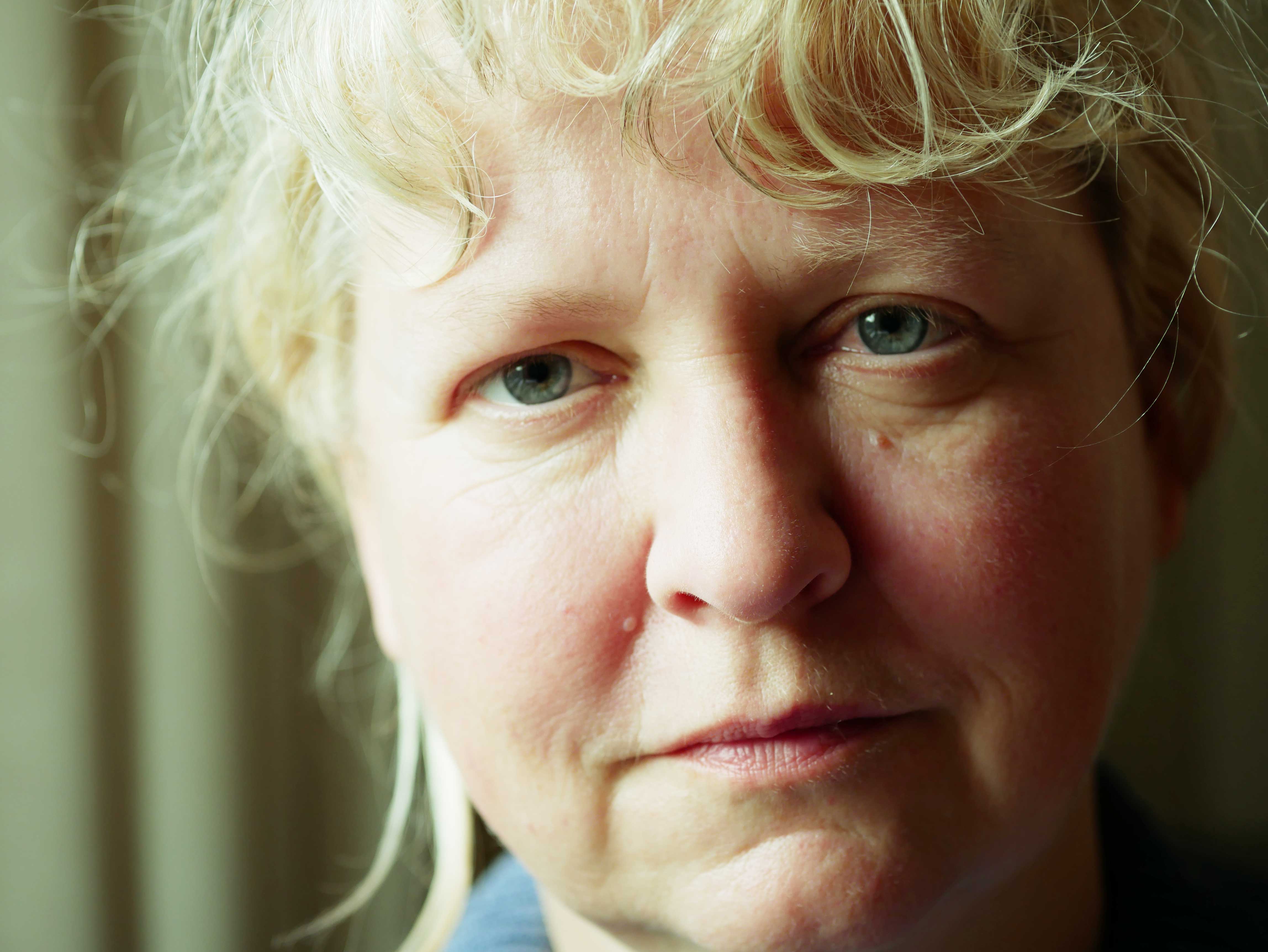
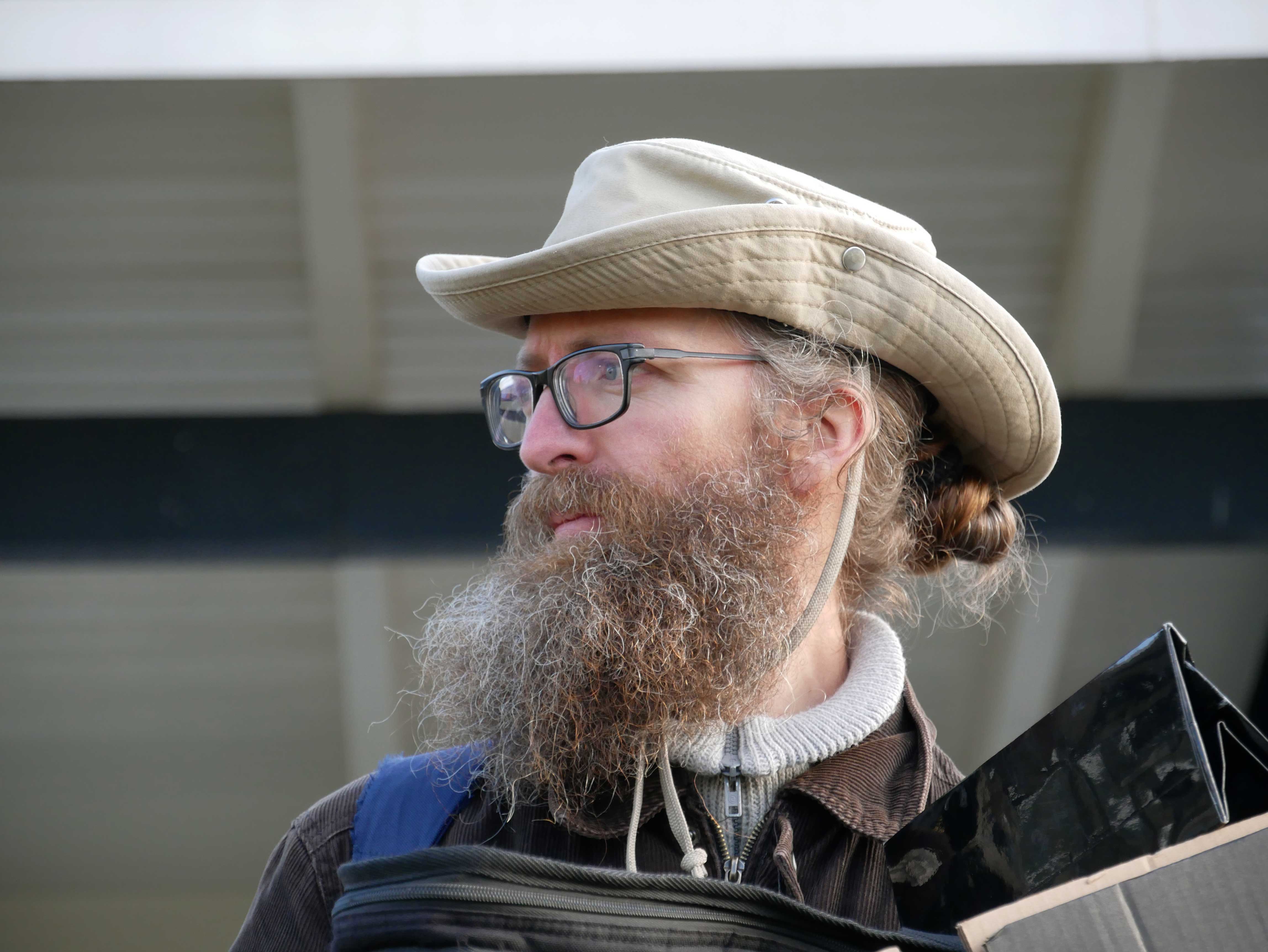
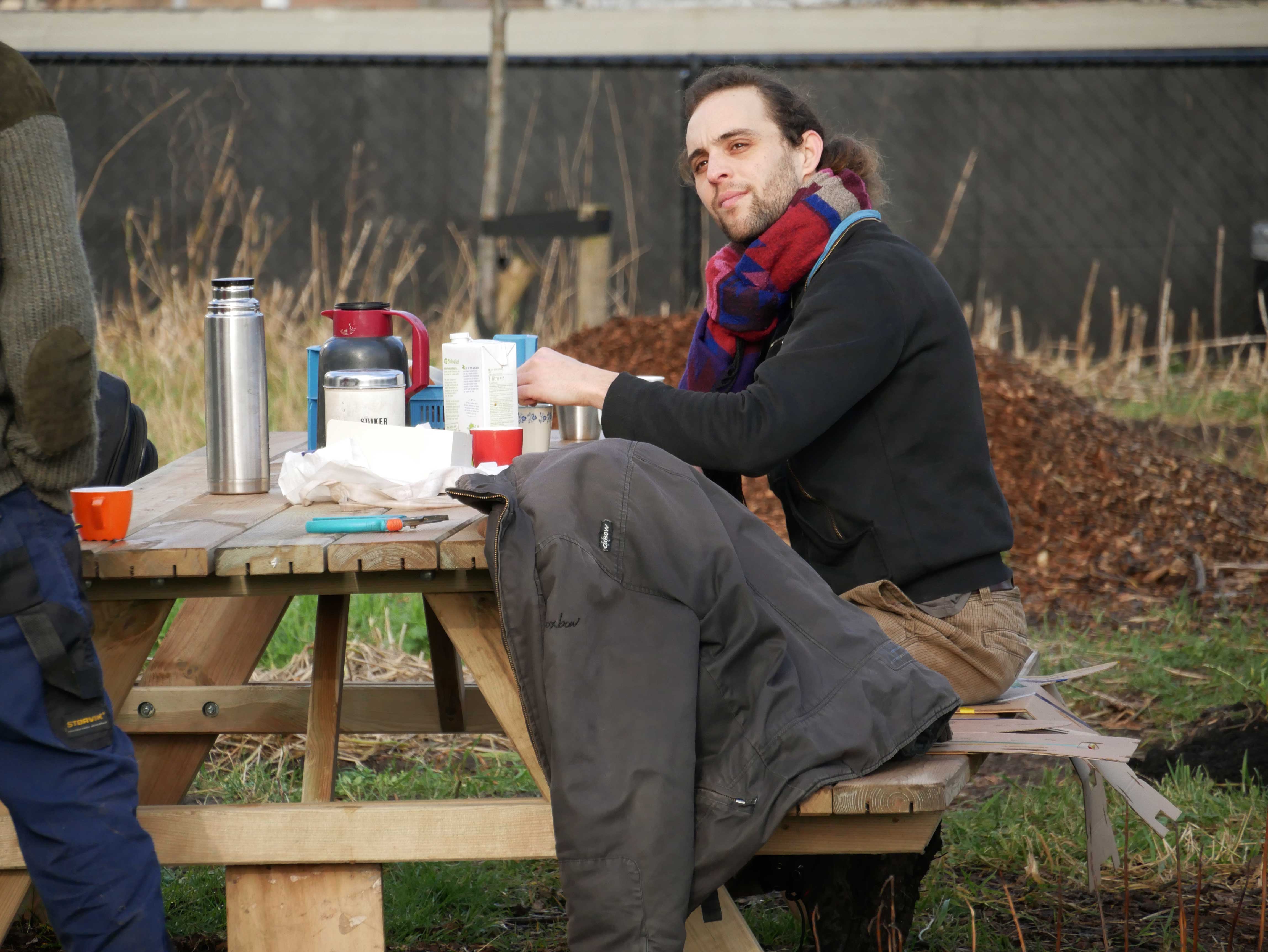
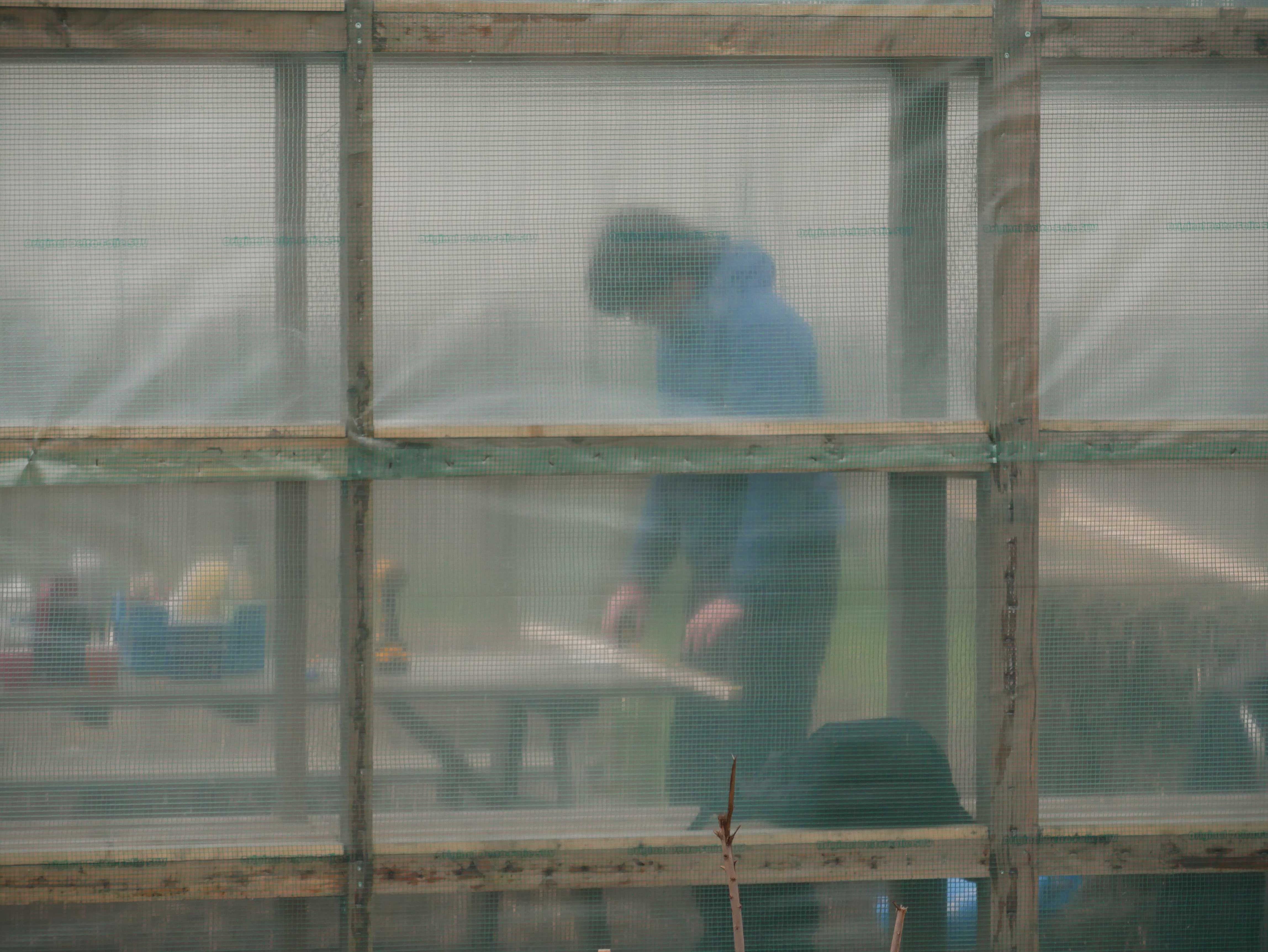
There was also a photographer, Leander, making photos of Rutger. He made a couple of me as well. I signed a declaration that he is allowed to use the photo for publication. He will also send them to me. Hopefully!

Published on February 7, 2018 at 7:00 by

Cold

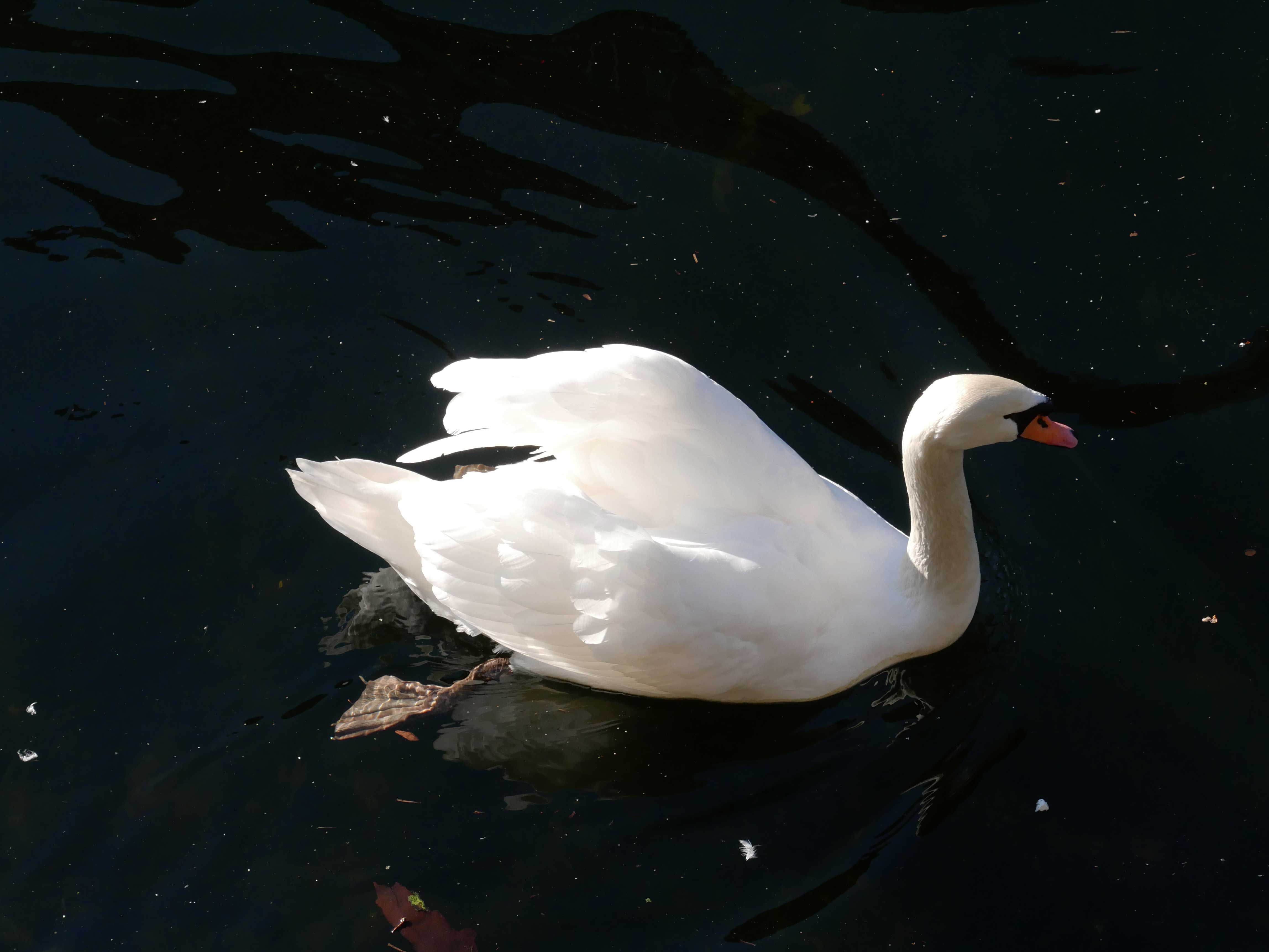
This swan swims alone. Still looking for a mate .
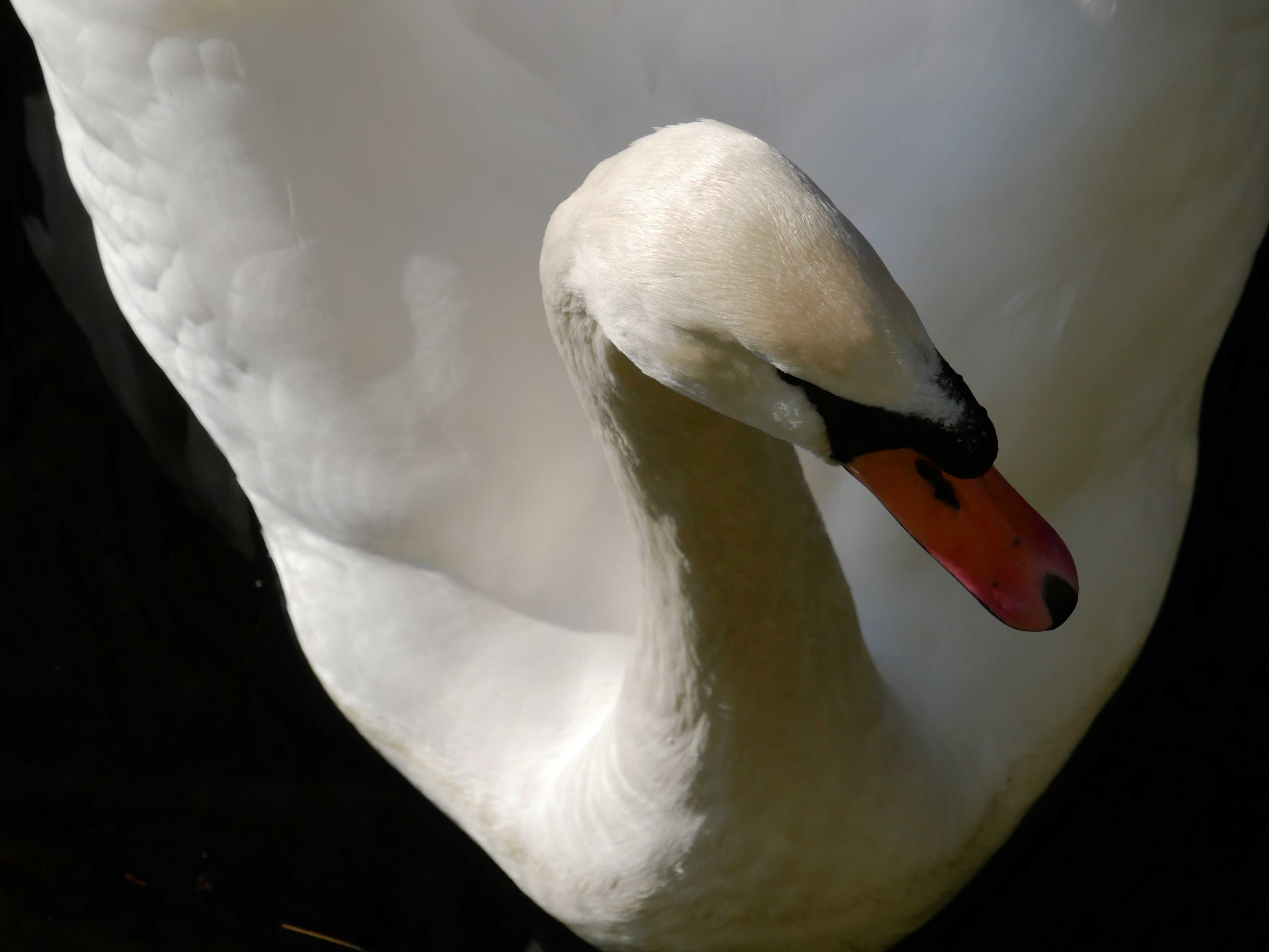
A close-up
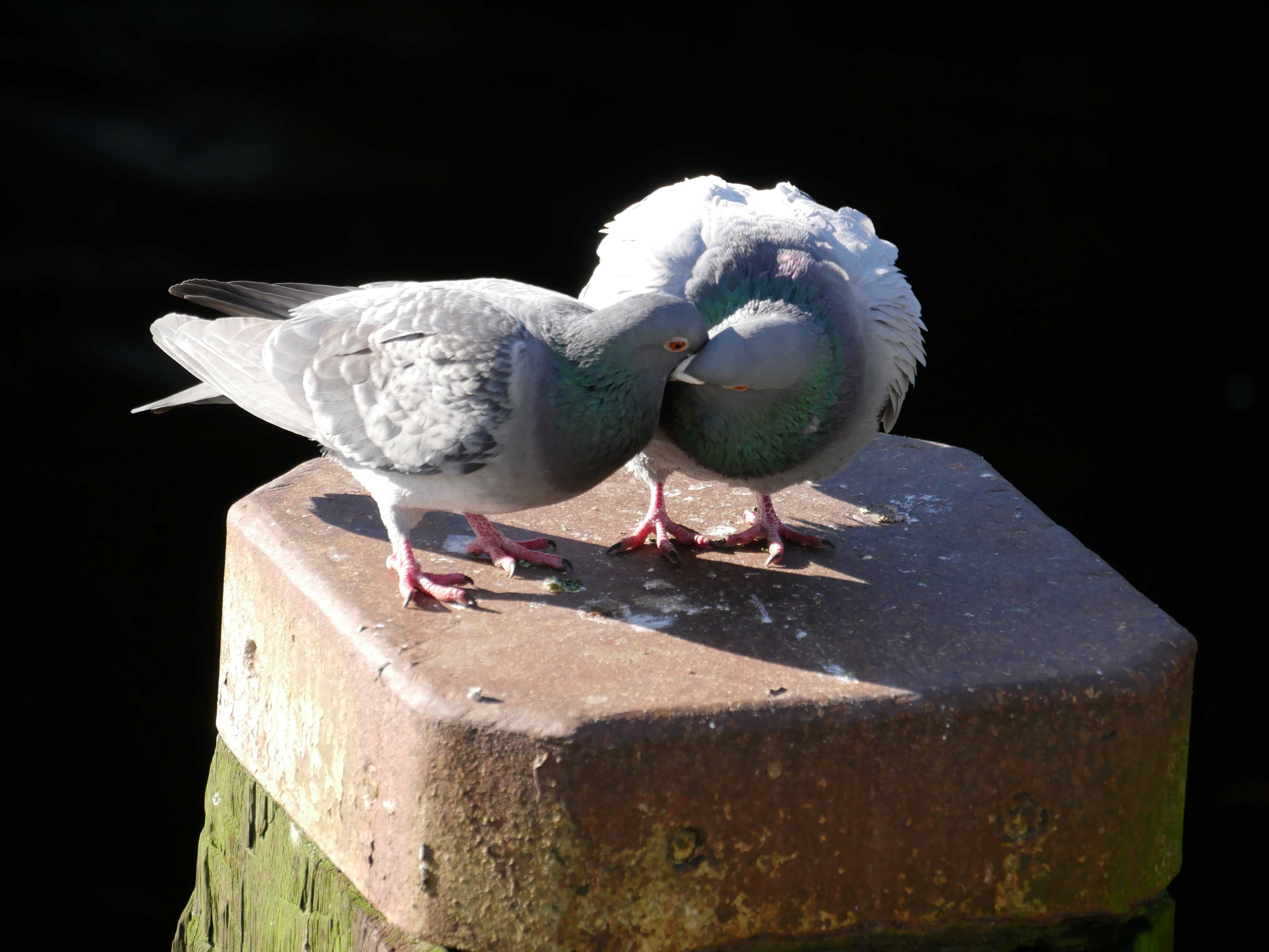
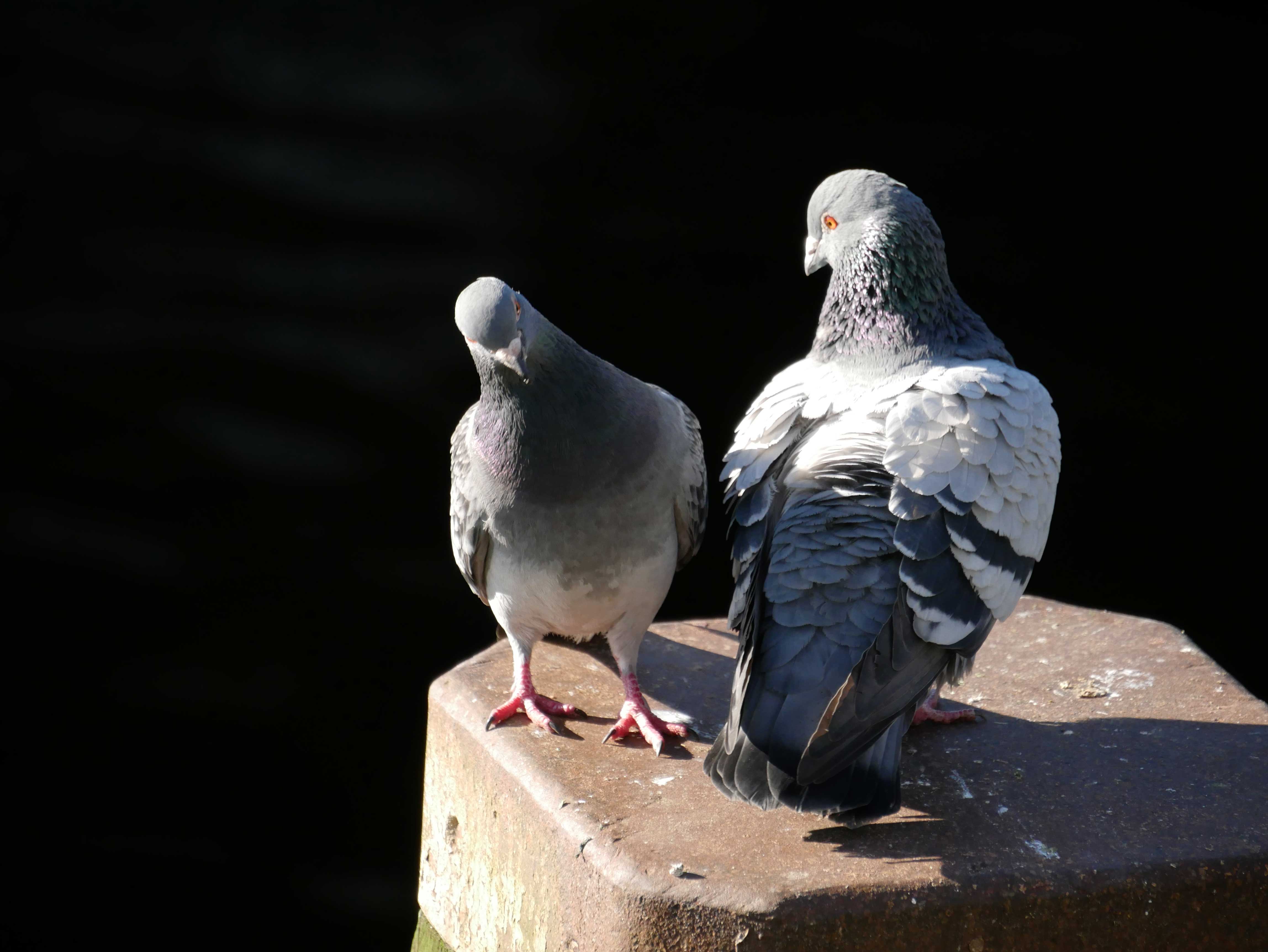
These doves fancy each other 🙂
Yep!
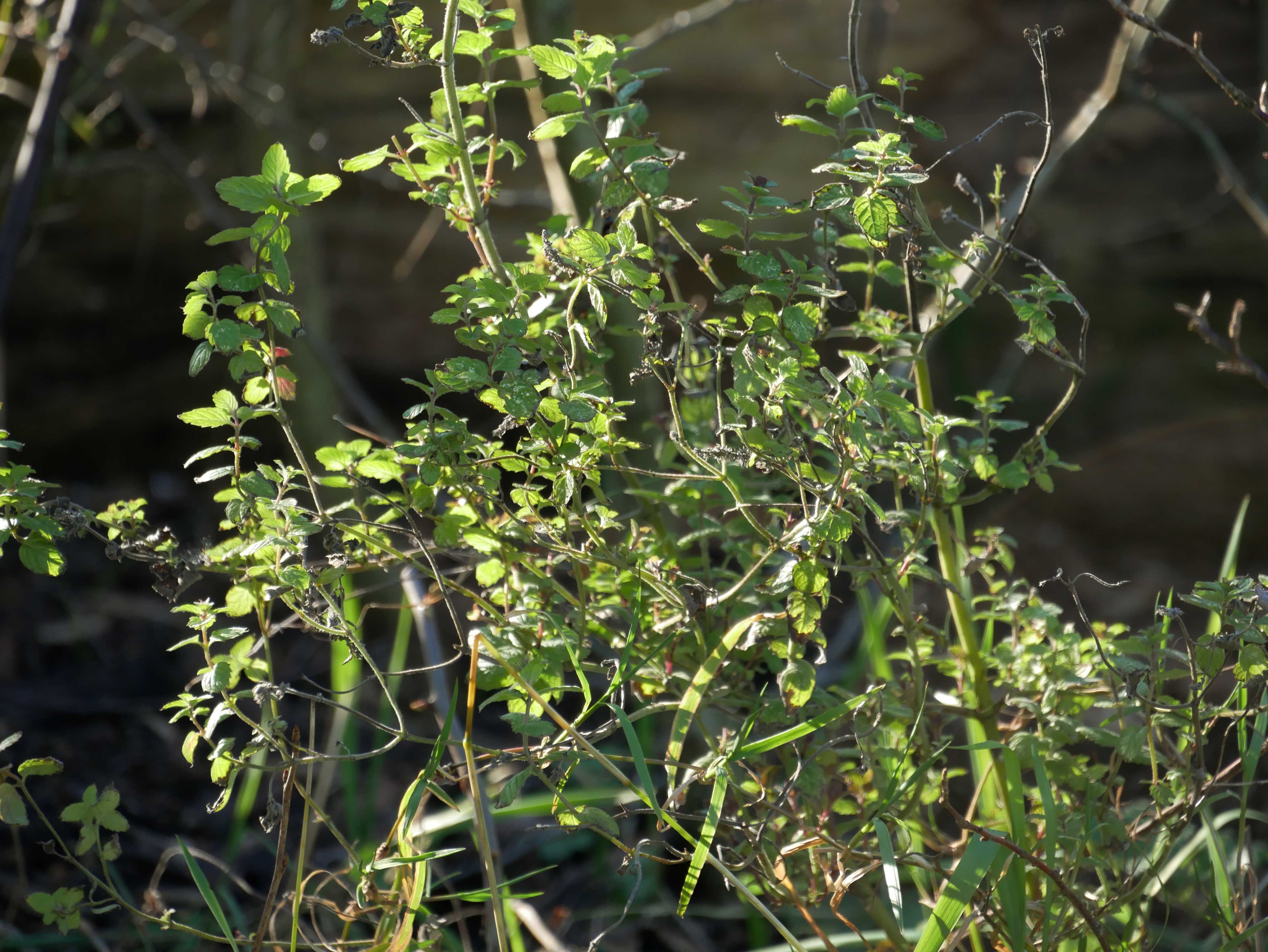
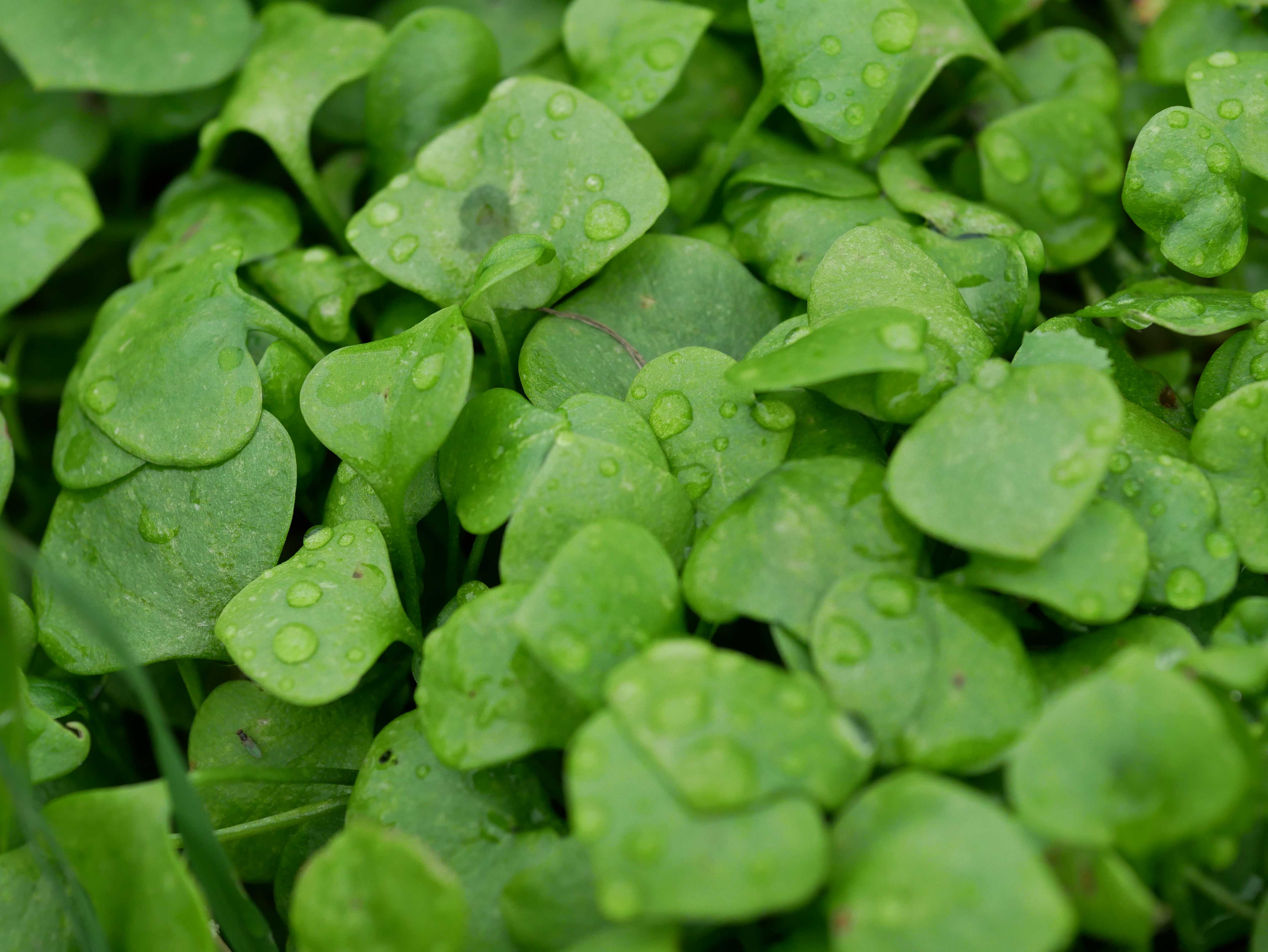
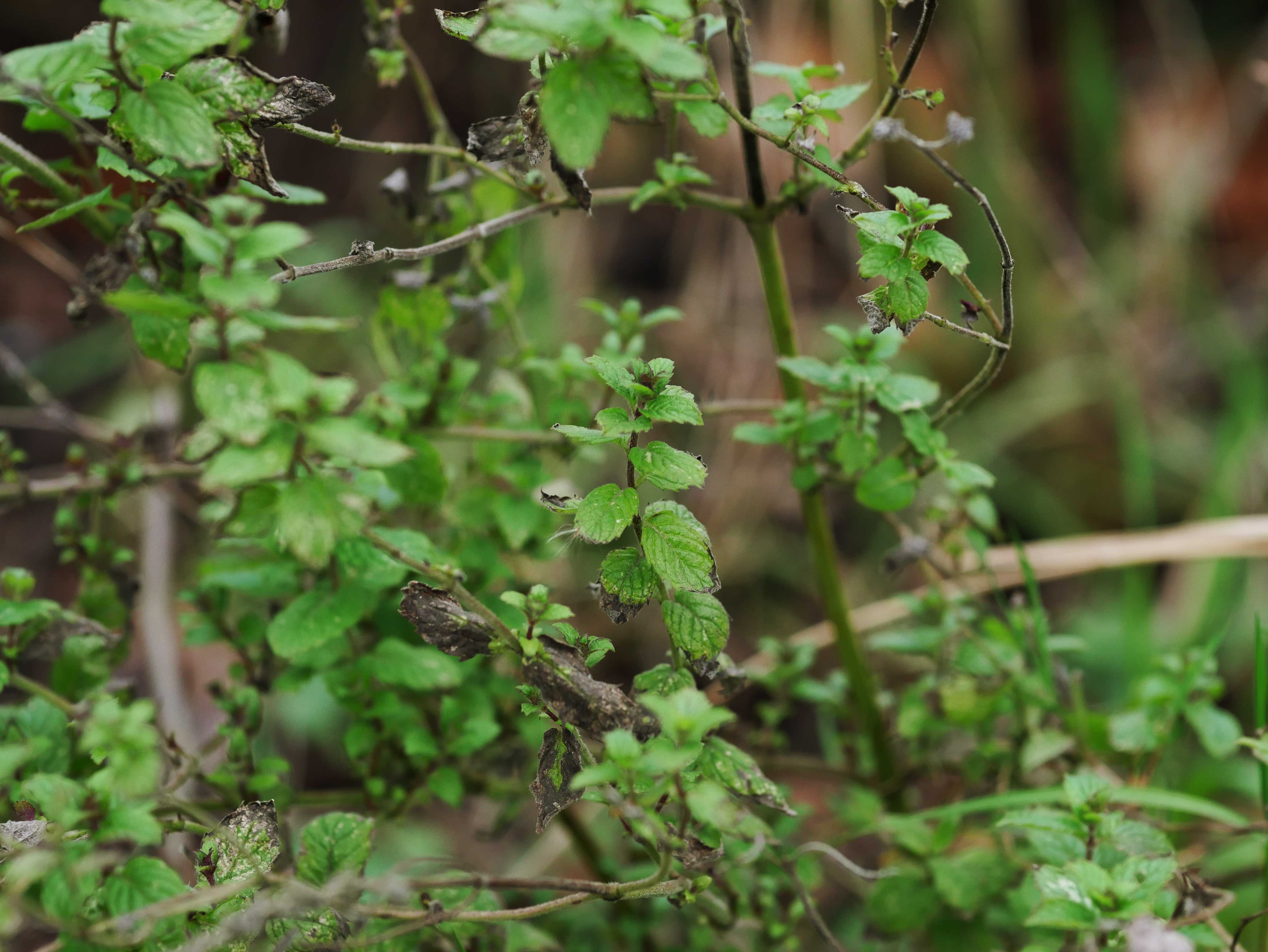
Mint
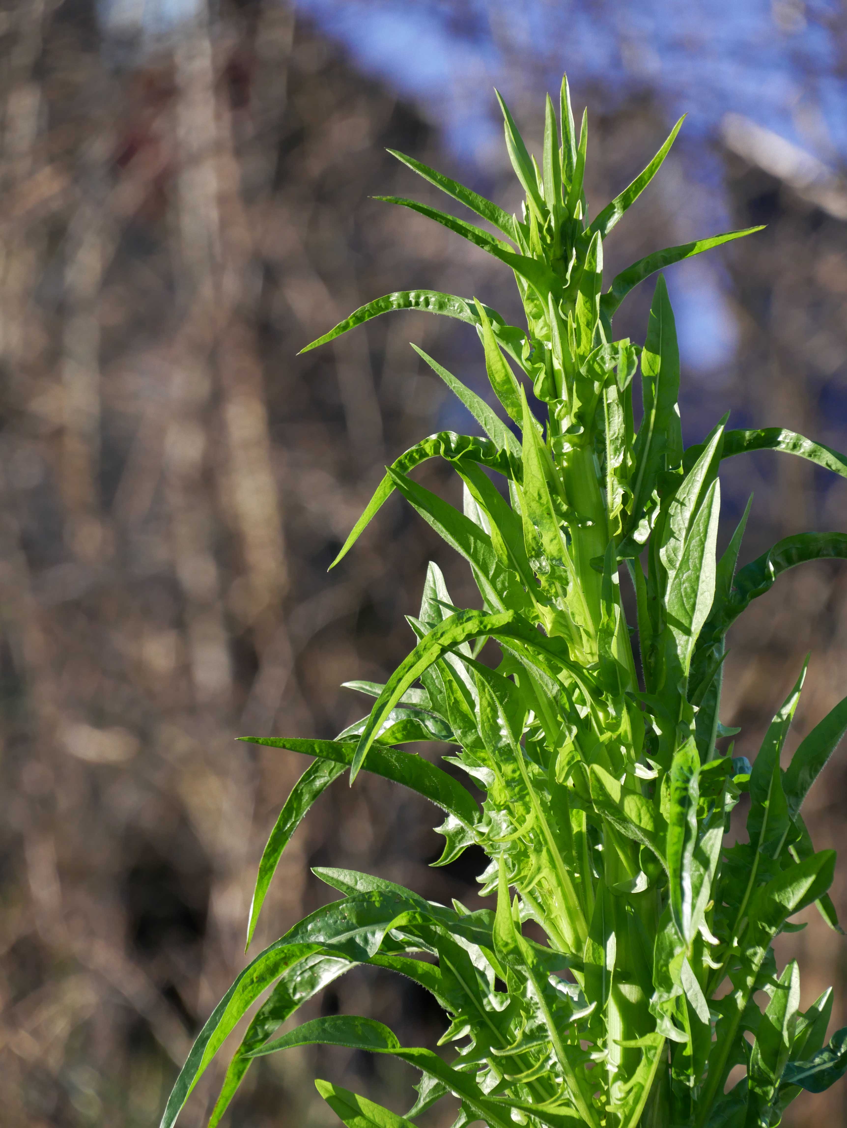
Chicory
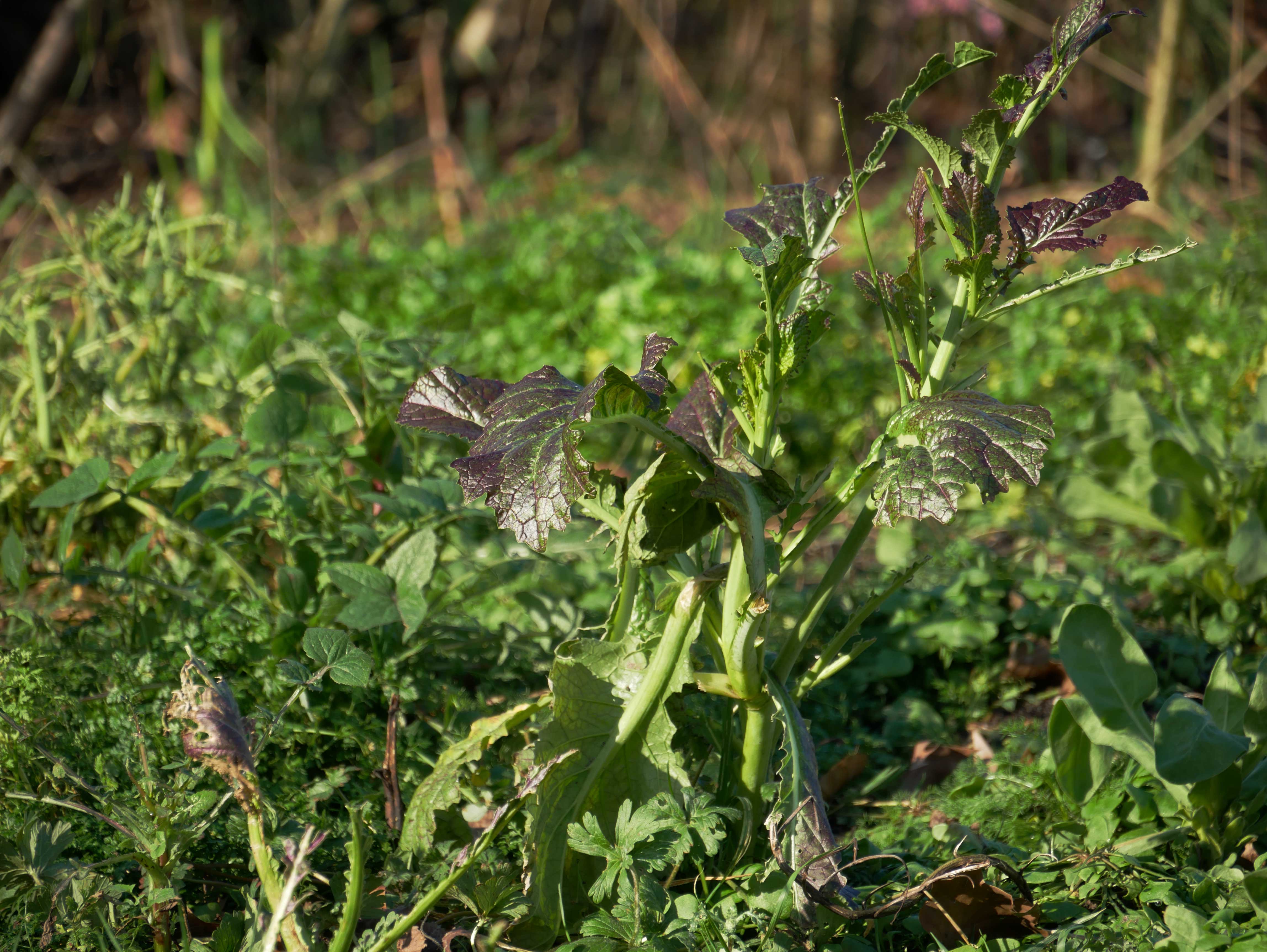
Amsoy
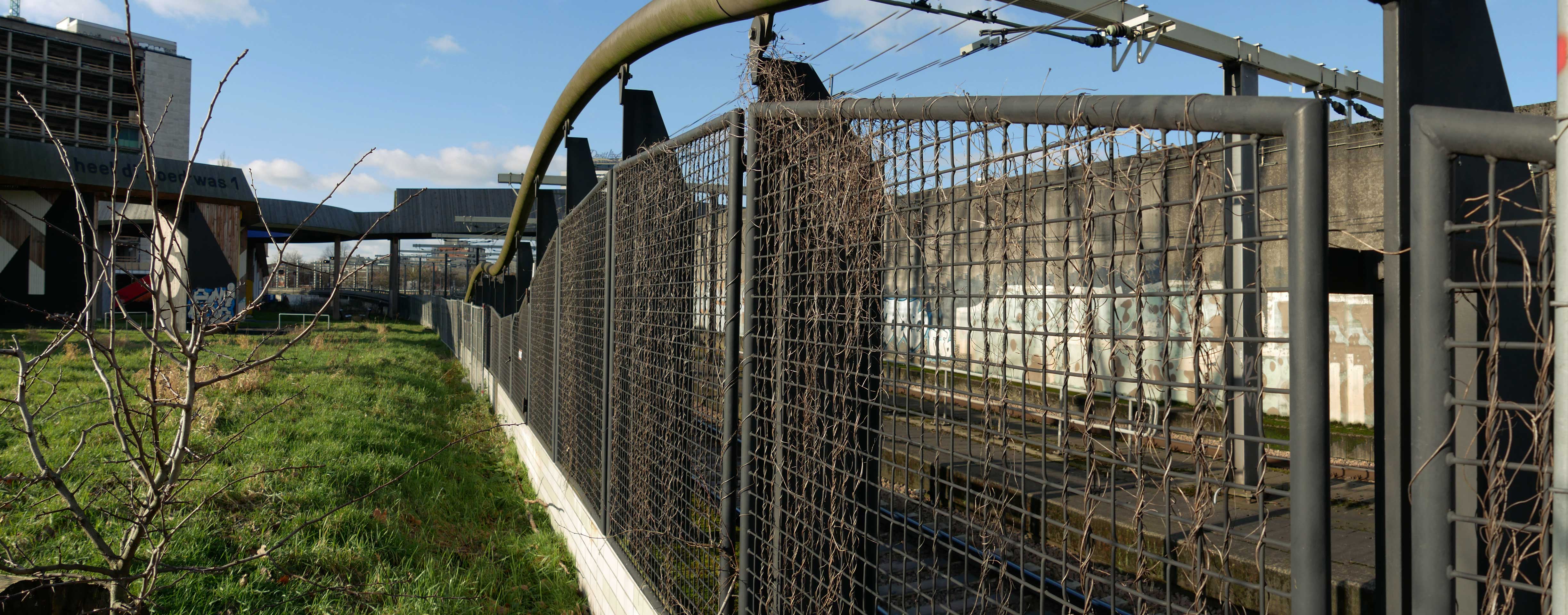
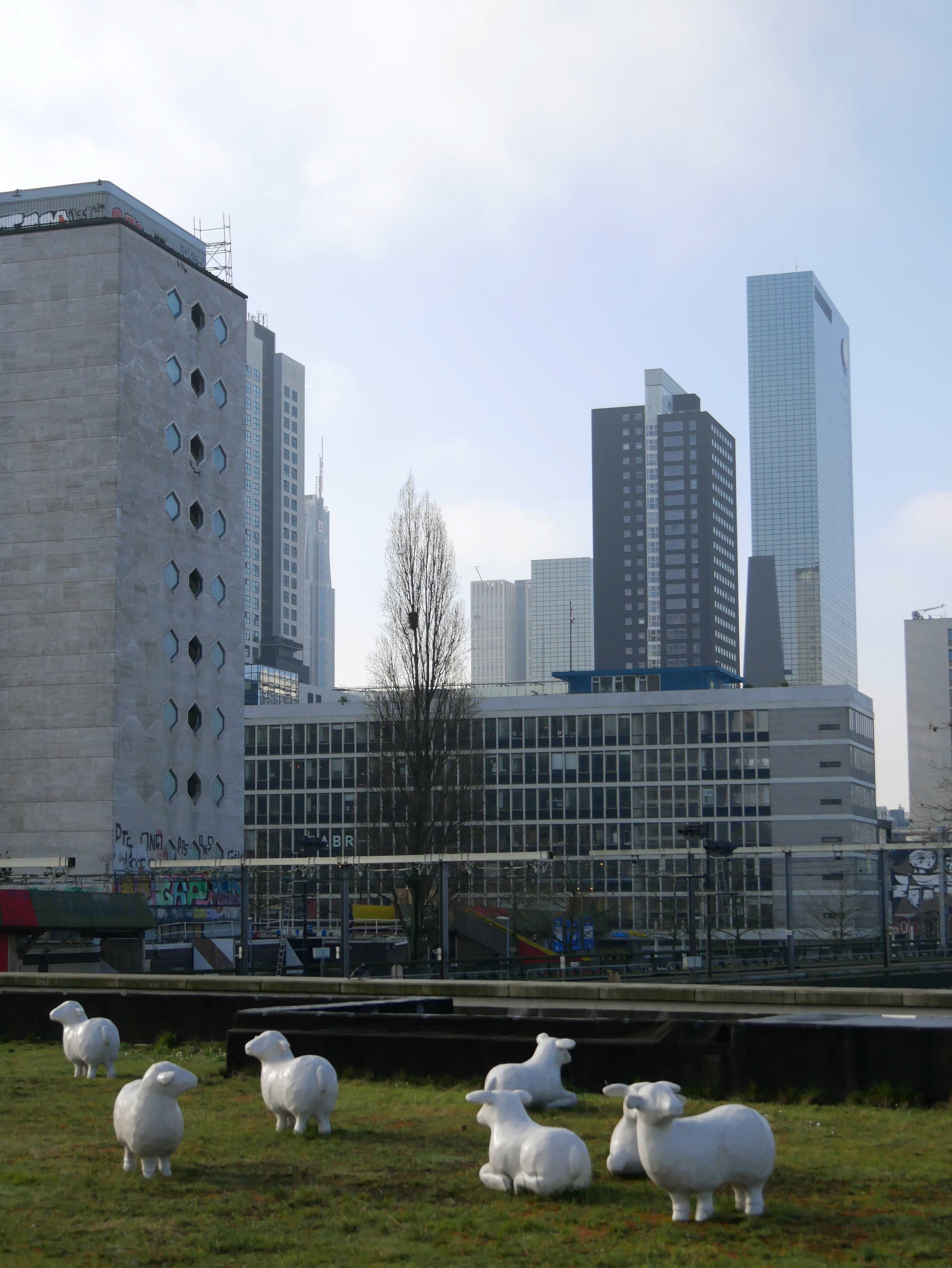
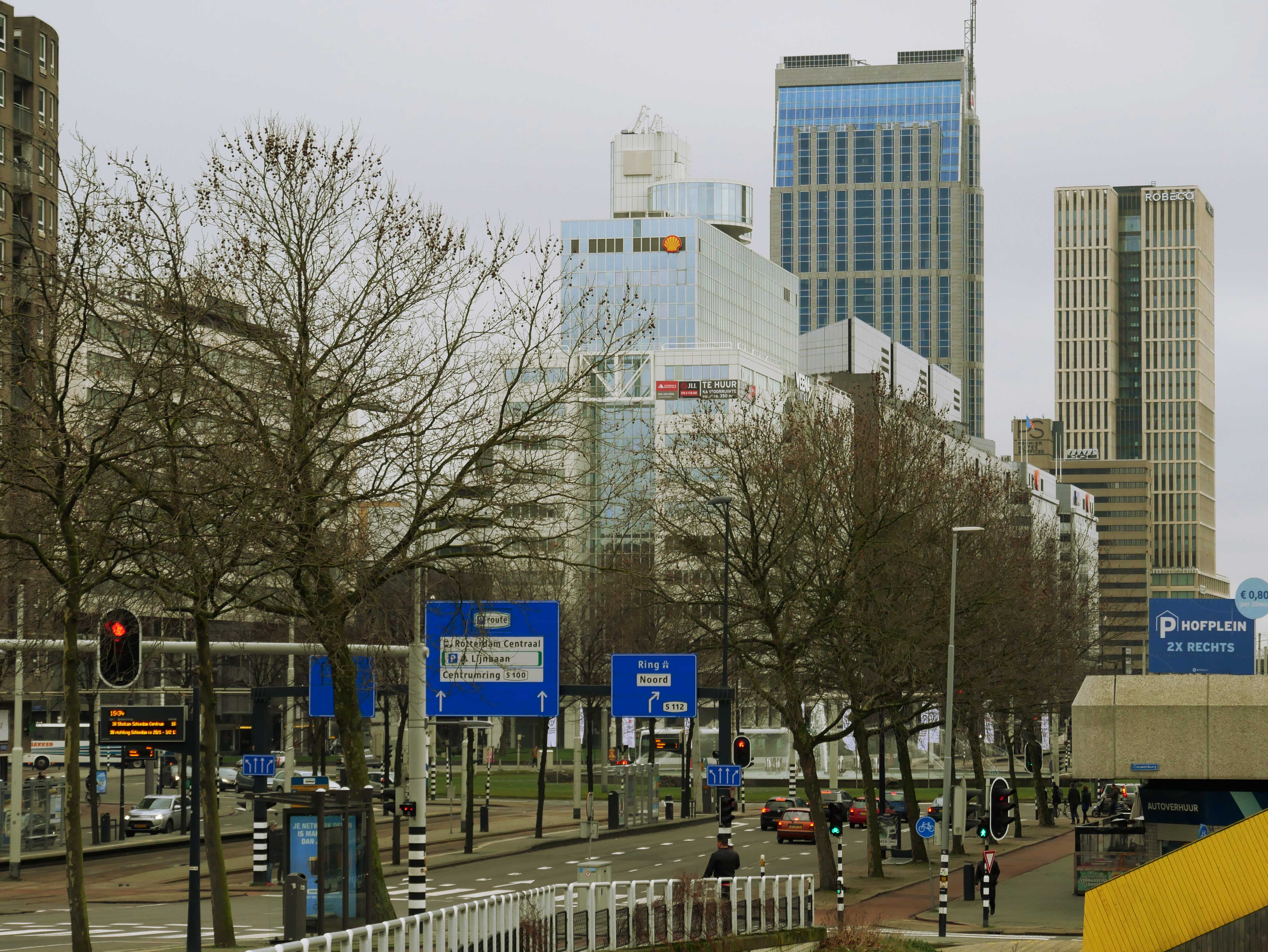
This photo is much bigger than it looks. A panorama shot.
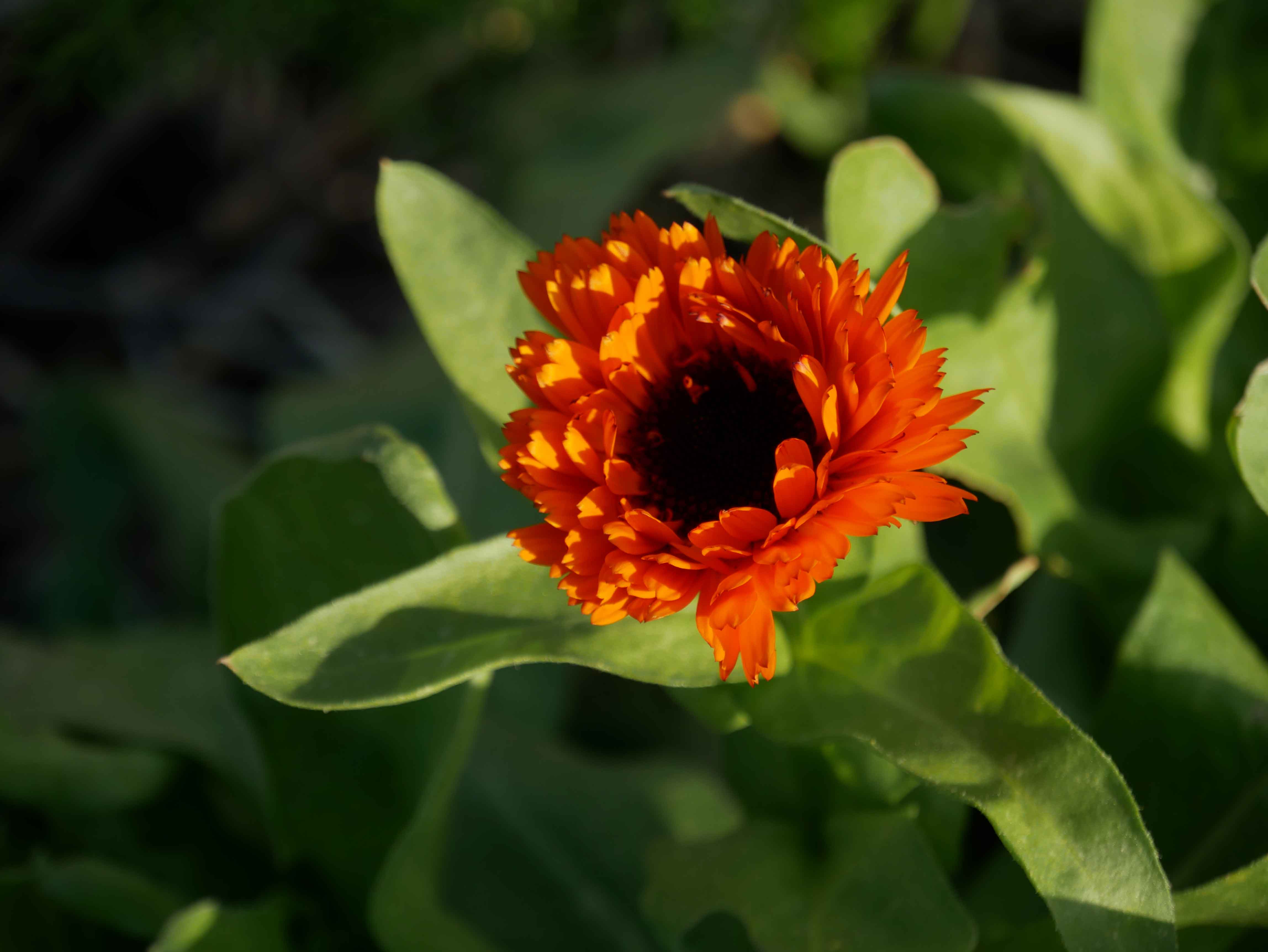
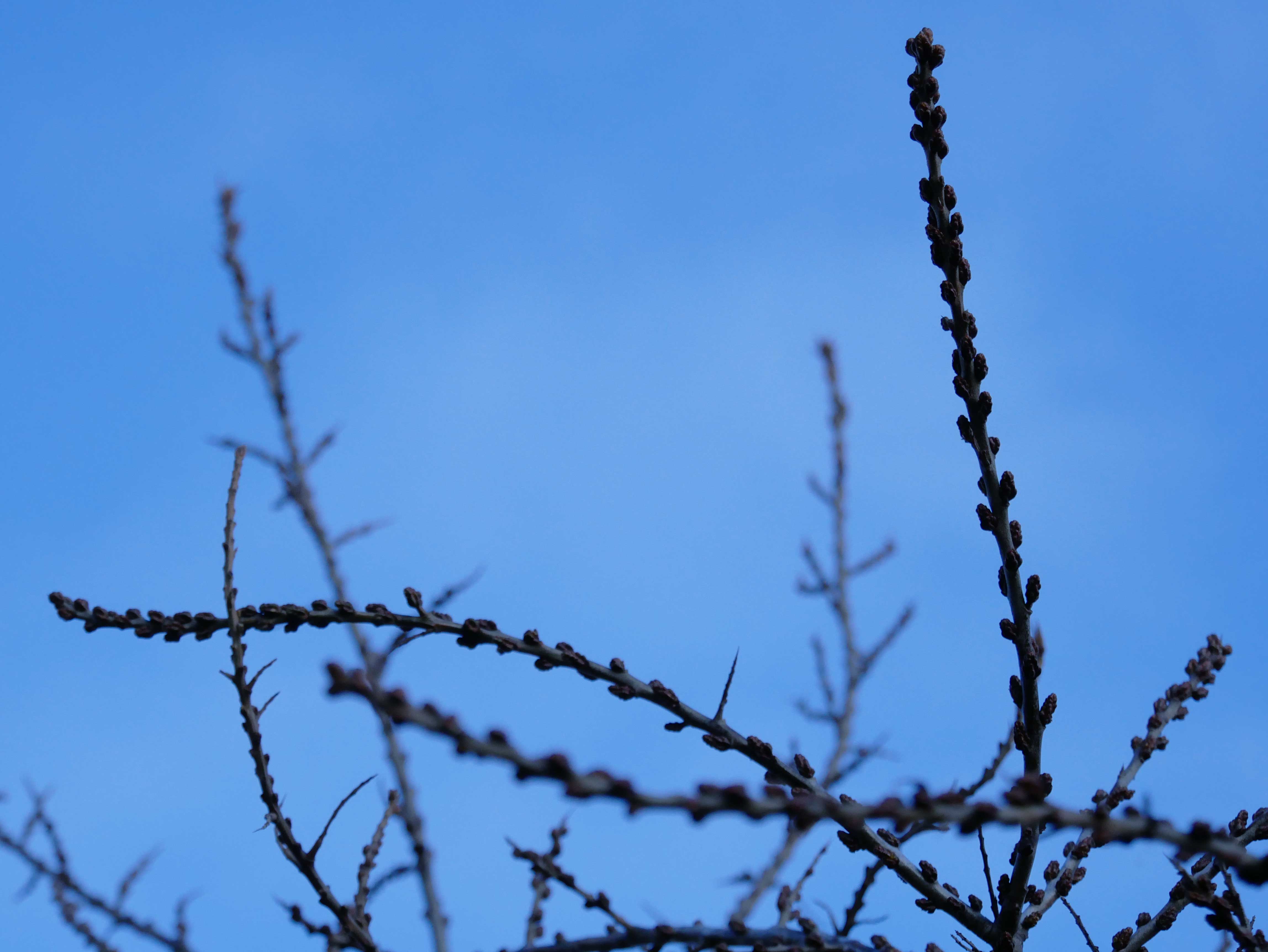
Afrikaantje? This flower doesn't seem to understand it is still winter.
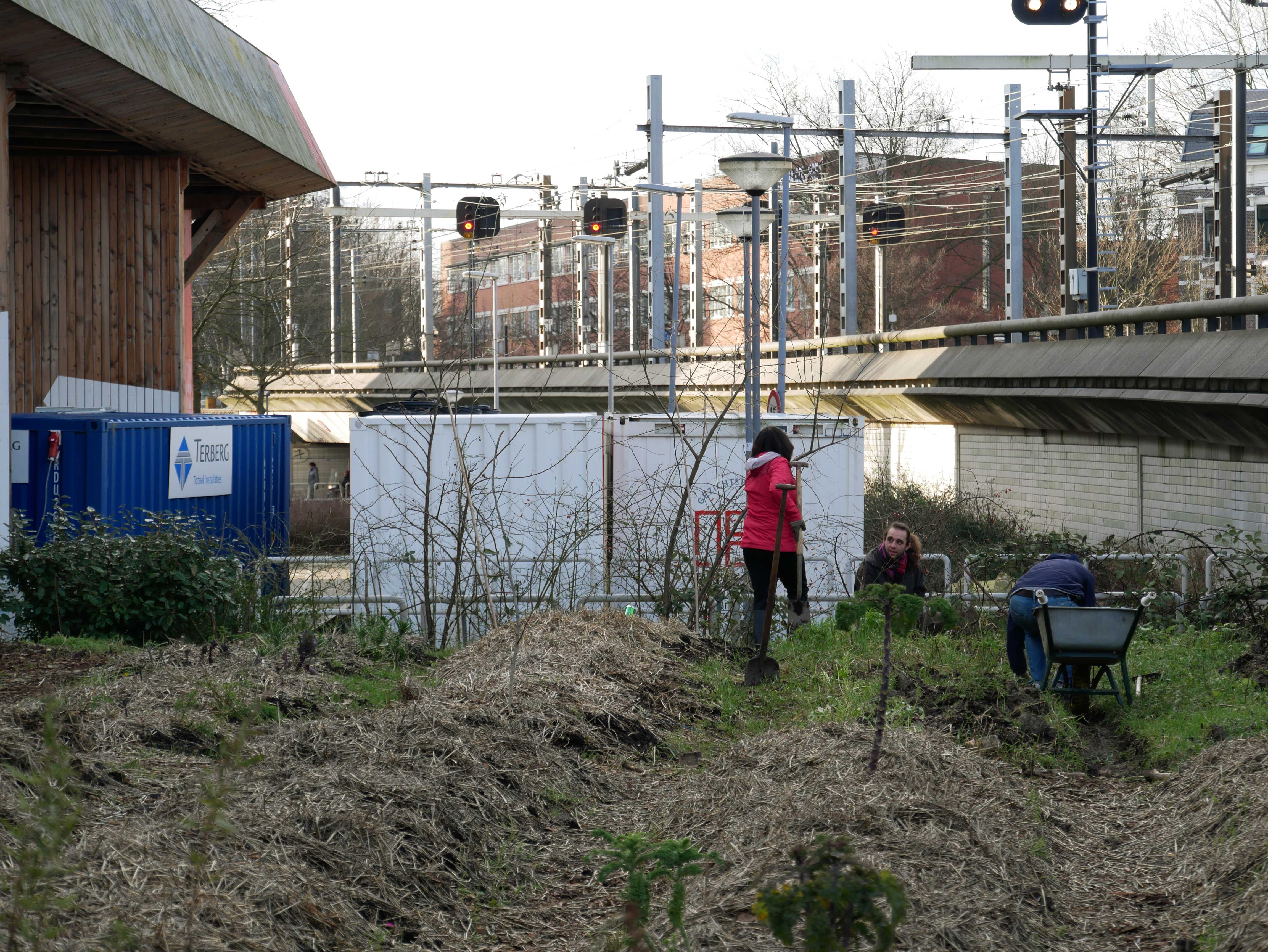
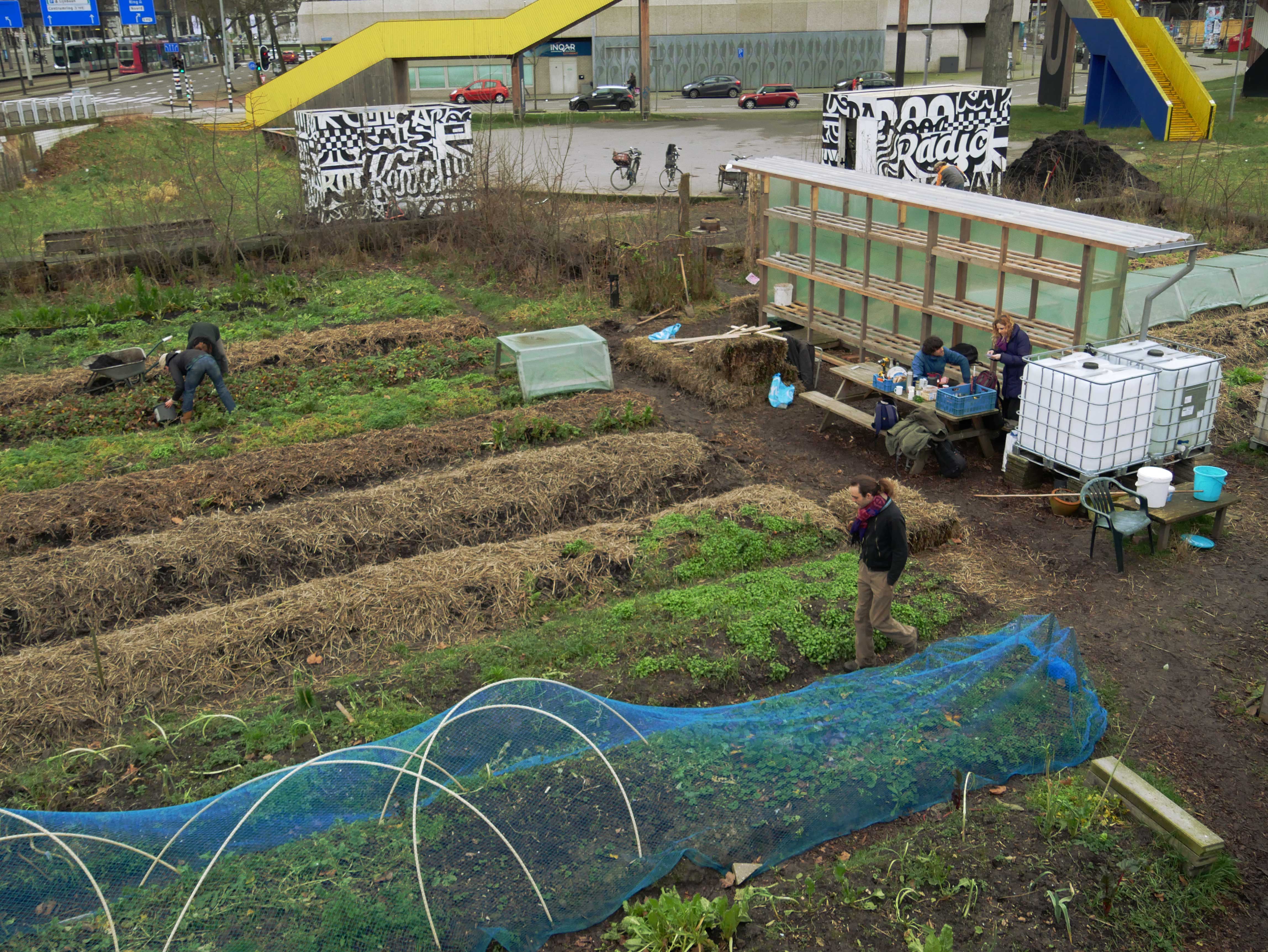
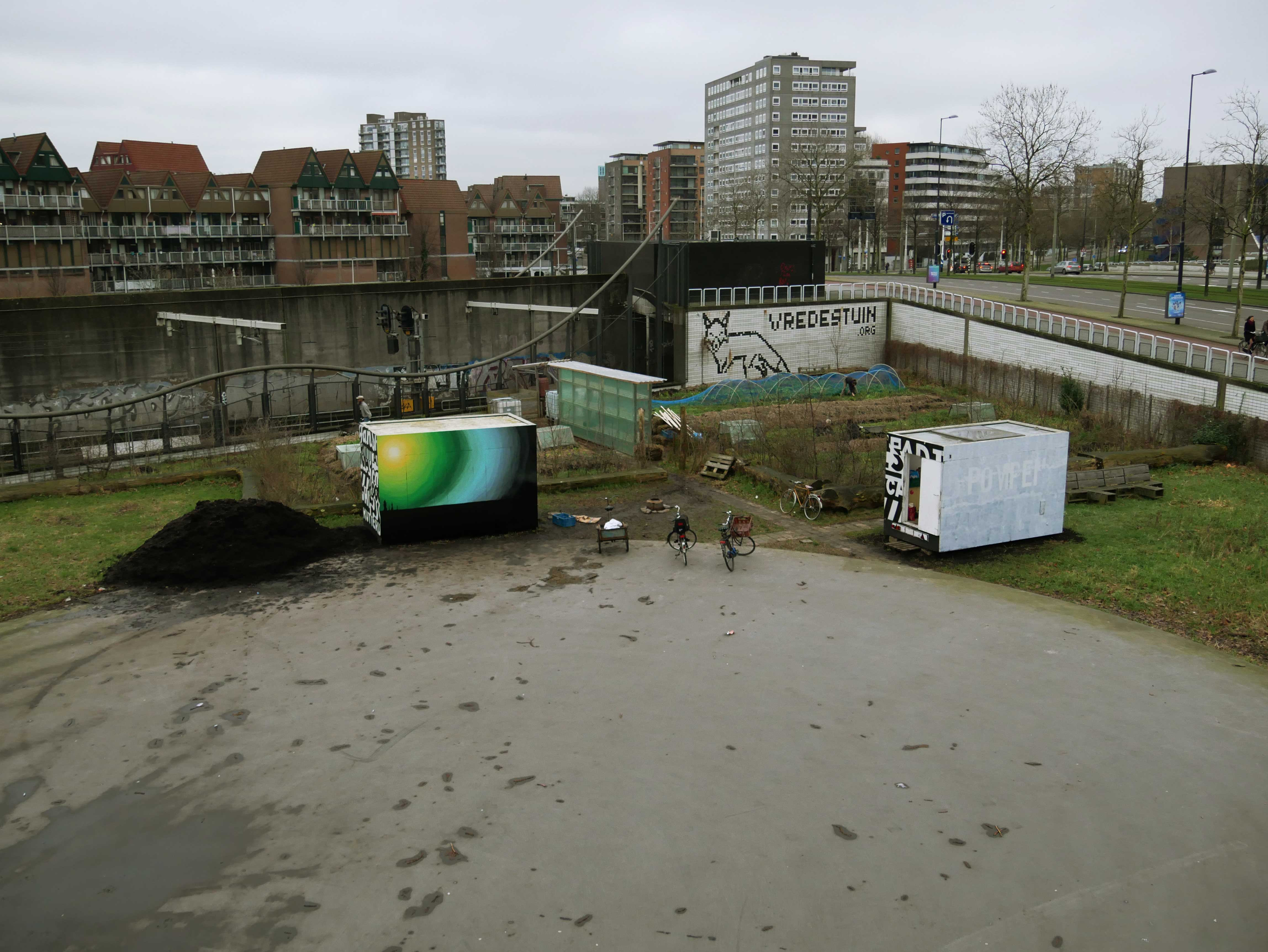
The railroad besides the garden.
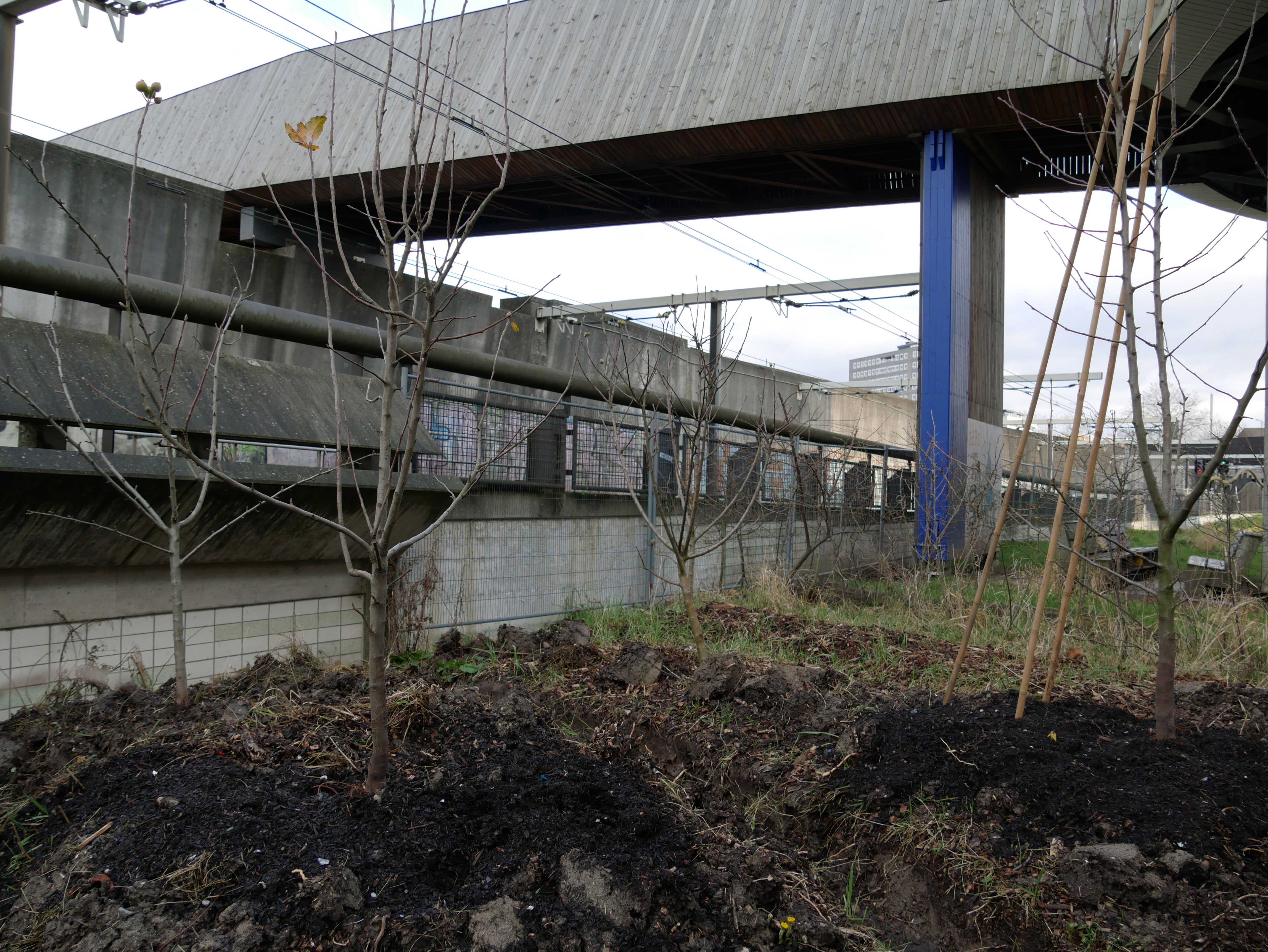
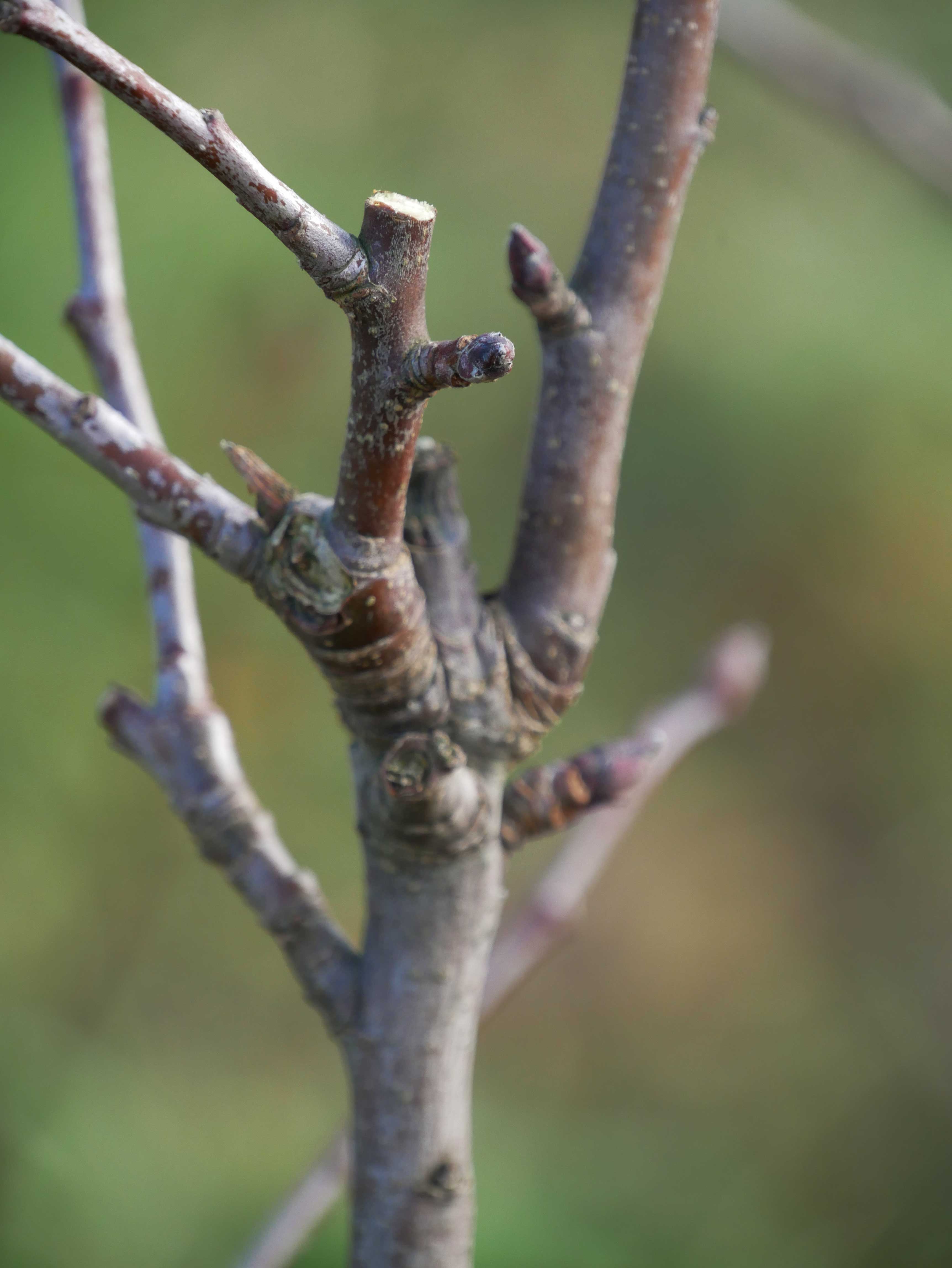
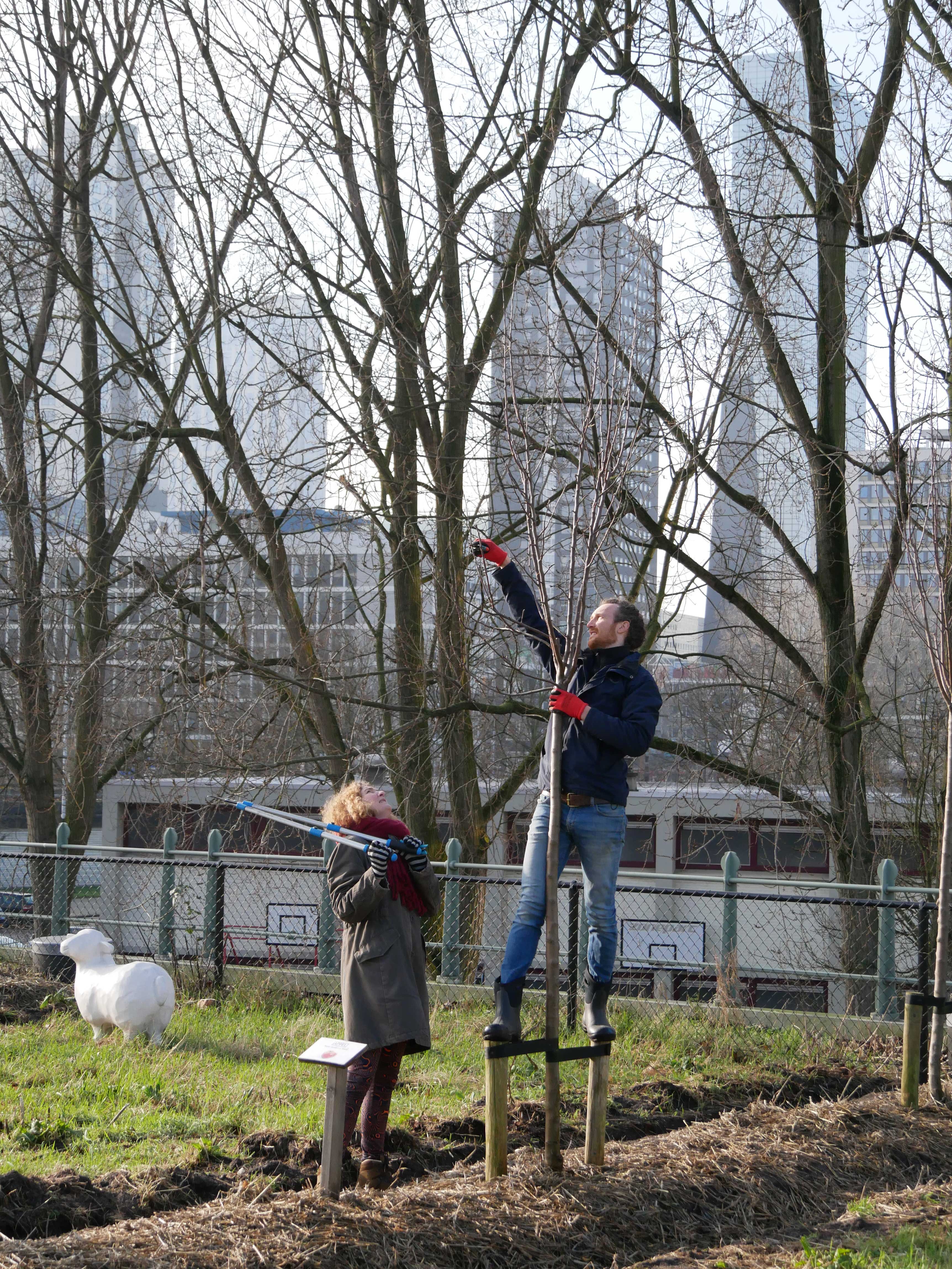
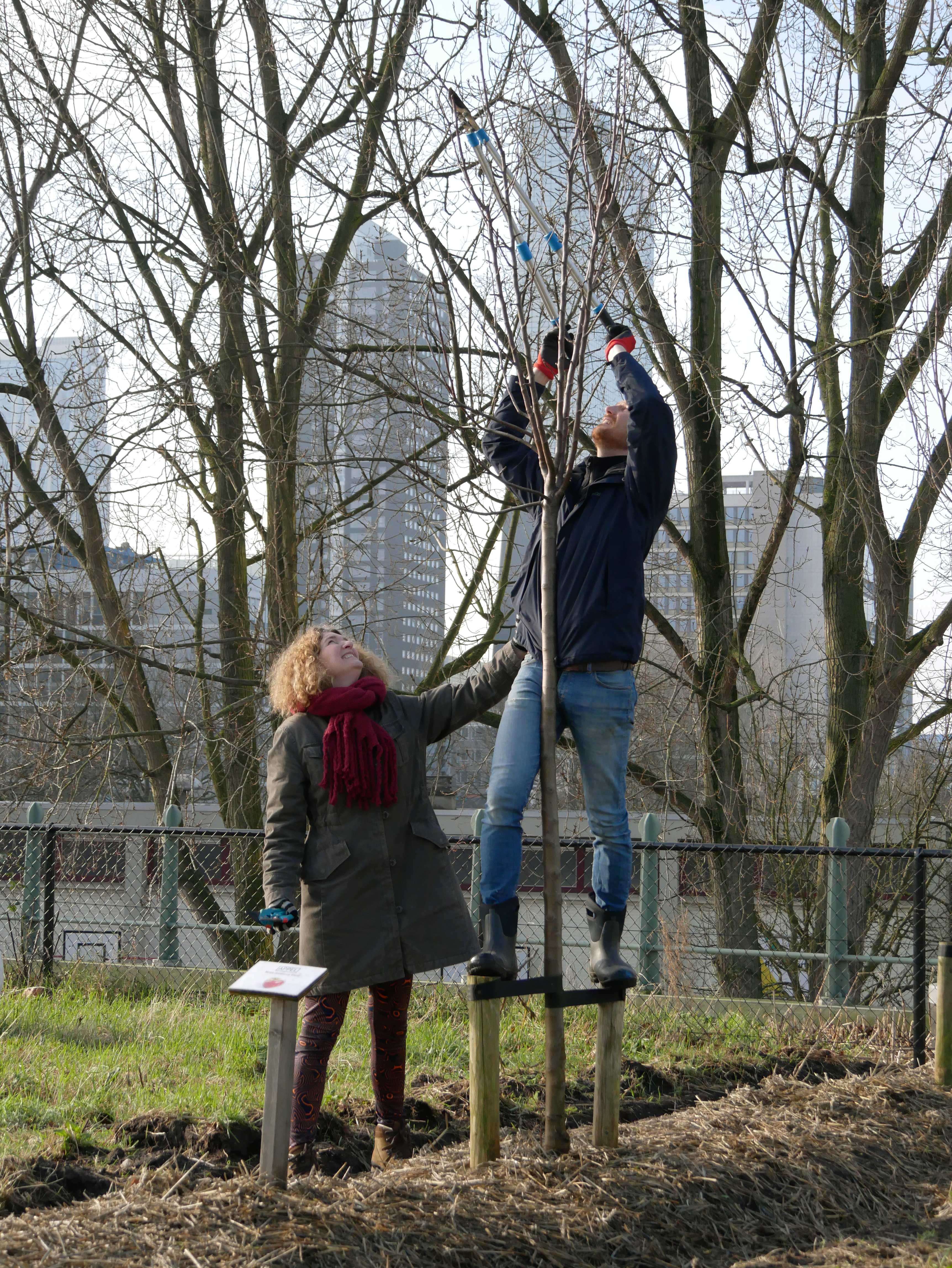
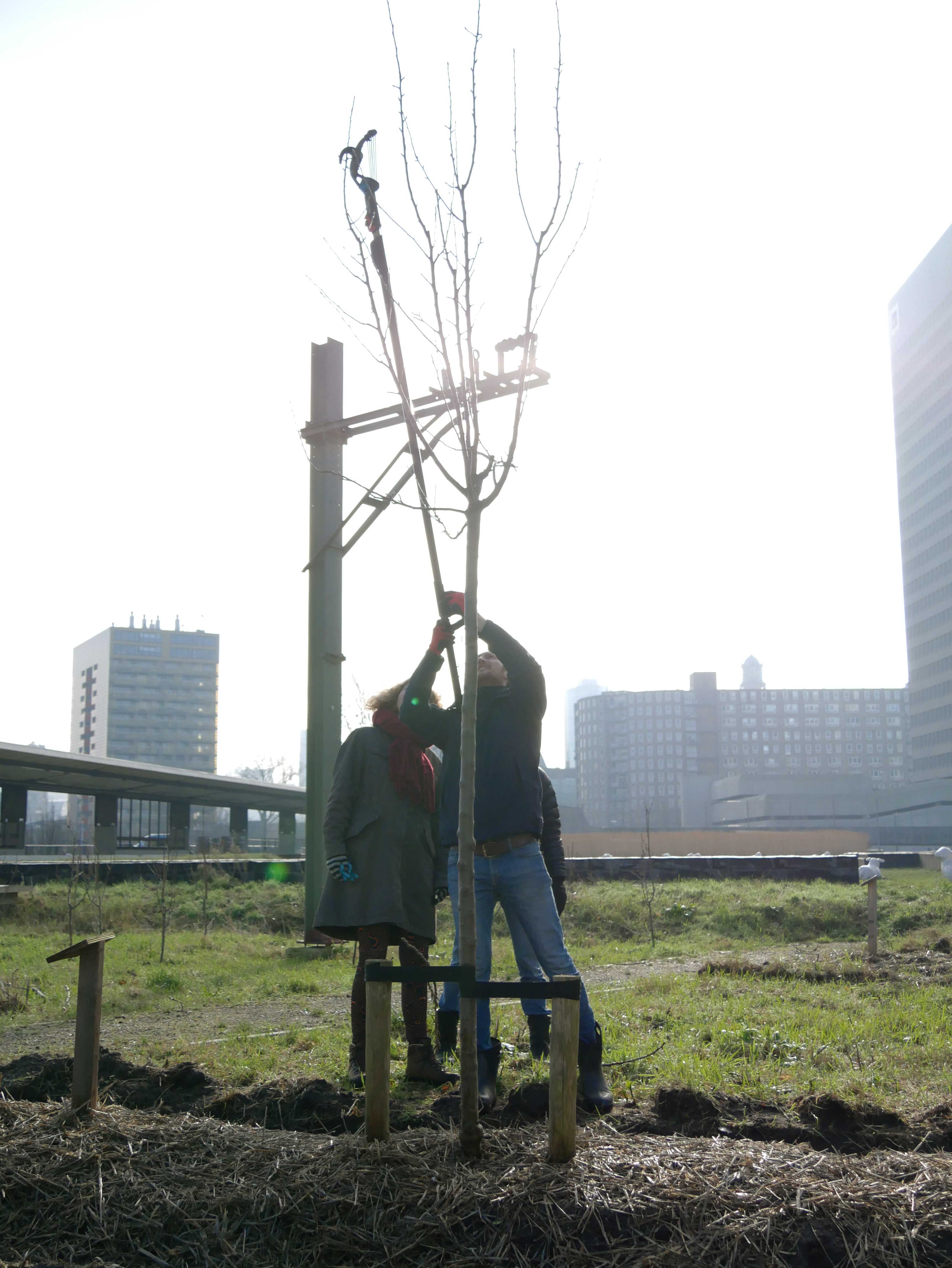
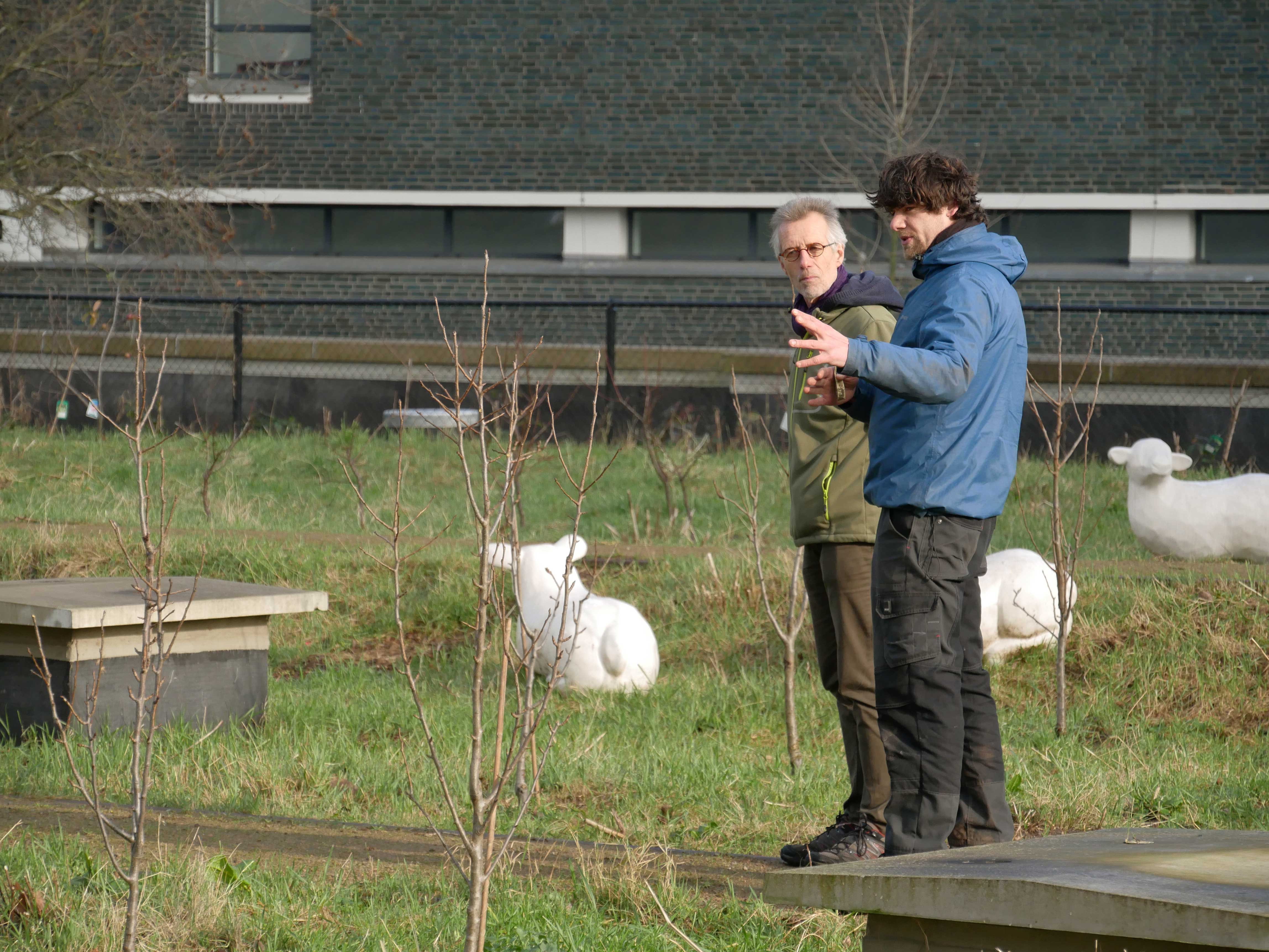
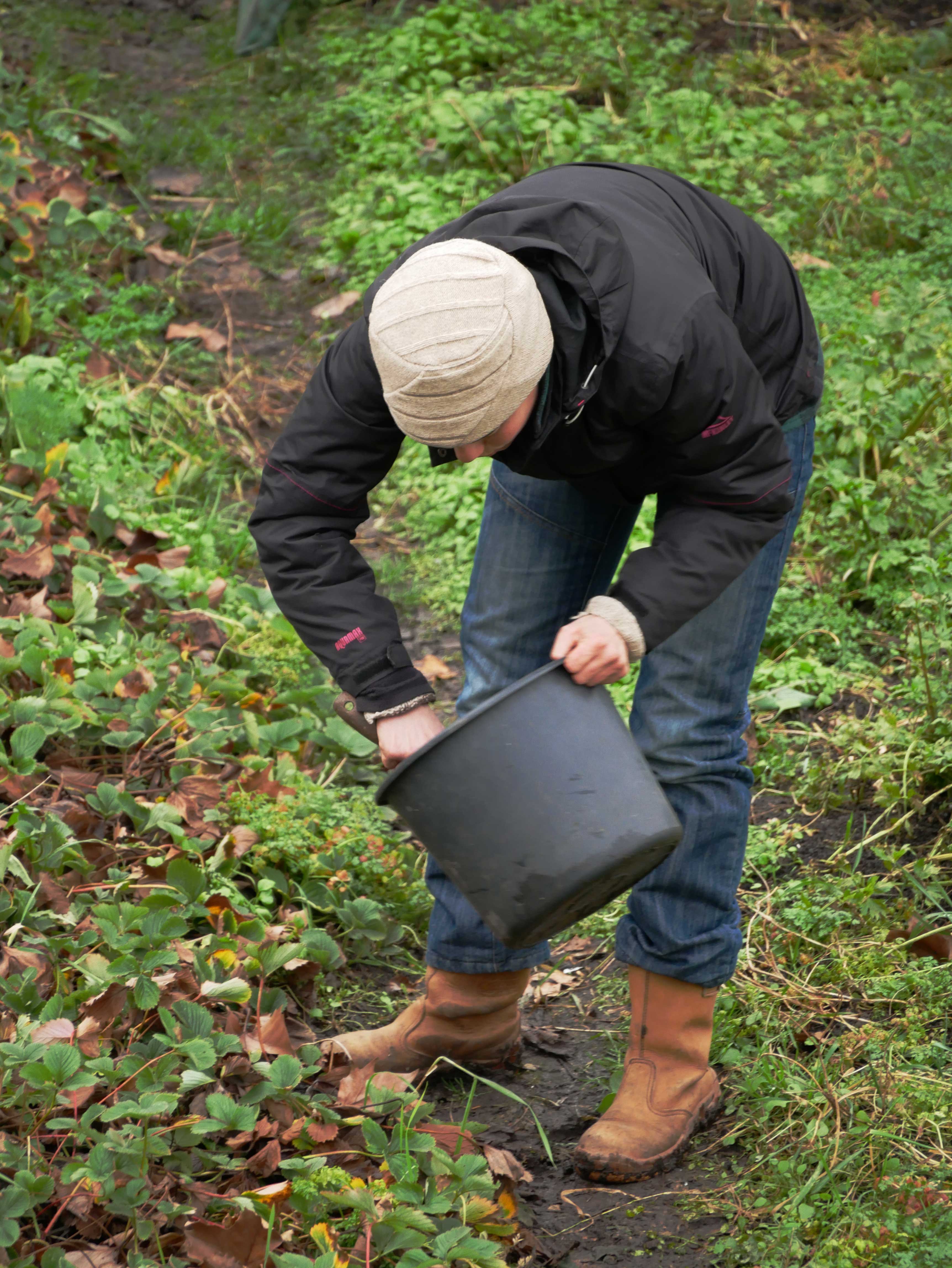
Setting the apple trees up higher. These are ented on a short piece, which will make the fruit be larger and grow faster.
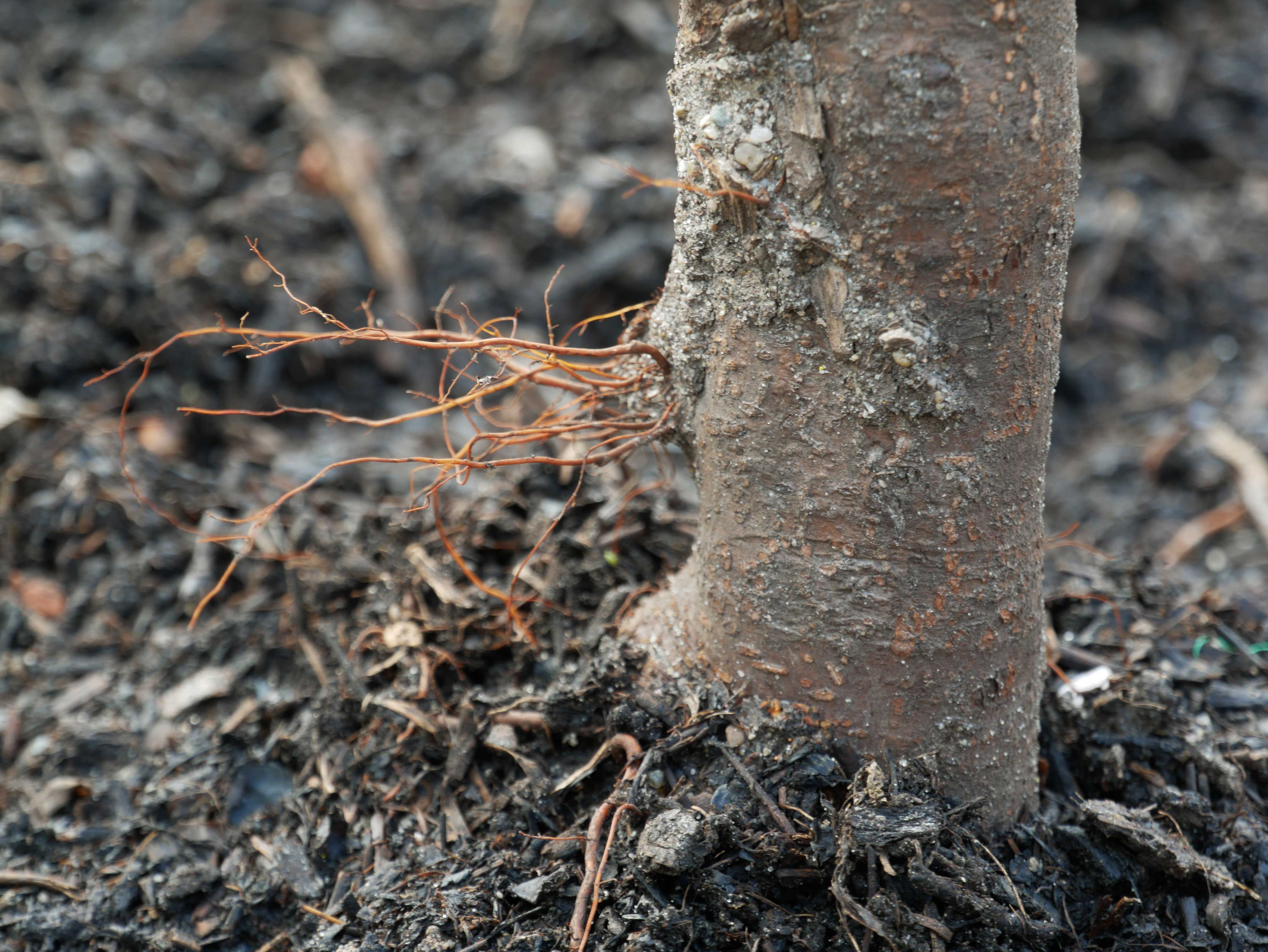
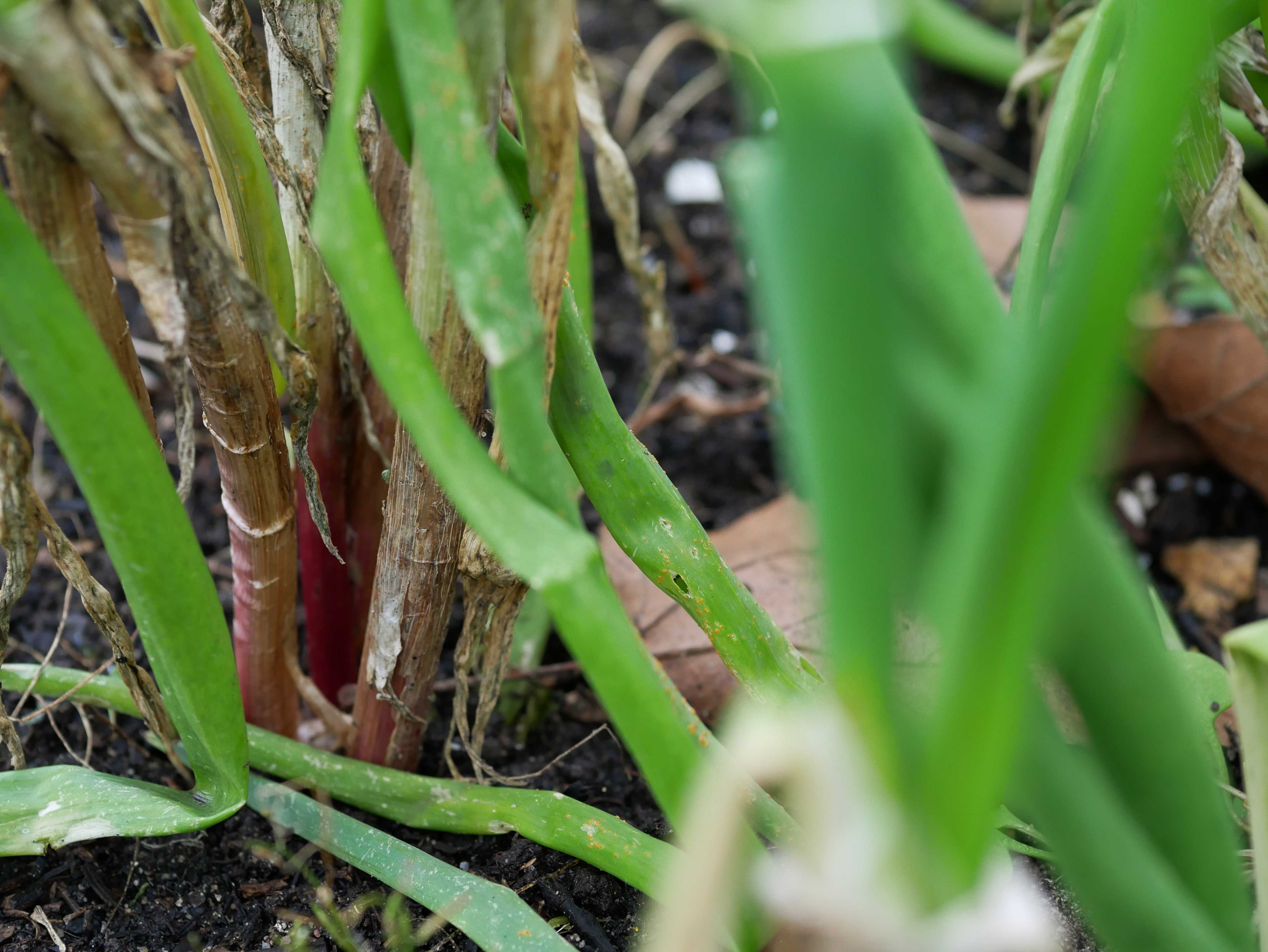
Roots
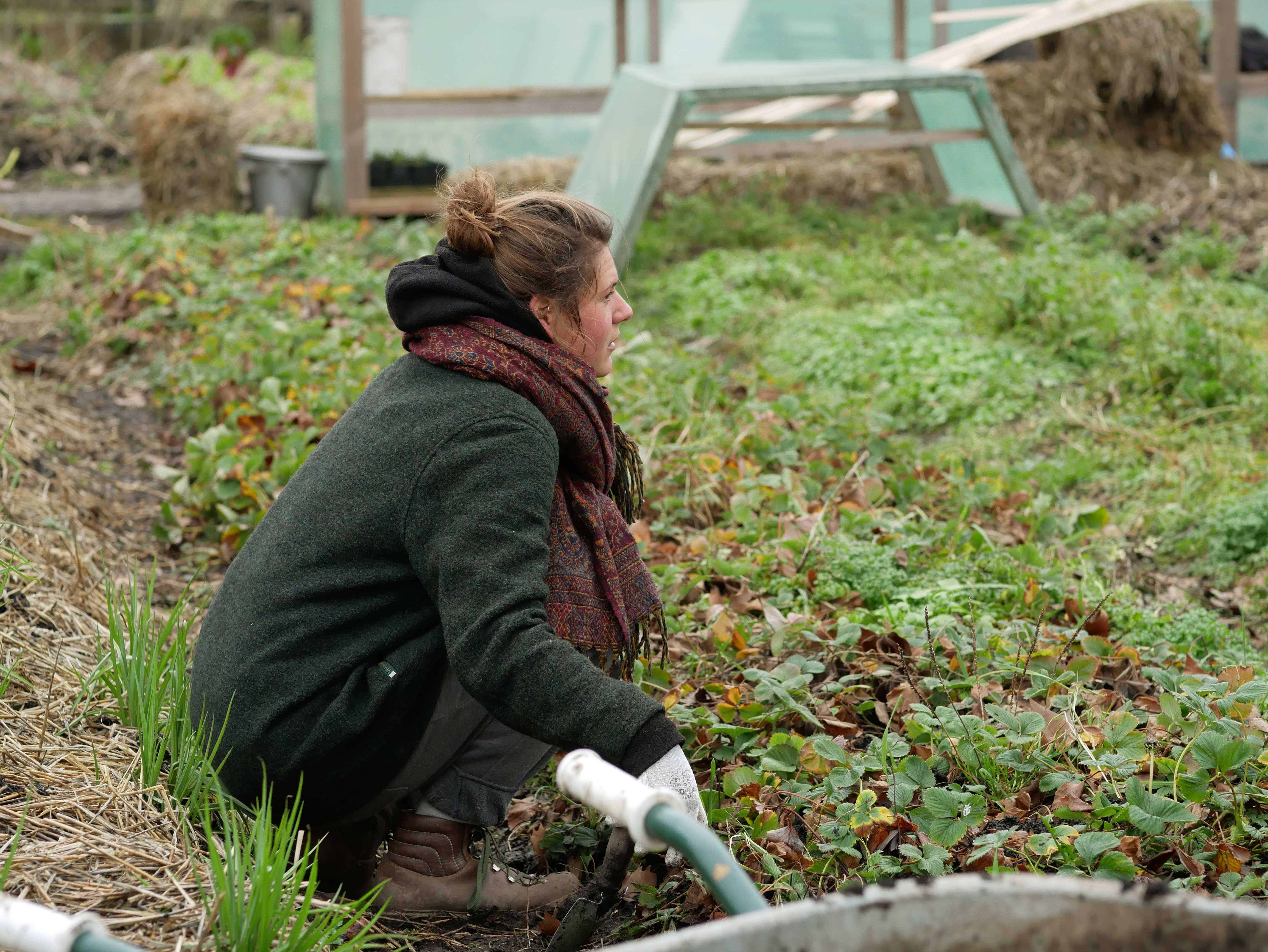
Cold work in the garden
Published on February 5, 2018 at 6:00 by

My first watercolour in the garden

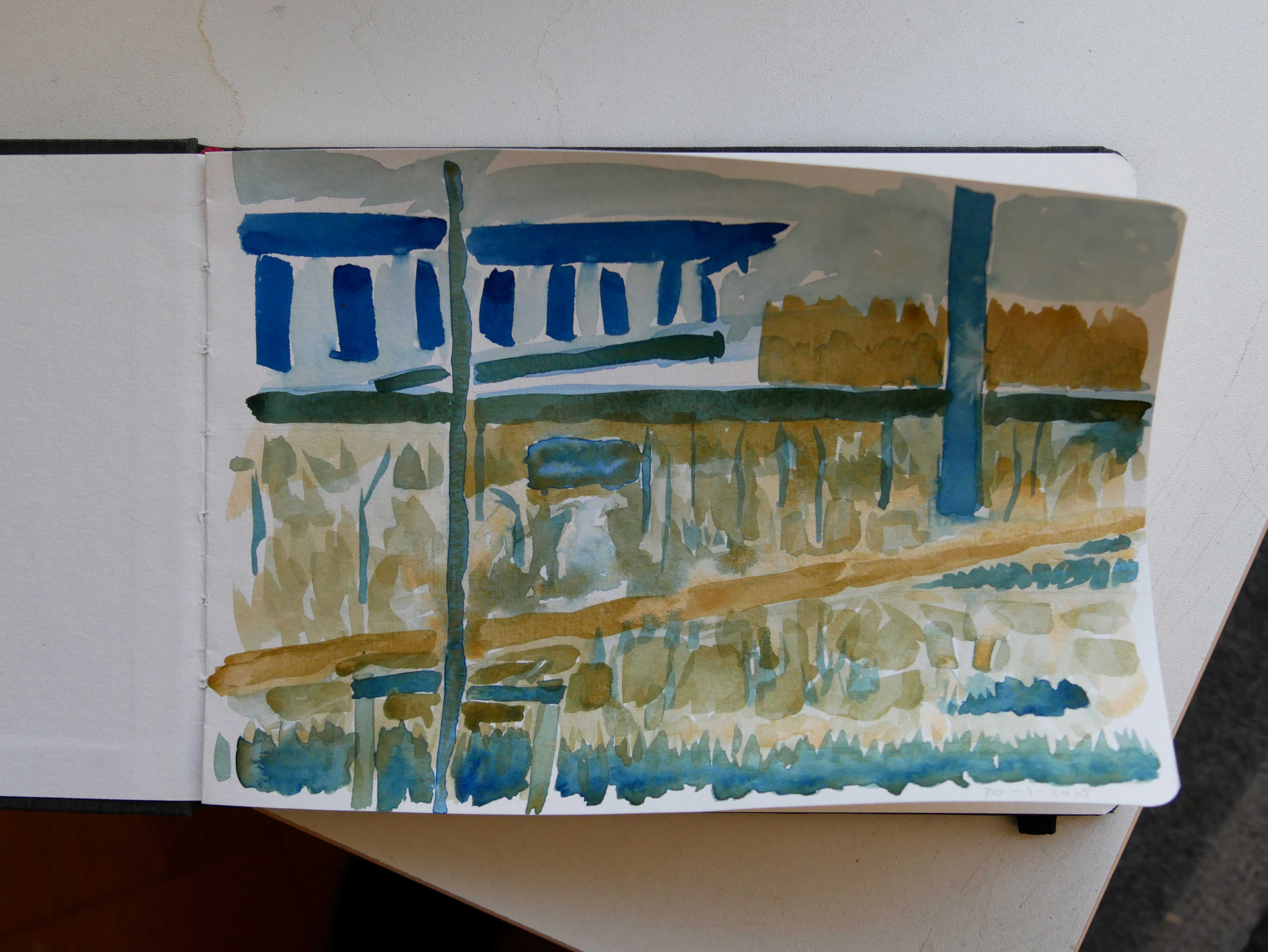
I had to think about it. I was a bit hesitant. But i did it. I took my new watercolour paints to the garden and made a watercolour painting. I had thought about it before. I knew i was going to use only two colours. Prussian blue and yellow ochre. I like limitations. I need to get to know the different paints.

The result is a sketch. A learning tool. But also a report of this hour sitting at the table and watching the area i had chosen to paint. The end result is nowhere near what i saw. Of course.

After i stopped painting i did do some work in the garden. I joined the others. A good day.

Published on January 31, 2018 at 6:00 by

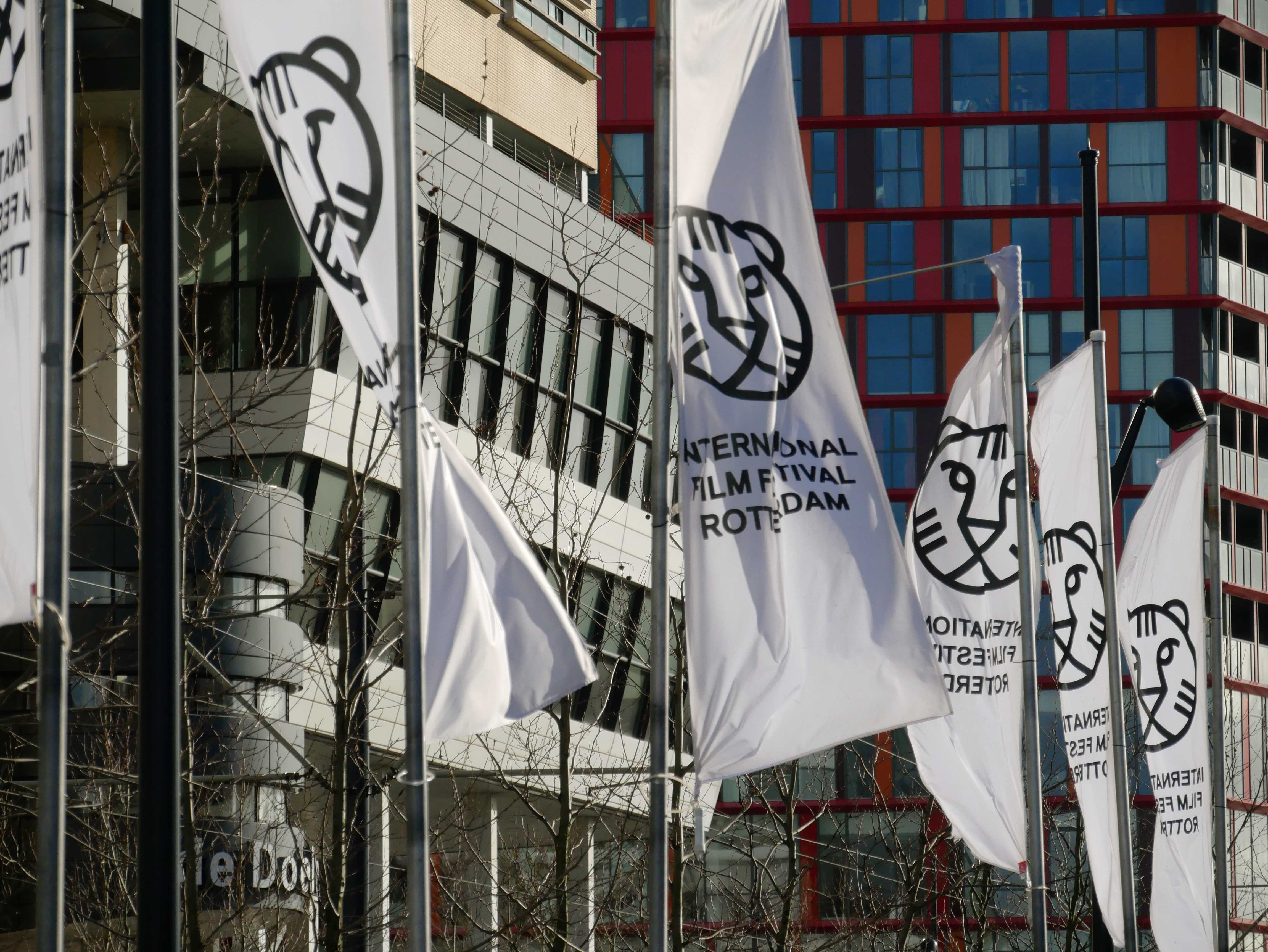
International Film Festival Rotterdam

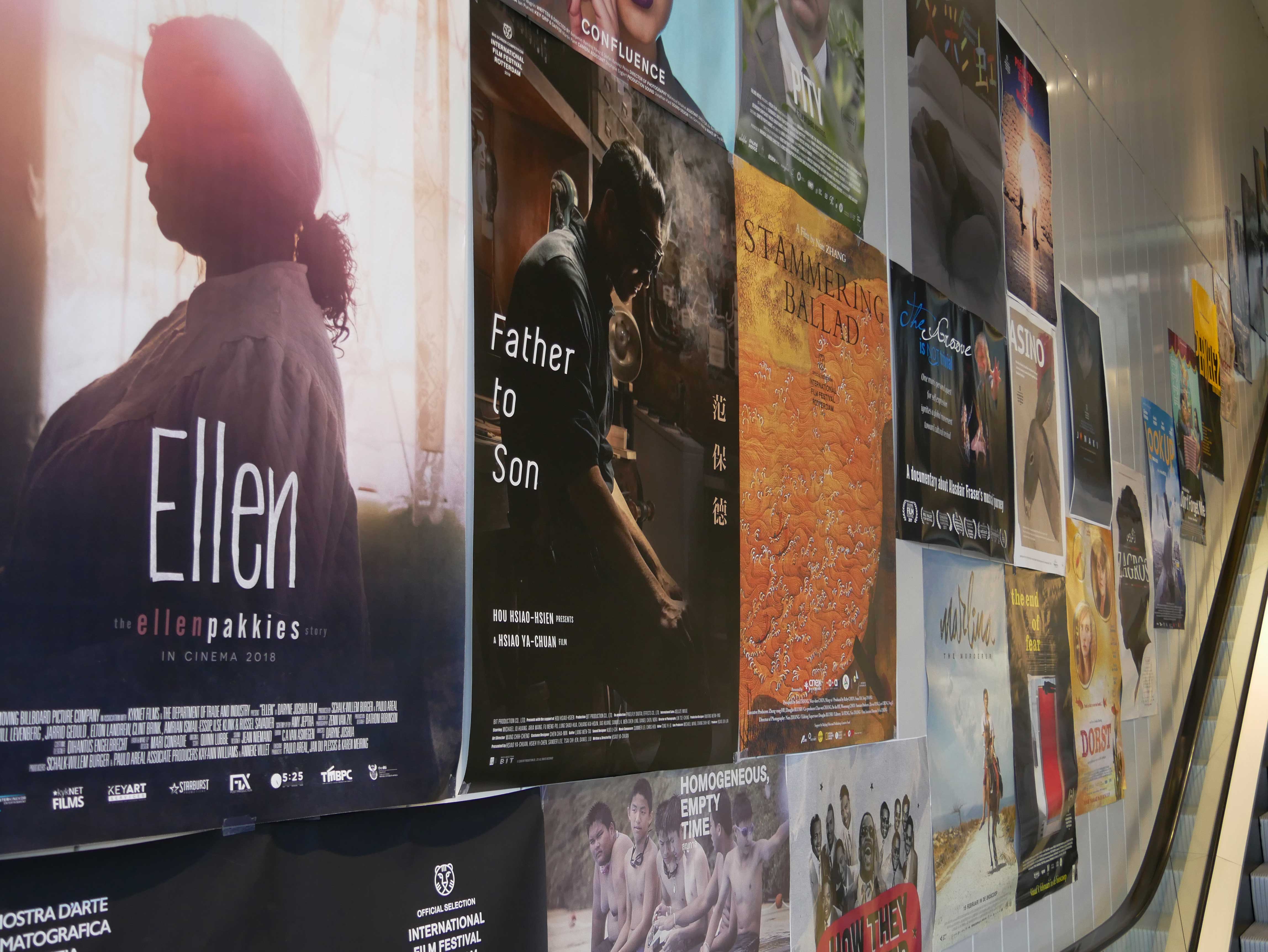
The past few years i decided not to go to the International Film Festival Rotterdam. Not anymore. It is expensive. I love films, sure. From the late 80s going to the IFFR was a staple in January. For around ten times i volunteered. More times even. I never counted them.

But it has changed. Streamlined. Commercialized. That is not a bad thing. But i do miss the old IFFR. Dancing n the Hilton.

So yeah, time doesn’t stop. Things keep changing.

It has vanished from my awareness.

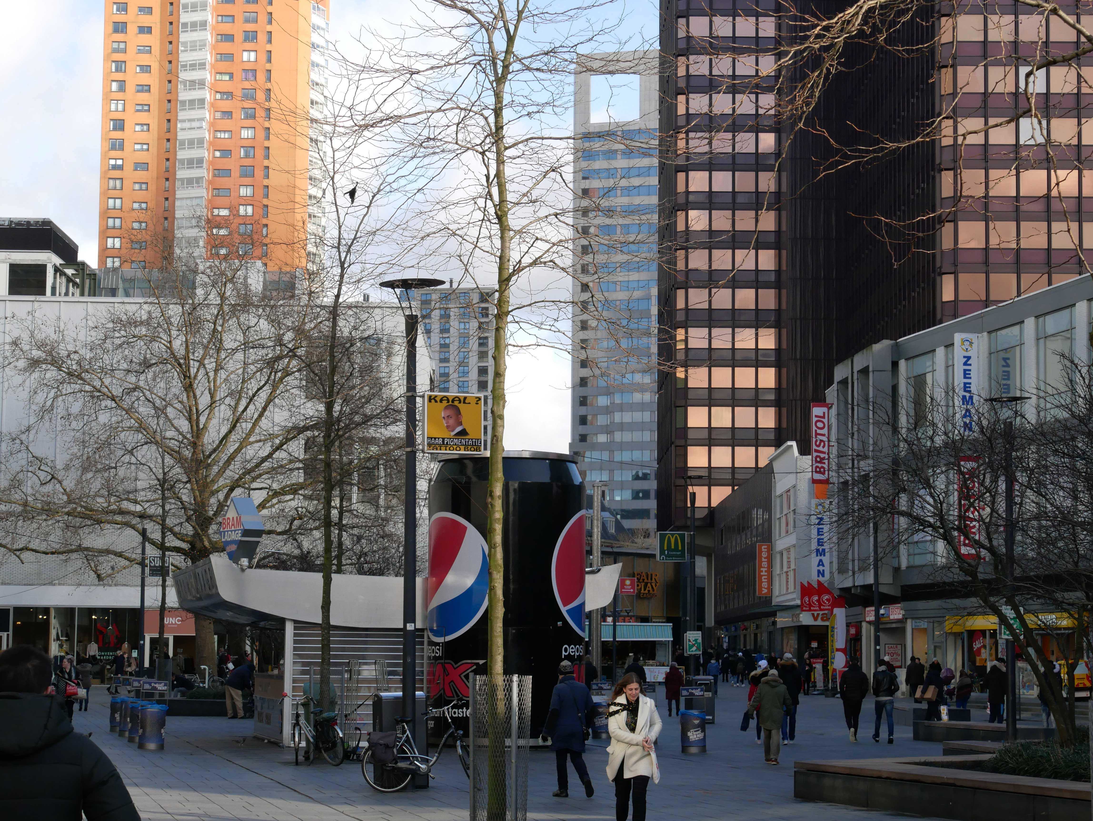
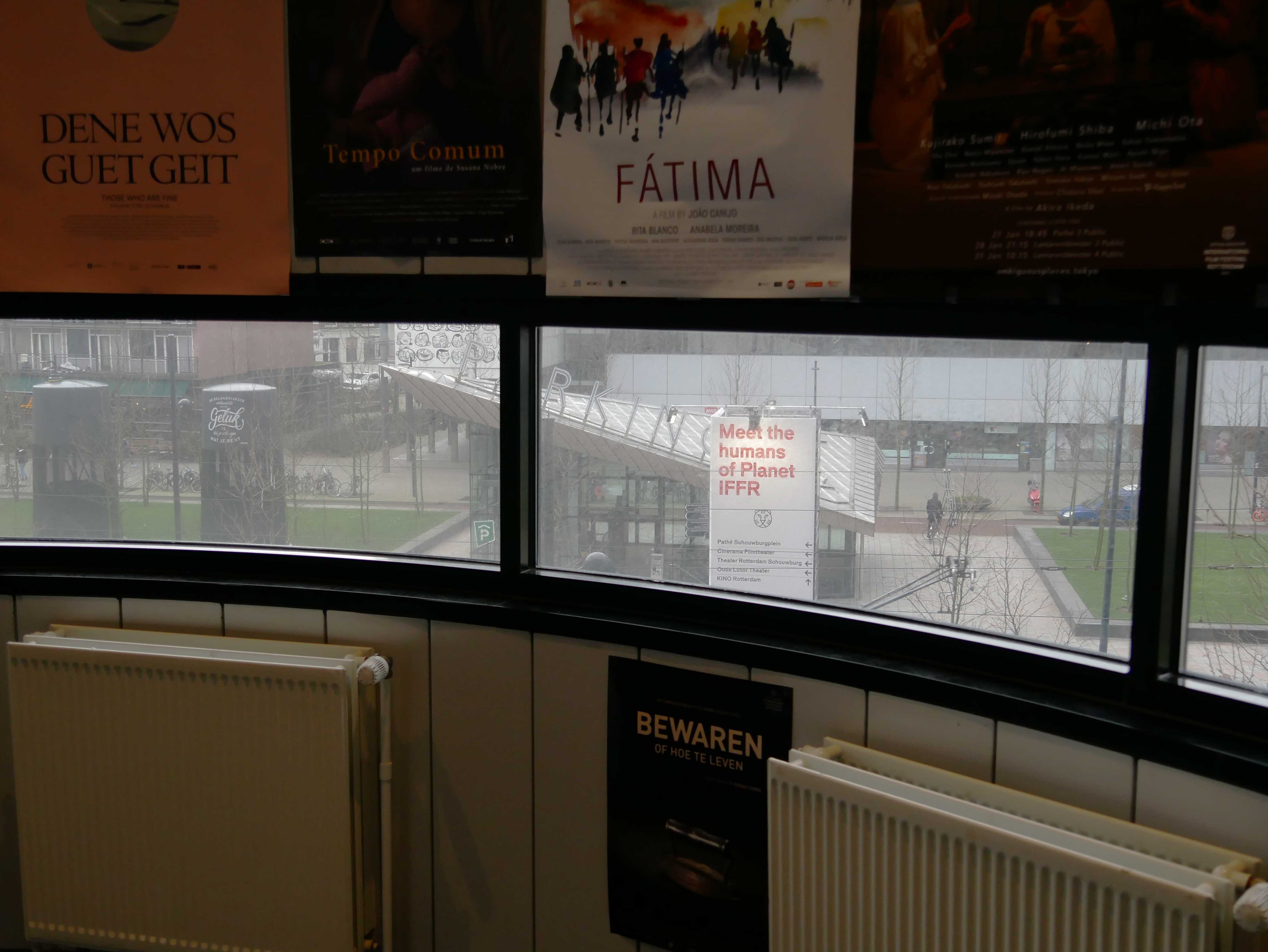
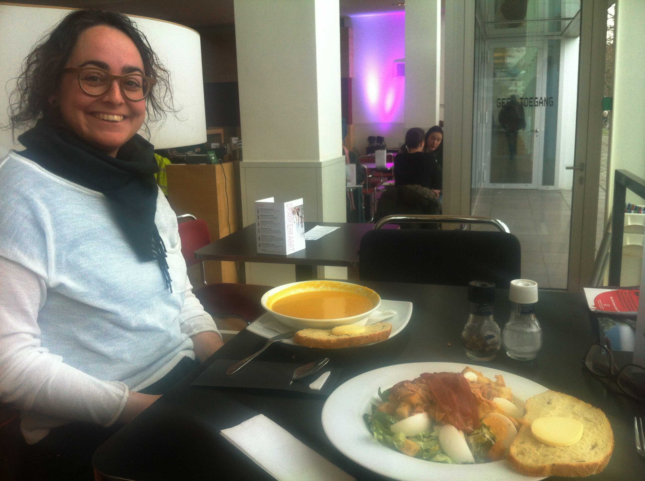
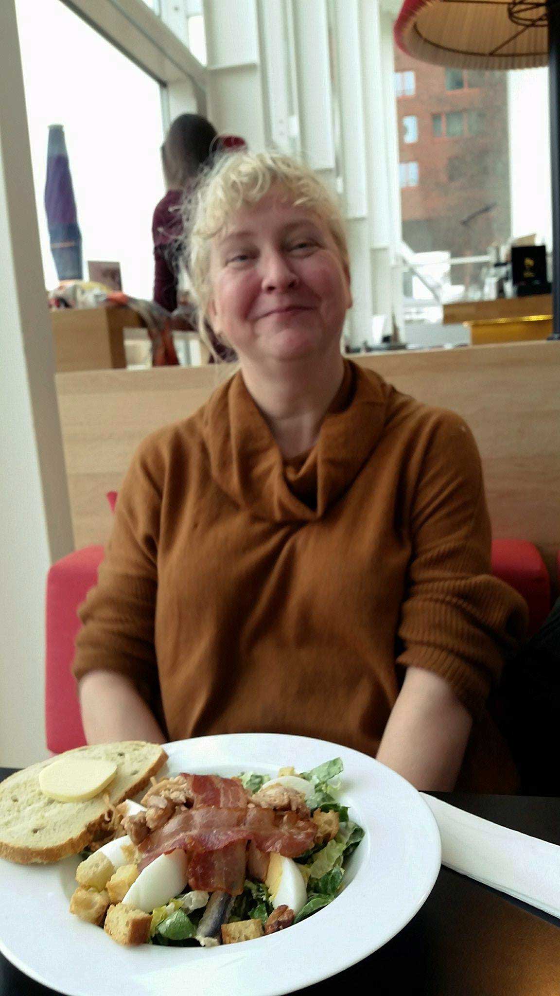
But today i went with Henja to the IFFR. The Doelen, KINO, Lantaren Venster. Coffee in the Doelen, lunch in Lantaren Venster. Walking through this city with Henja who is still relatively new in Rotterdam. Made me realize how this city is soaked in my memories.

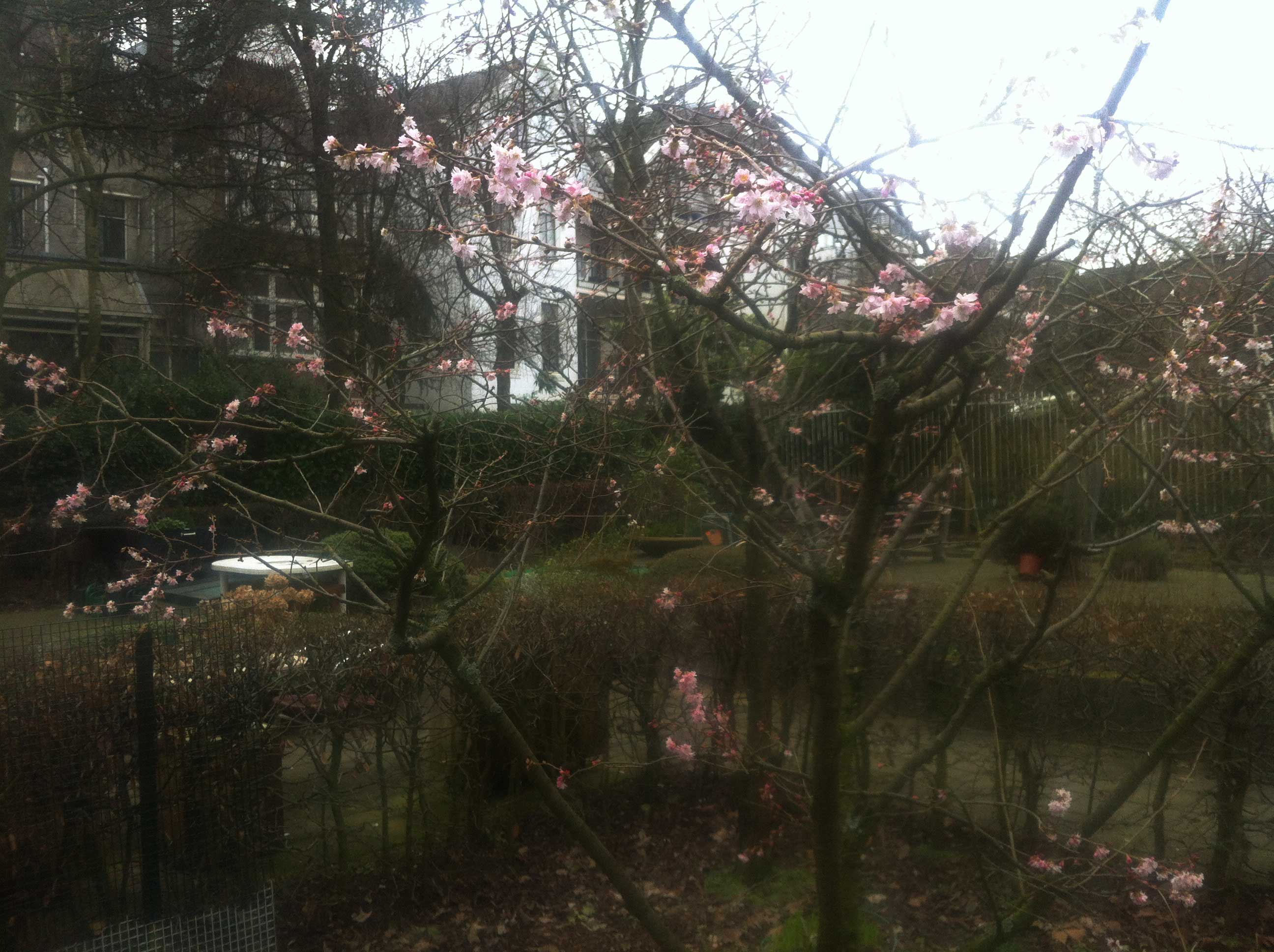
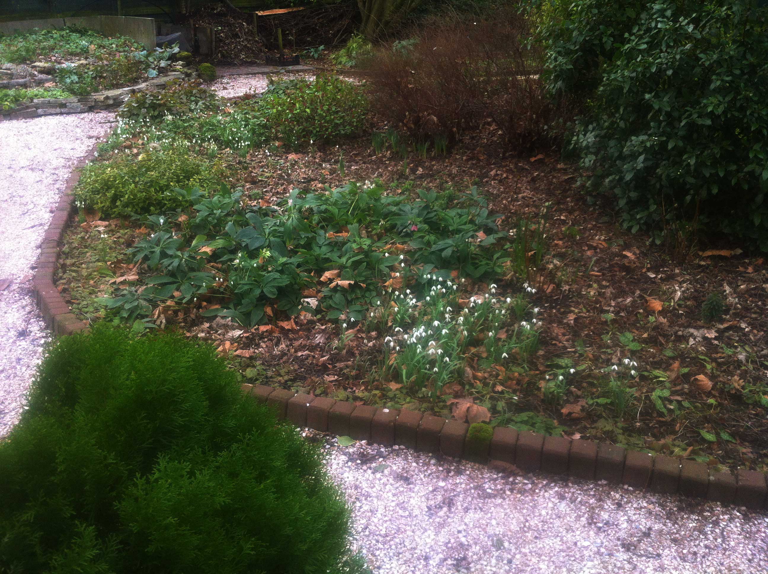
Happy to see small pink flowers in a garden along the way. And snowdrops!

A very enjoyable day.

Salute!

Published on January 30, 2018 at 6:00 by

Watercolour

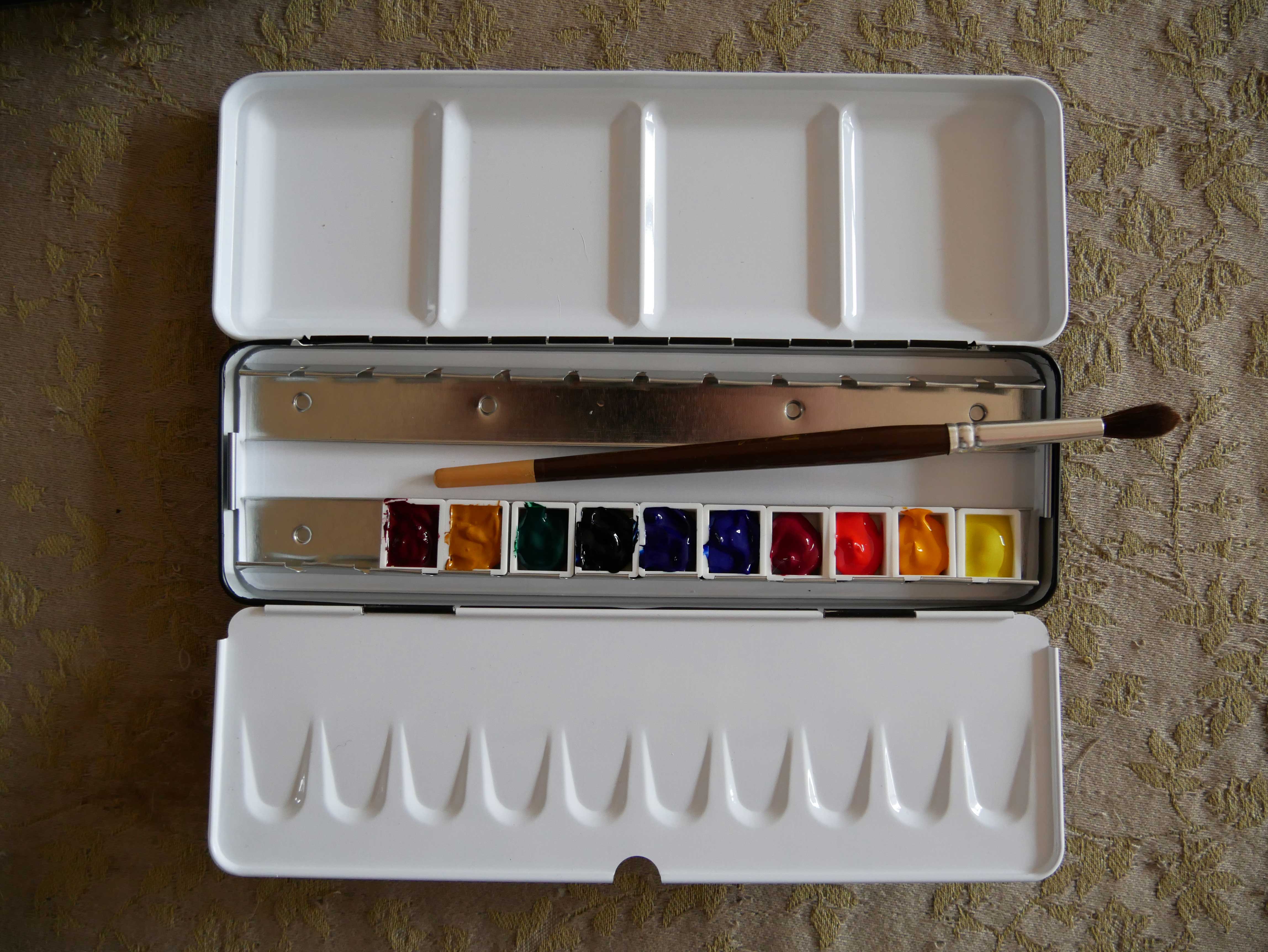
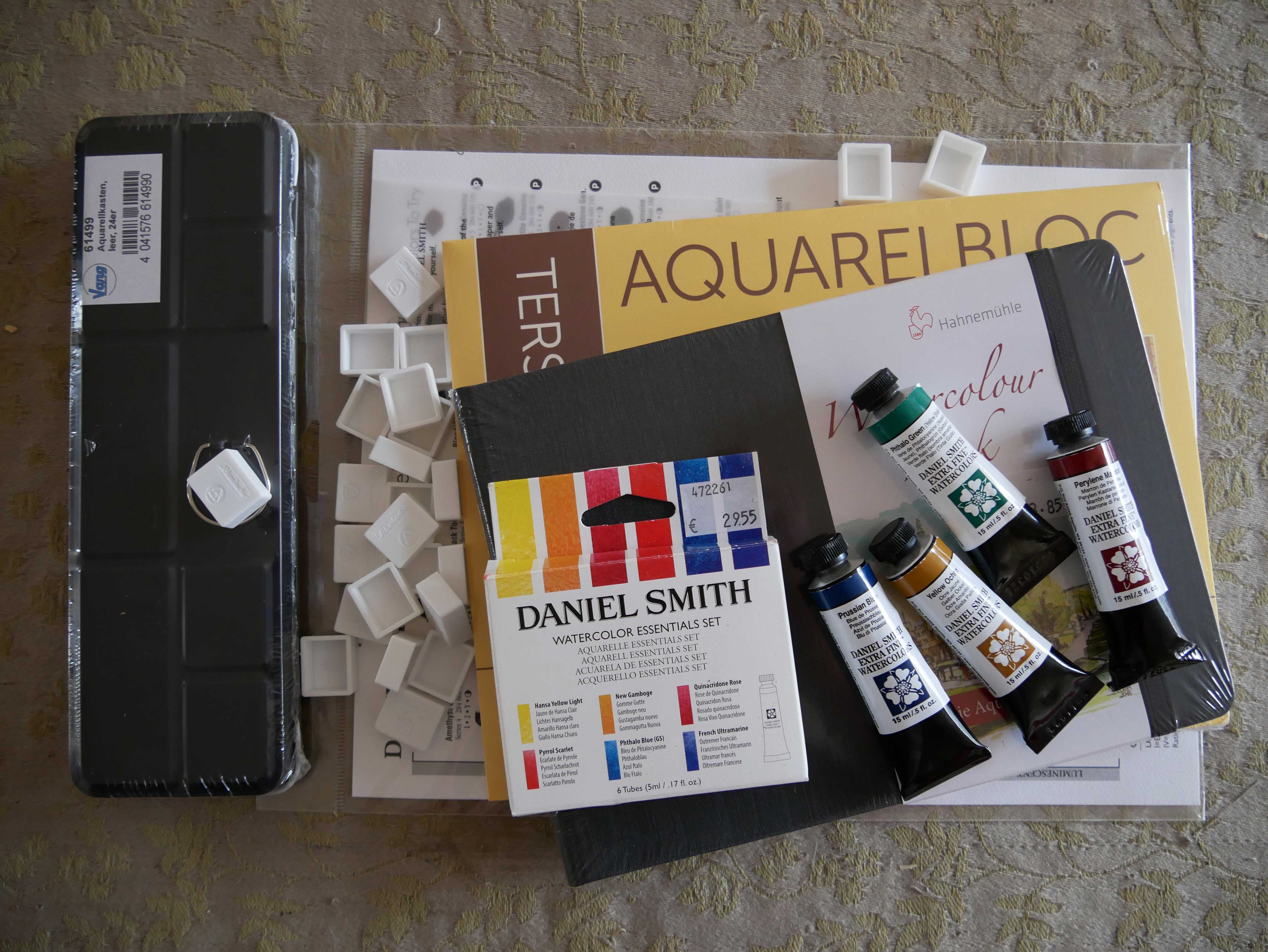
Today i bought watercolour paints, two watercolour paper books, a watercolour pan holder and empty pans.

I decided to buy Daniel Smith watercolour paint. I don’t remember seeing this brand in the early days in the 80s when i used to watercolour. I have seen many youtube clips about watercolour paints, sets and tips and how-to’s. Daniel Smith does come recommended by many different sources. Good professional watercolours.

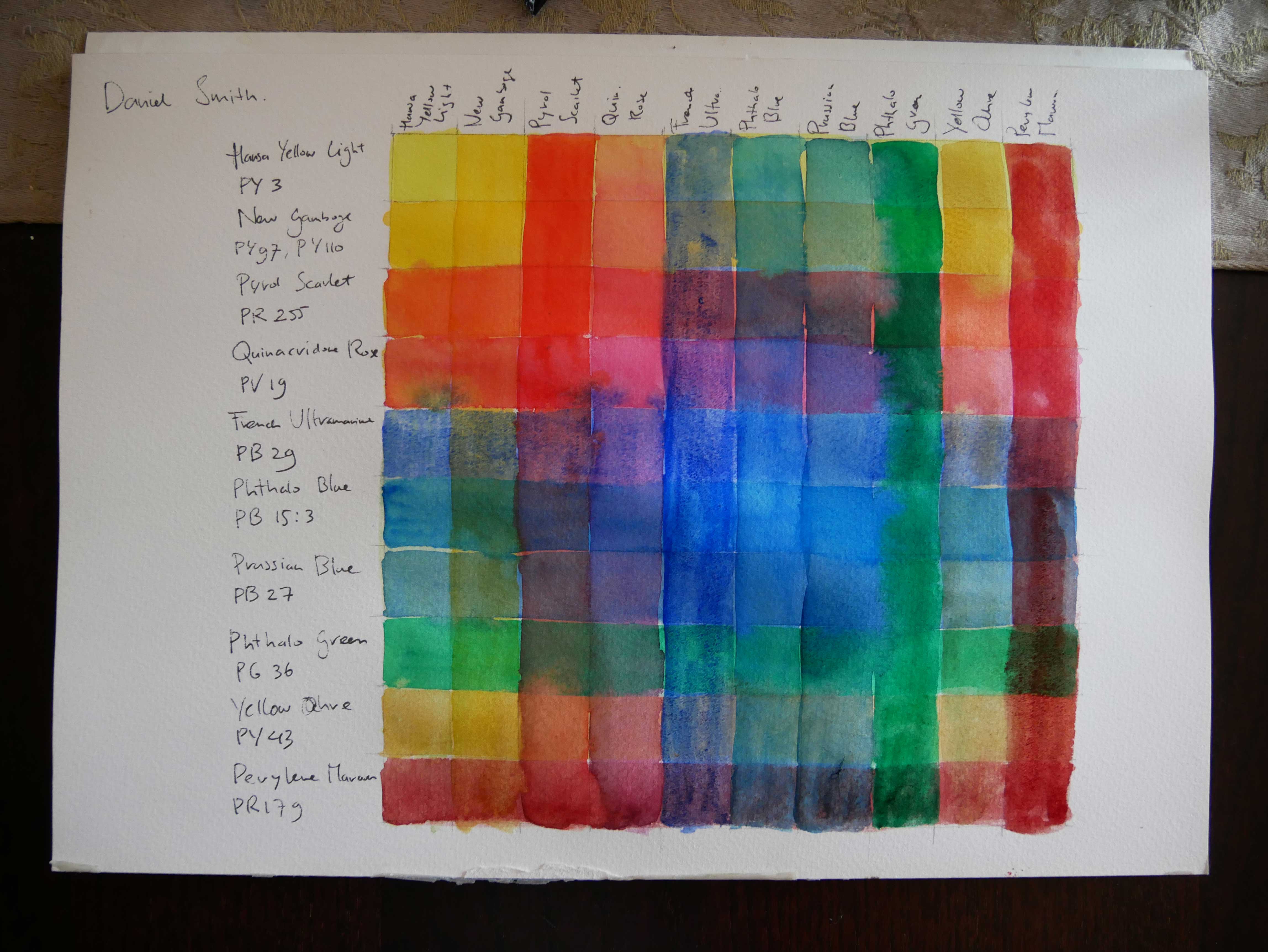
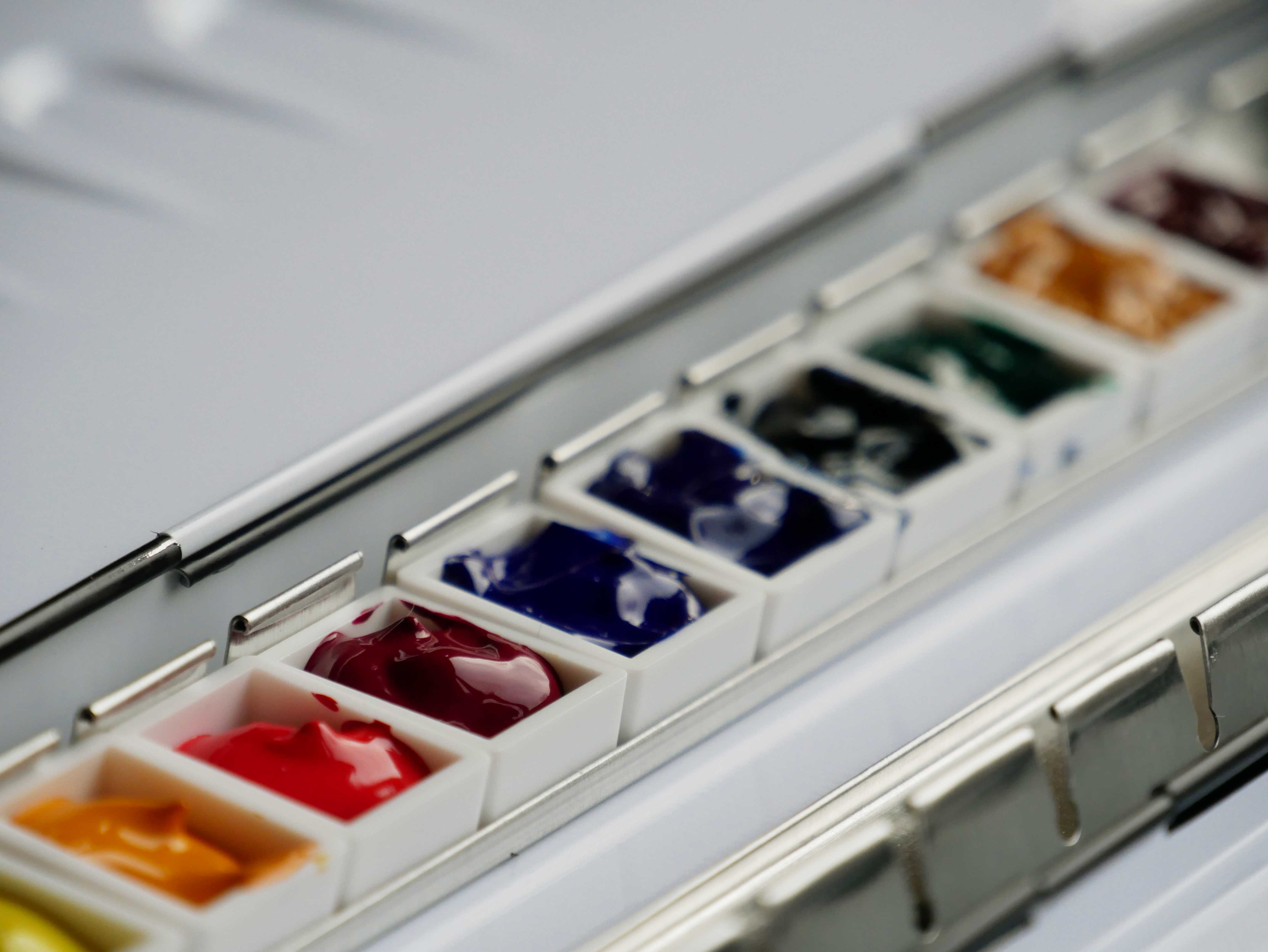
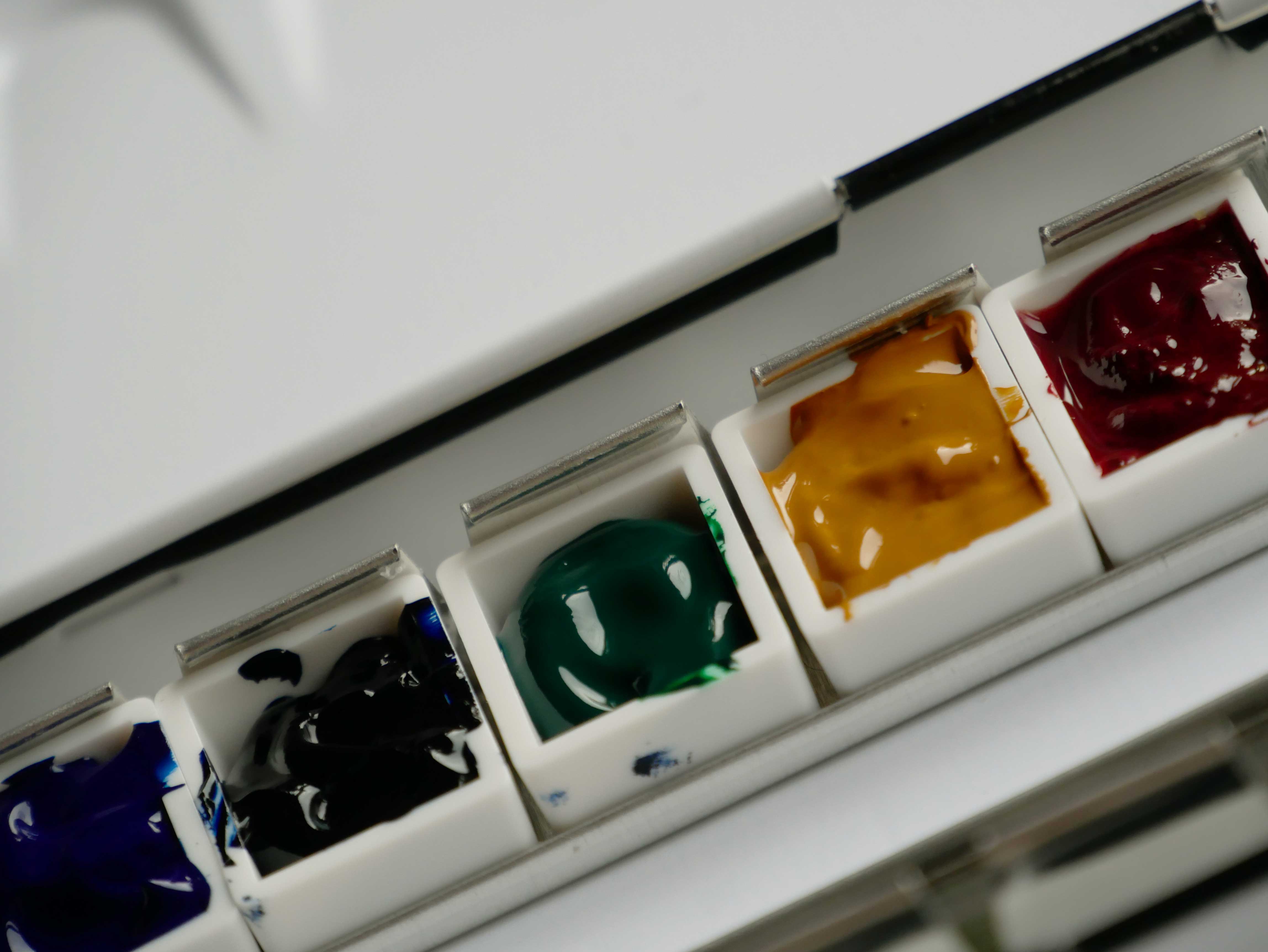
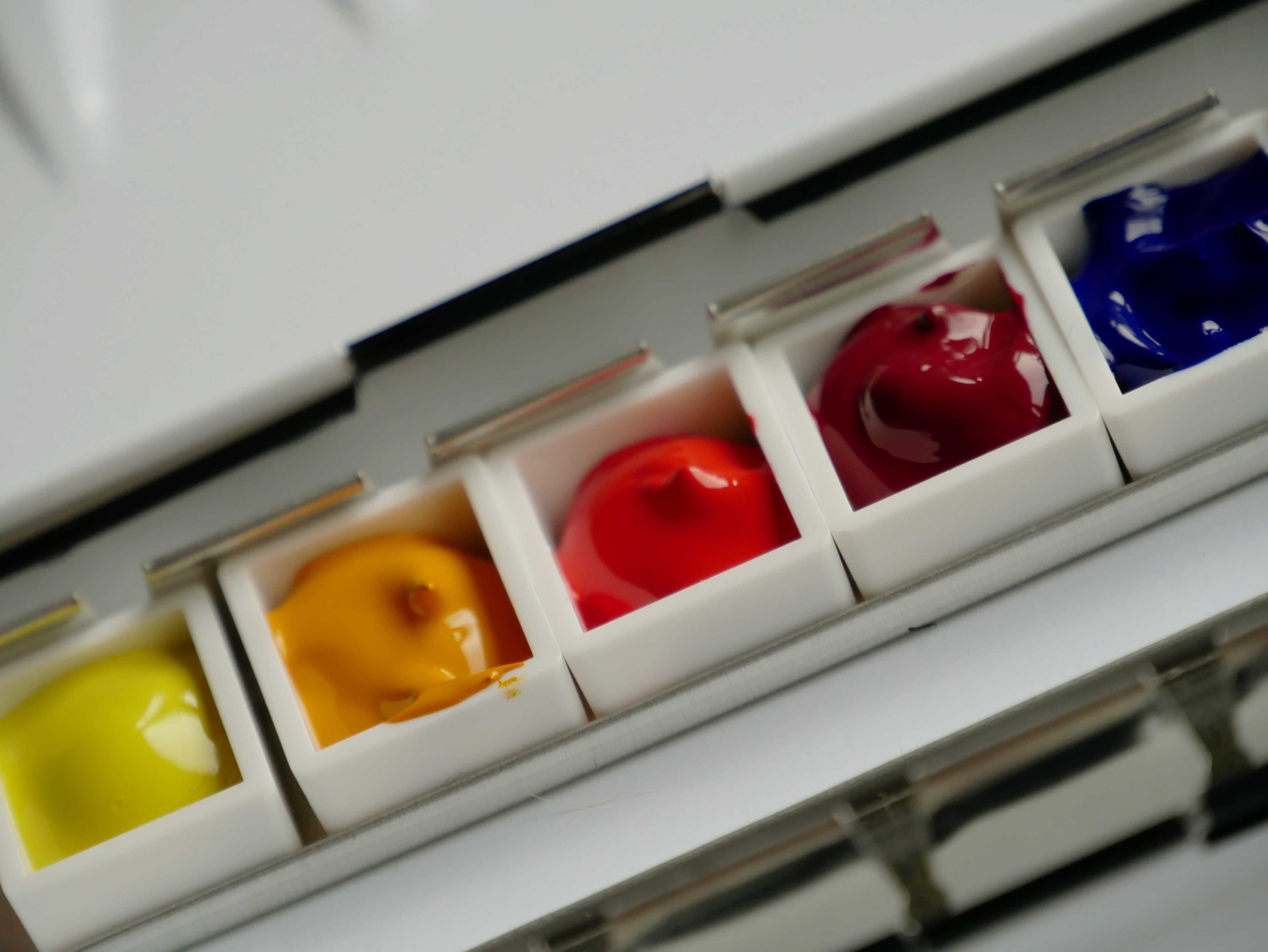
I bought the essential kit with six colours. Most of these i wanted to buy anyway. From three primary colours a warm and a cool colour. I also bought four other colours, in fifteen ml. Prussian Blue, Phthalo Green, Yellow Ochre and Perylene Maroon. Simply because with four colours i would get a Daniel Smith dot card for free. Ten colours to start with. No neutrals. With the extra green and ochre and maroon i can make darker colours. I did want to get Burnt Sienna, but that was out of stock. I will get more colours, but for now these are enough.

Only the New Gamboge is a two pigment colour. All the other colours are single pigments.

The best site i found is handprint.com. There is a huge section about watercolour paints, pigments, brushes and paper. I will need to read all the writings on this website again, there is so much to take in. There are also other parts of this website. Even a Wittgenstein part.

Recommended colours for a basic palette are the following:

  • benzimida yellow (either PY151 or PY154)
  • nickel dioxine yellow (PY153)
  • cadmium scarlet (or cadmium red light) (PR108)
  • -> perylene maroon (PR179)
  • quinacridone magenta (PR122)
  • -> ultramarine blue (PB29)
  • -> phthalo blue GS (PB15:3)
  • cerulean blue (PB35)
  • phthalo green BS (PG7) or
  • -> phthalo green YS (PG36)
  • gold ochre (PY42) or
  • -> yellow ochre (PY43) or
  • transparent yellow oxide (PY42)
  • burnt sienna (PBr7) or
  • transparent red oxide (PR101)

Prussian blue is my favourite of the old days. It is also a good dark colour. There are several ways to make black with this palette, a green – red one and a blue – yellow one. Warm colours with the yellow ochre and perylene maroon works good too.

I bought a Schmincke watercolour tin. I might blend some colours eventually and put them in a separate pan. For now i don’t do that, i need time to get used to painting again.

I bought one sketchbook to take out with me. Another small block for other paintings.

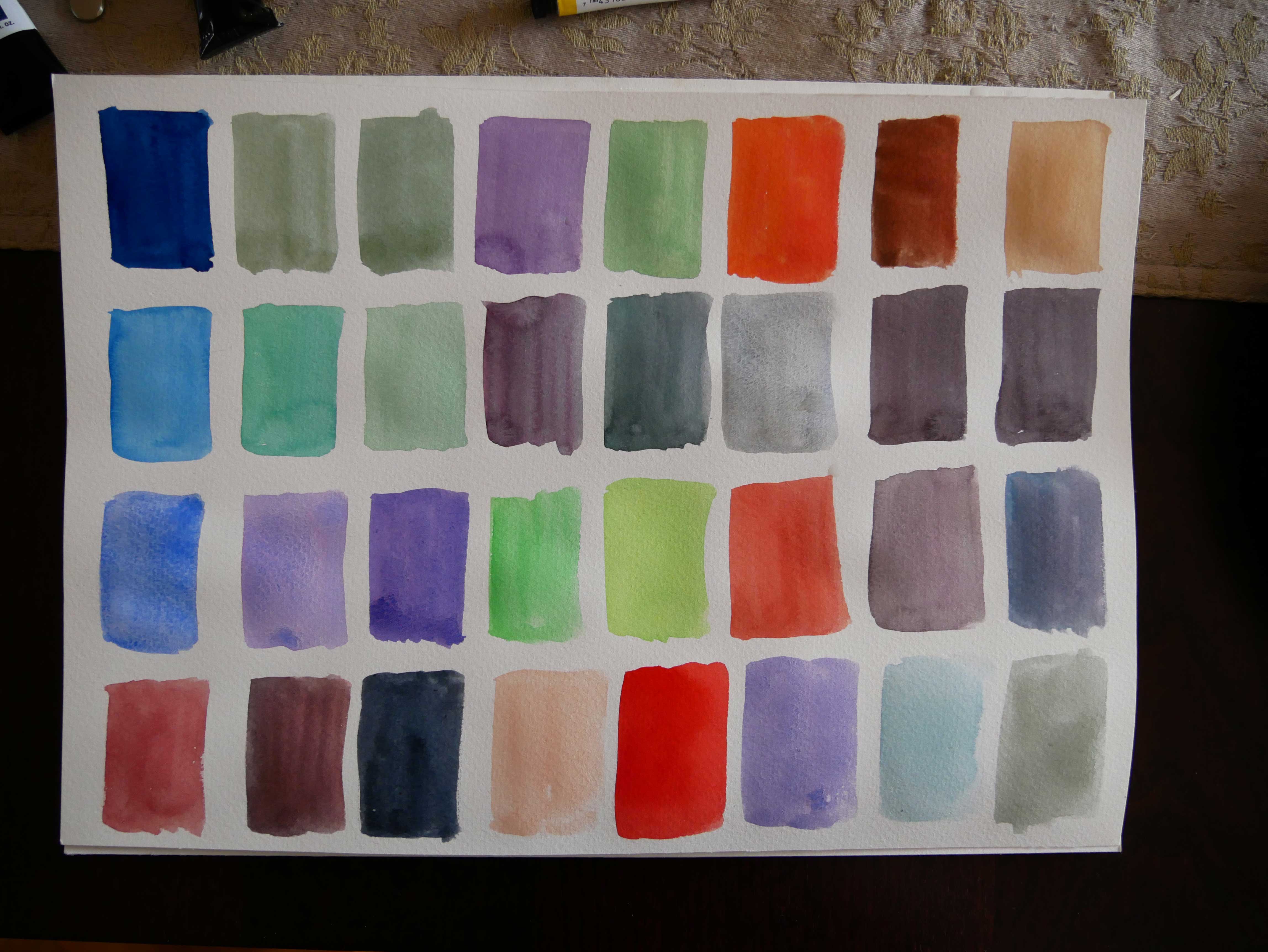
For the mixing i did today i used an old watercolour block i still had. I made one with glazes. Another paper with several mixes. I will make more of these. A colour wheel. Larger mixes of all the different colours. Neutral mixes.

And of course sketches and drawings in the garden. The main reason i bought this. Yay!
Published on January 26, 2018 at 6:00 by