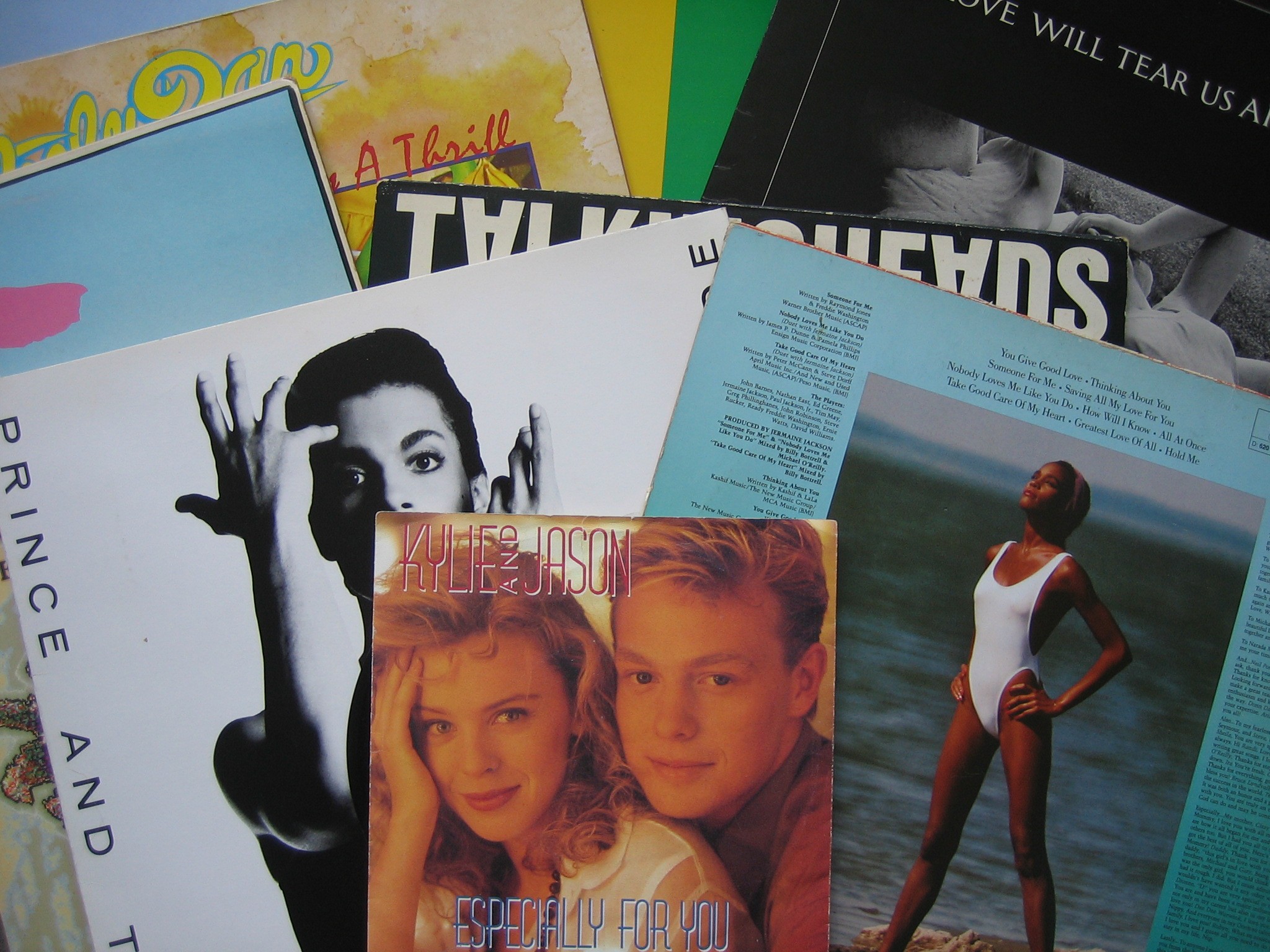
My eight favourite album covers
My eight favourite album covers, out of my own collection of vinyl. Or rather, seven albums, one single. It’s not my favourite music, but there is some overlapping. I did start out with ten covers, but wasn’t sure about a couple. So decided i didn’t want to use these and ended up with eight.
If you wanna see my music taste, you might go and see my MIX stuff on Spotify. I made a present for those playlists.
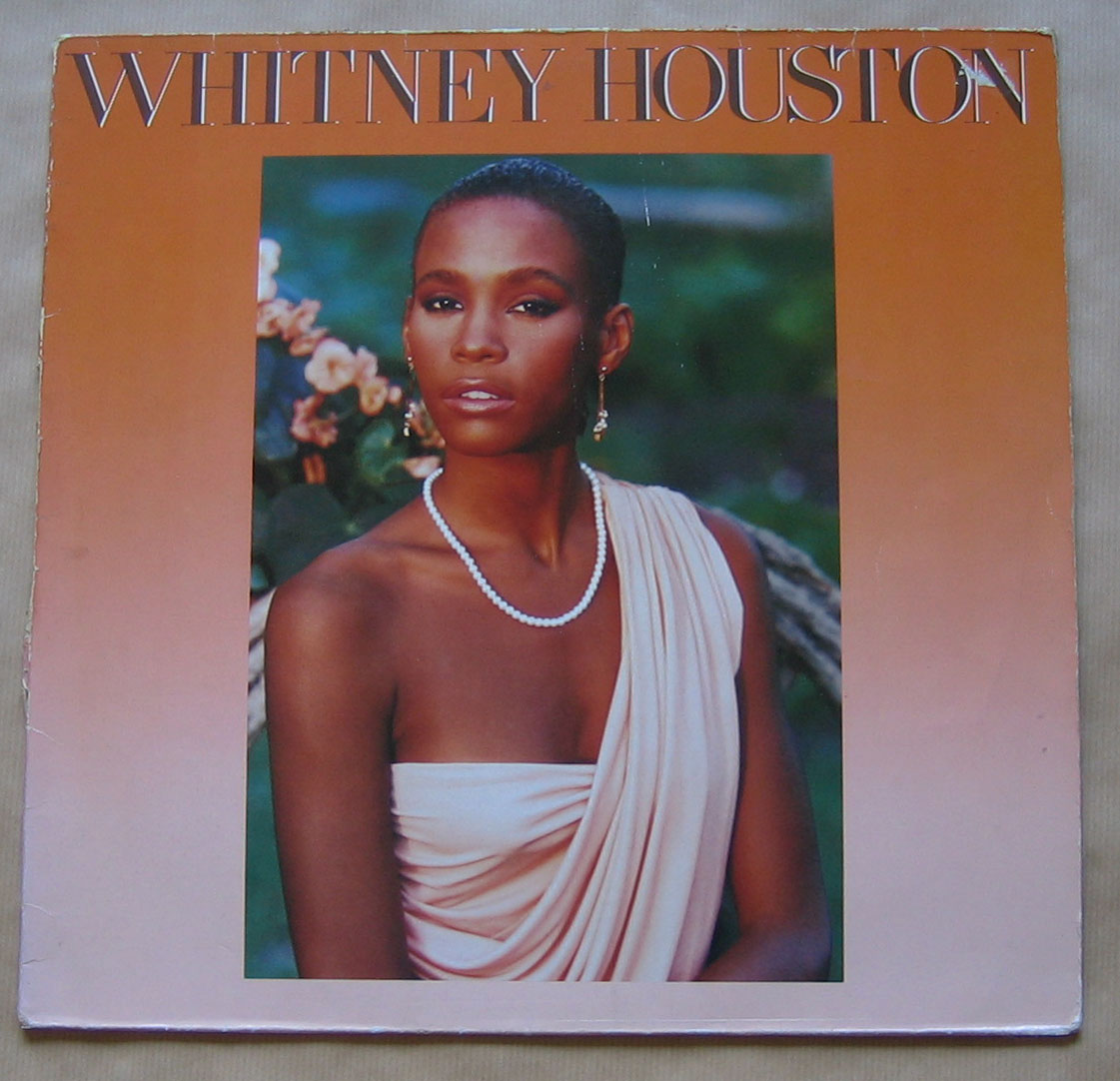
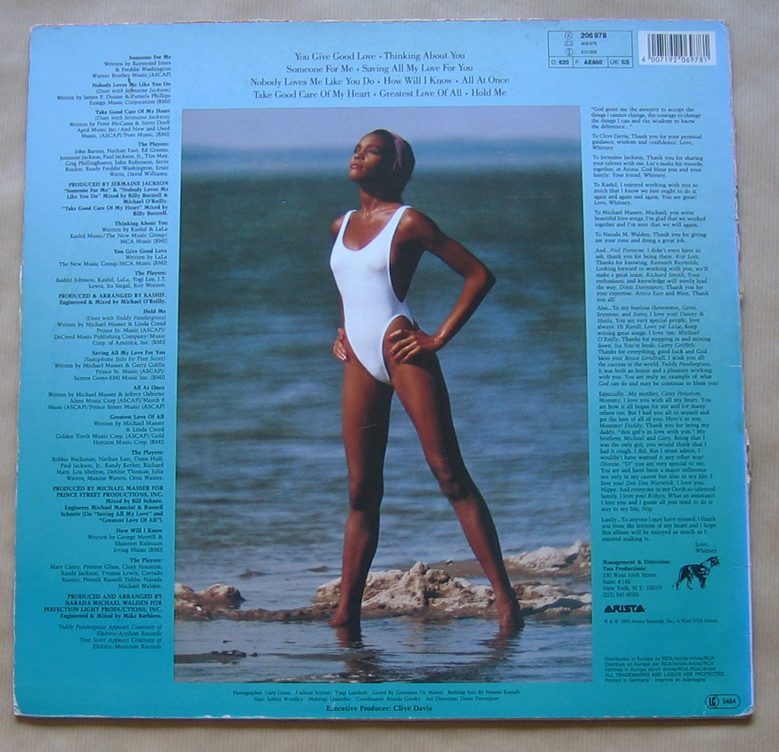
Whitney Houston – Whitney Houston
The title! The picture! The picture at the back! The orange! The blue! The gradients! The text!
Exclamation mark after exclamation mark. In this case very well suited. I hardly know where to start. It’s either terribly ugly or exquisitely beautiful. But, and you know this of course, else this cover wouldn’t be in the list, i move to the exquisitely beautiful. She is of course stunning. Young, healthy. A true princes.
It wasn’t gonna stay like this. Damn.
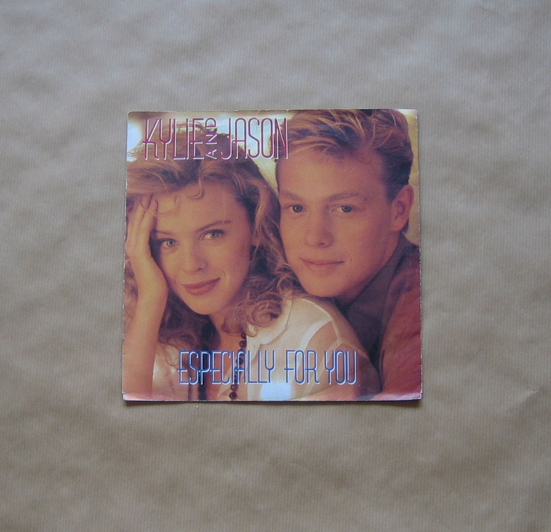
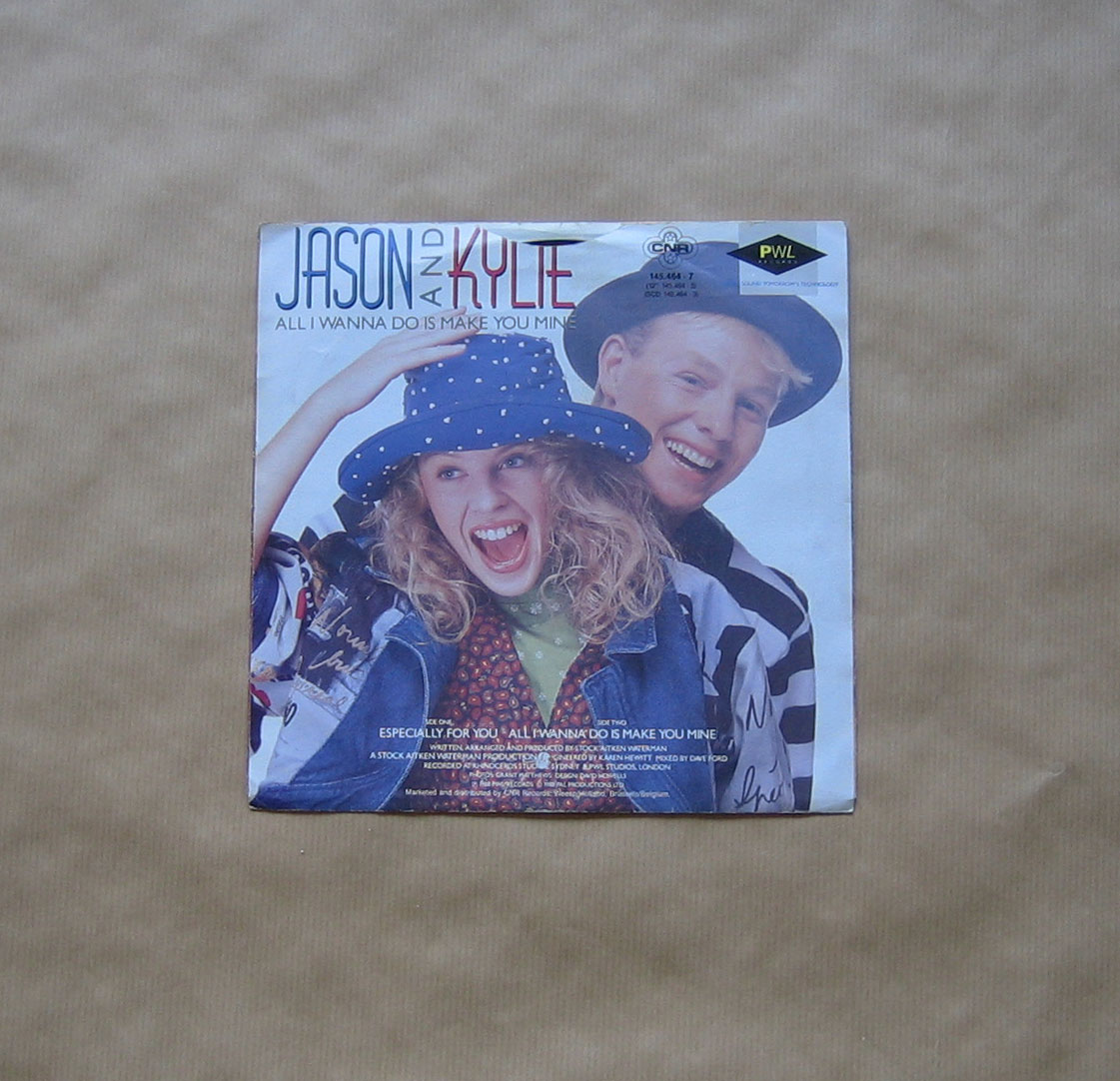
Kylie and Jason – Especially for you
I still love Kylie. But her earlier career is my favorite. This song, Especially for you, most of all. So yeah, in this case i fell for the song mostly. But, that picture on the front, these two people smiling softly, looking into the camera and looking so peaceful and happy. Her hand shielding her from whatever danger might be coming upon them from the left. The warm shadow they are in, with only a small flare of direct sunshine on her t-shirt. Lovely.
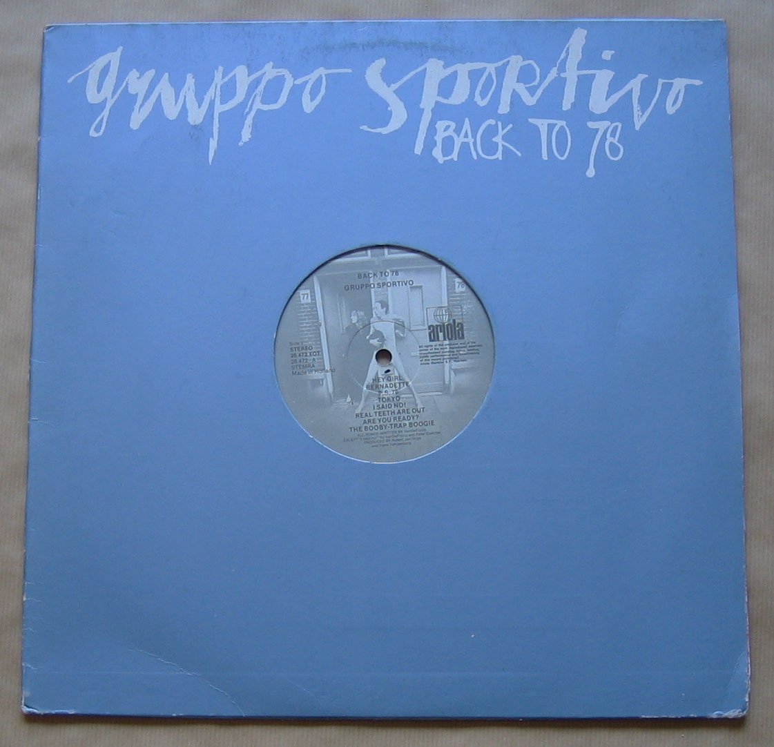

Gruppo Sportivo – Back to 78
I bought this album when i was 14 years old. It’s the one with a 3D element in it in the whole collection. But it only shows when you put it on a turntable. The idea of only putting the name of the band and the title on the cover, and have a circle where you can see the image on the record is great!
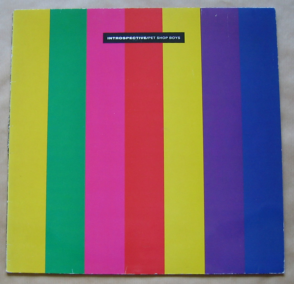
Pet Shop Boys – Introspective
This is a definite top three candidate. I love the stripes. The yellow, green, magenta, red, yellow, purple, blue. It seems other cd editions use different colours, an idea which i do like. The text in a small size white on black. The black back with white text at the bottom makes a great finish. I do admire the packaging of the Pet Shop Boys on the whole.
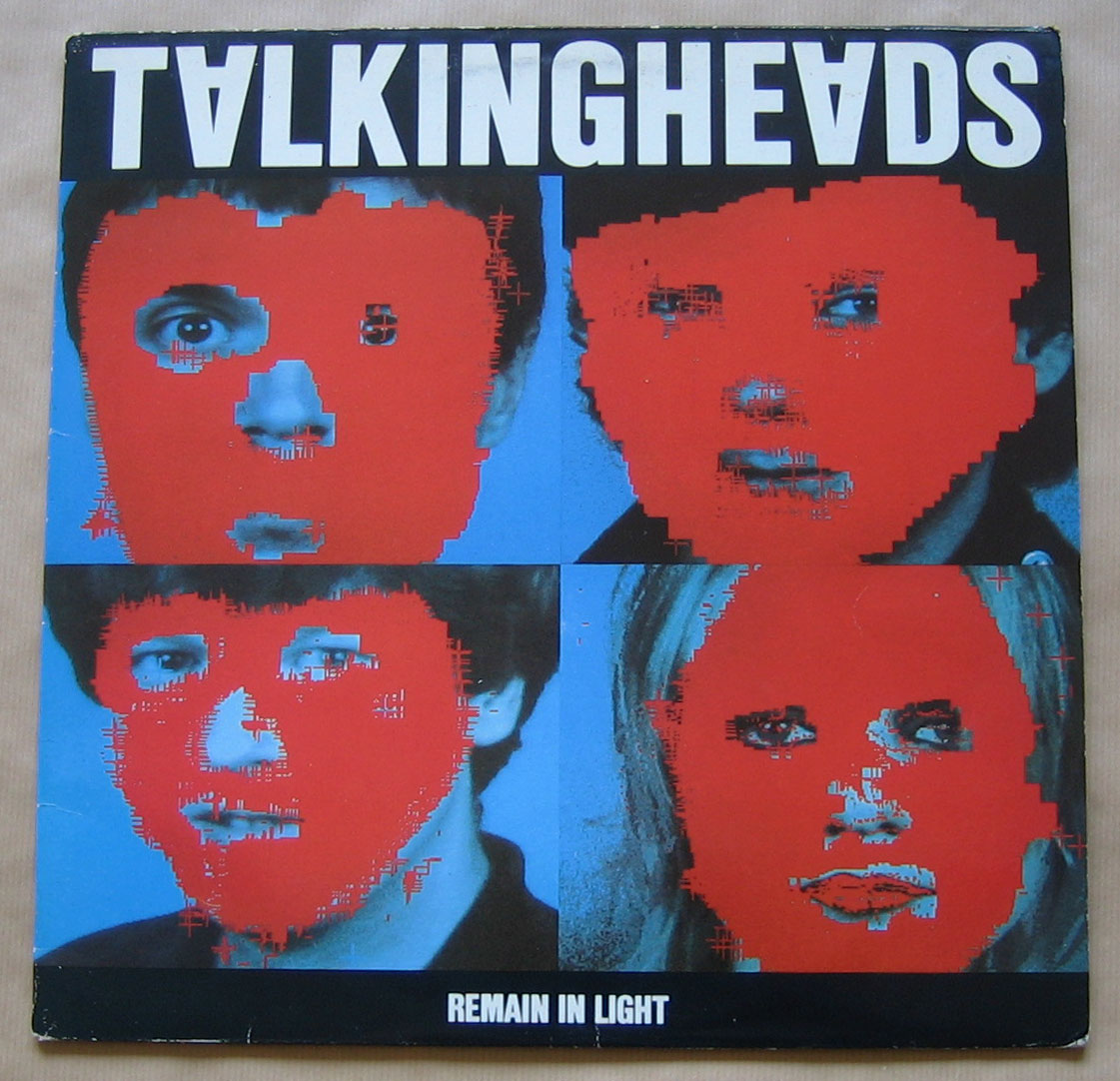
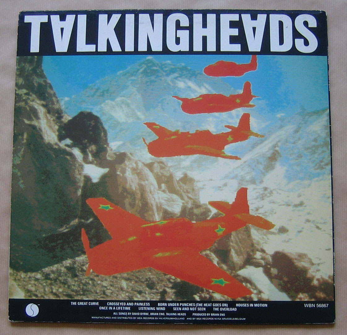
Talking Heads – Remain in light
I bought this album in 1981. I loved it. I do remember a week my parents were on holiday, in which i listened to this album continuously. Even while i was doing the dishes in the kitchen. On the wikipedia page for this album there is a part about the packaging.
I love the front, with the four faces and the red blotting on them. The one thing i don’t like is the red lips on Tina Weymouth’s mouth. It could be the make up of course, it’s hard to tell. David Byrne’s eye looks really strange too, the one on the right.
I do like the rotated A’s in the name of the band.
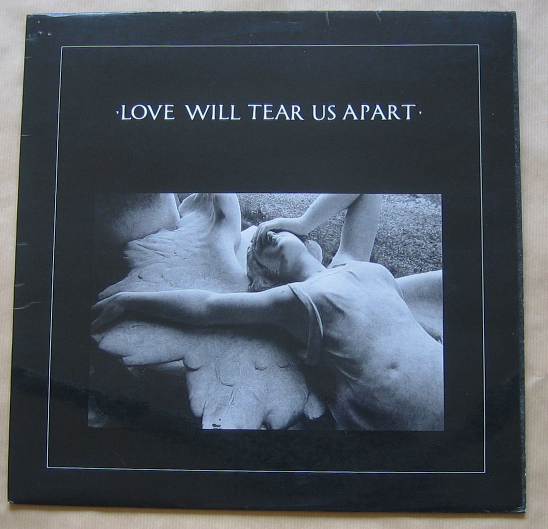

Joy Division – Love will tear us apart
Only the title of the song on the front. And the name of the band on the back. And, on the back, the following line: Fac XXIII-XII A Factory Records product. It’s a very stark sleeve.
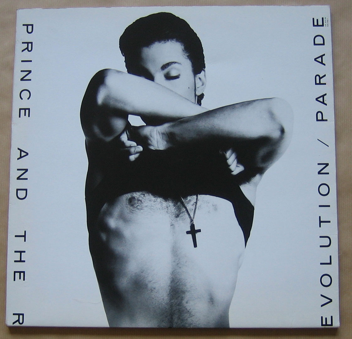
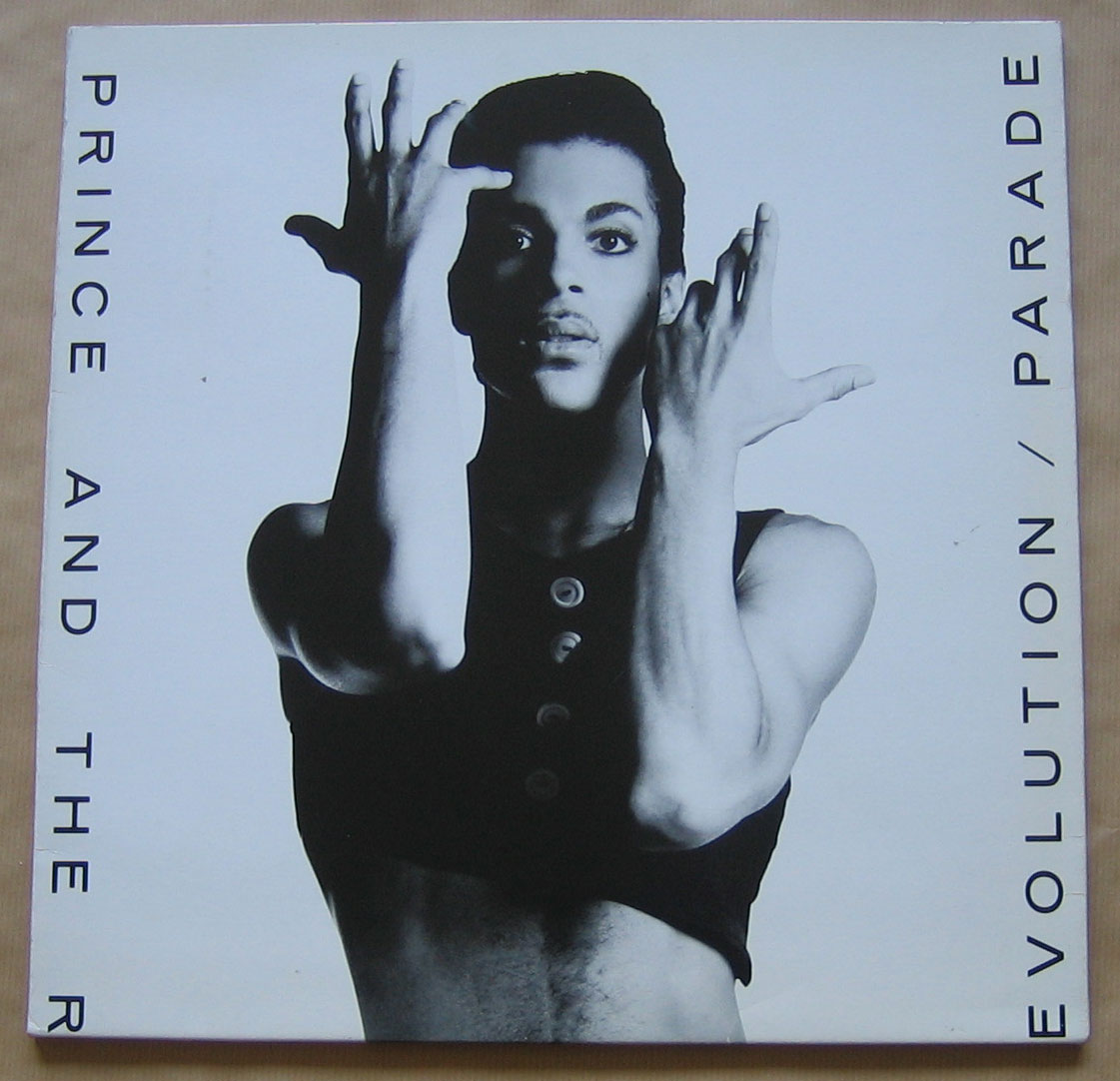
Prince – Parade
I actually choose this Prince cover because on its side, the belly button, my eyes usually falls on when i look at my albums. It’s the one image in the whole collection which is visible on the side. That’s good enough for me.
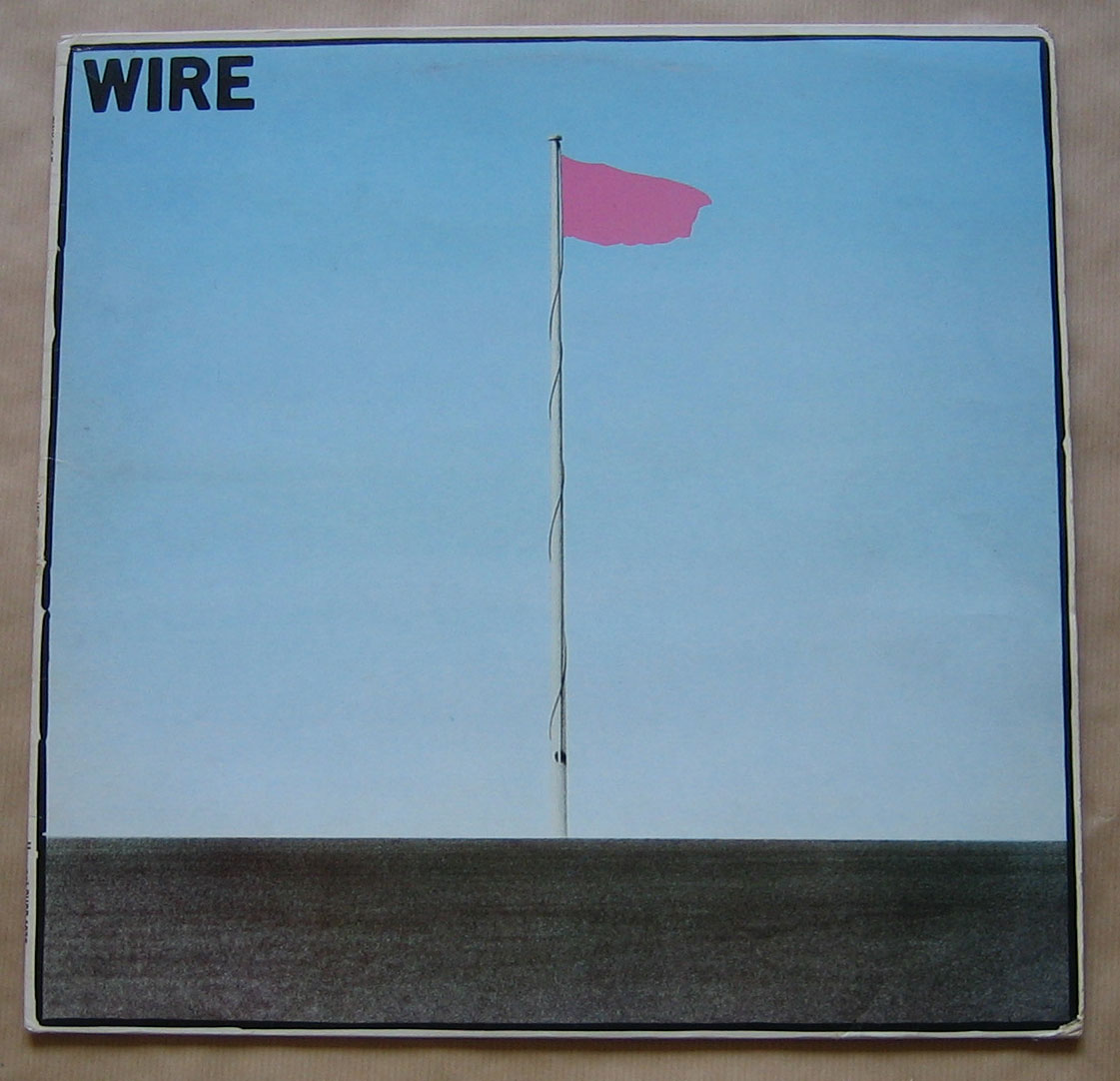
Wire – Pink Flag
Brilliant.