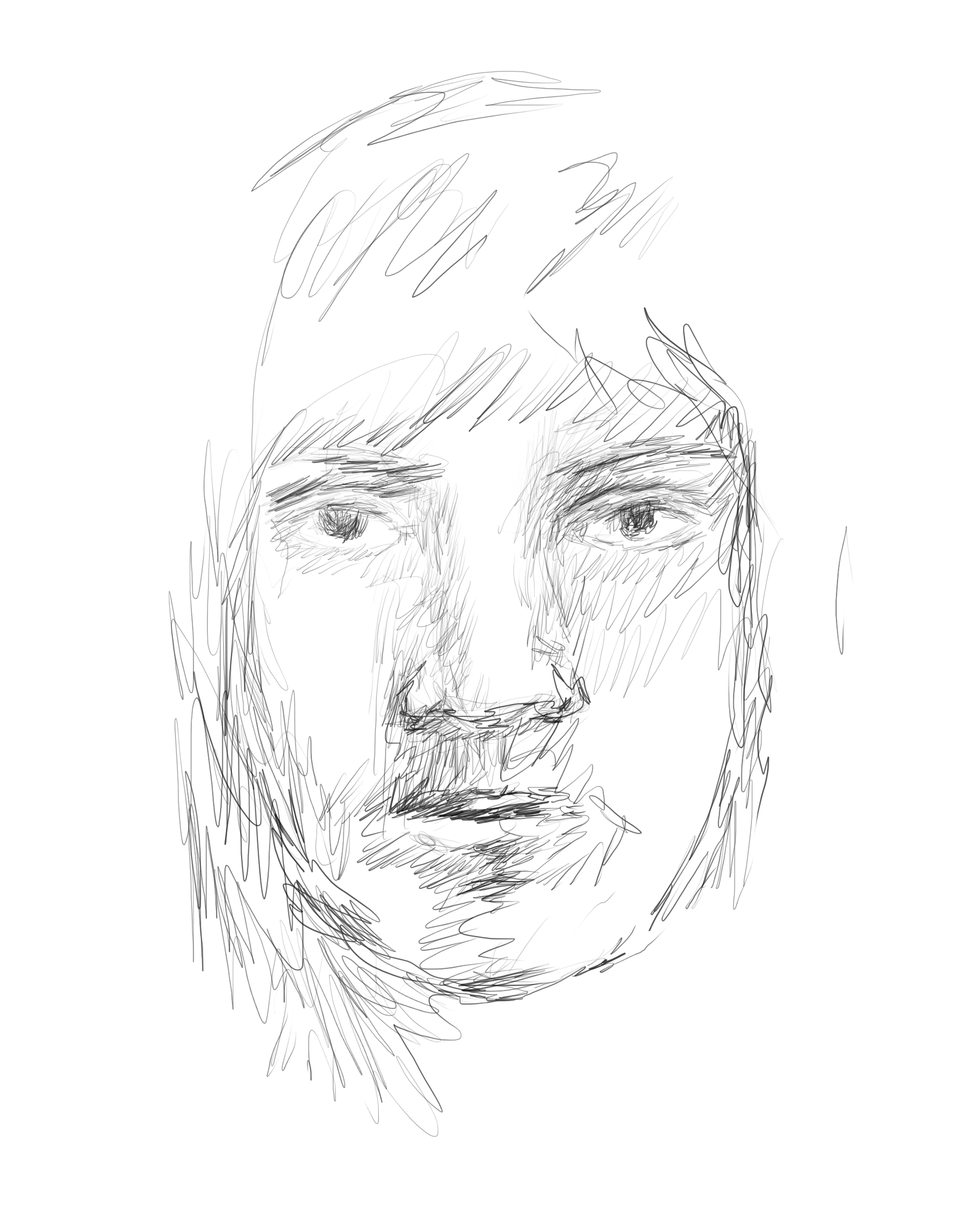
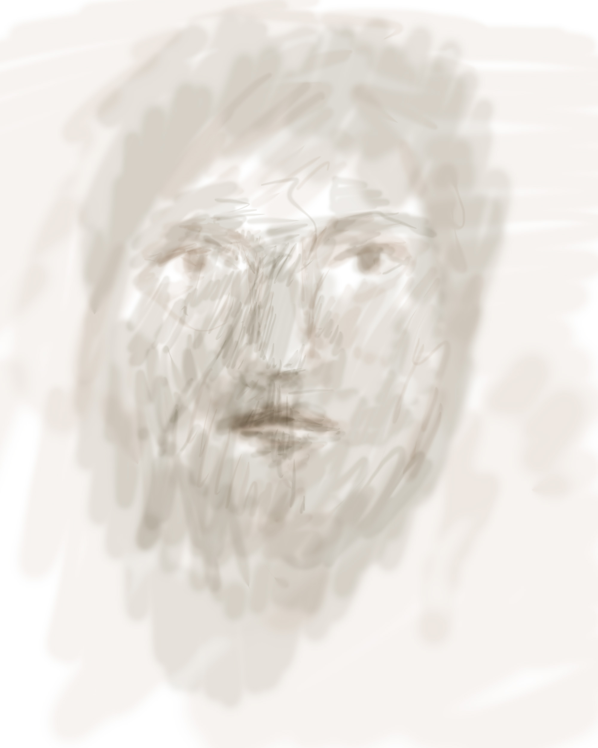
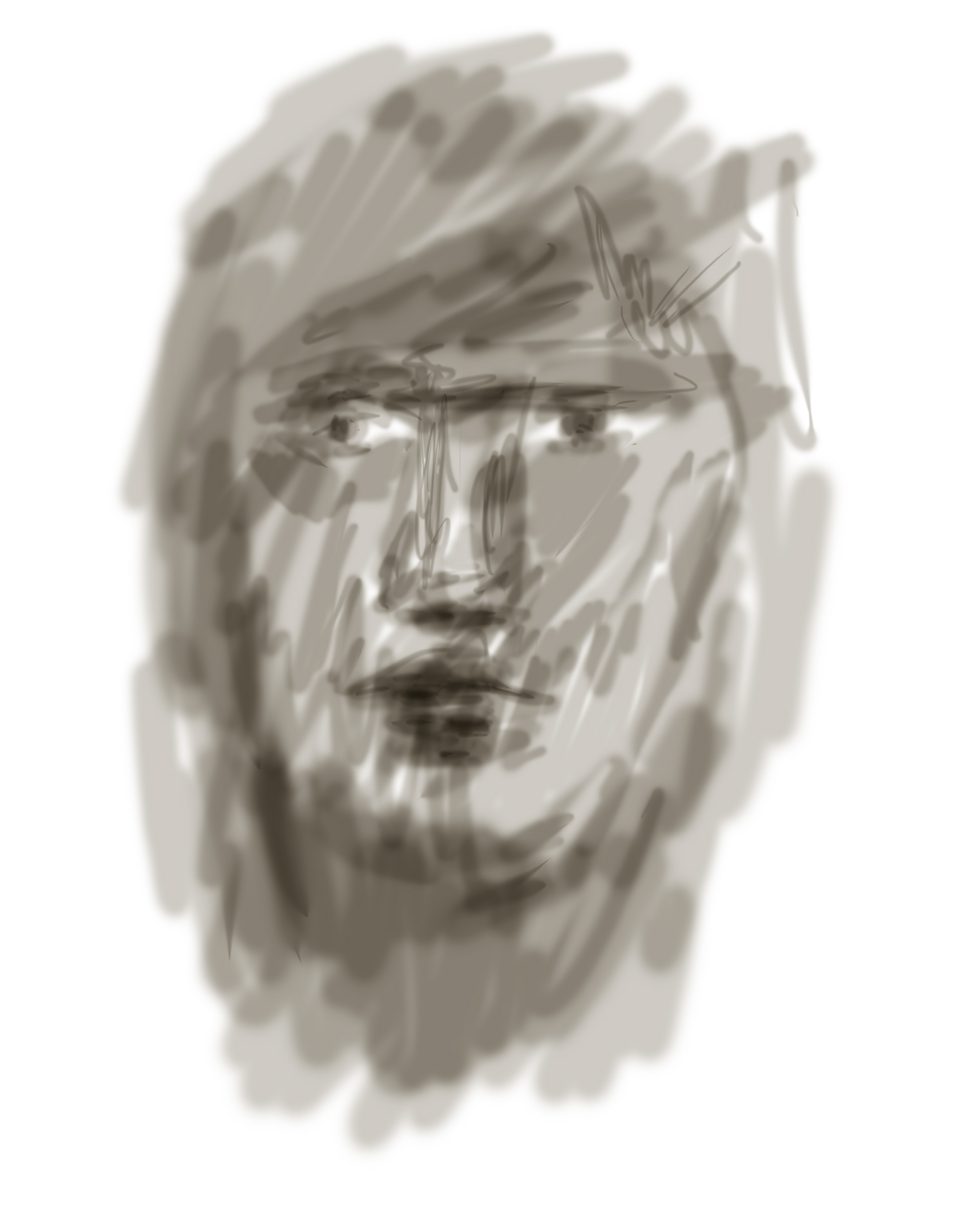
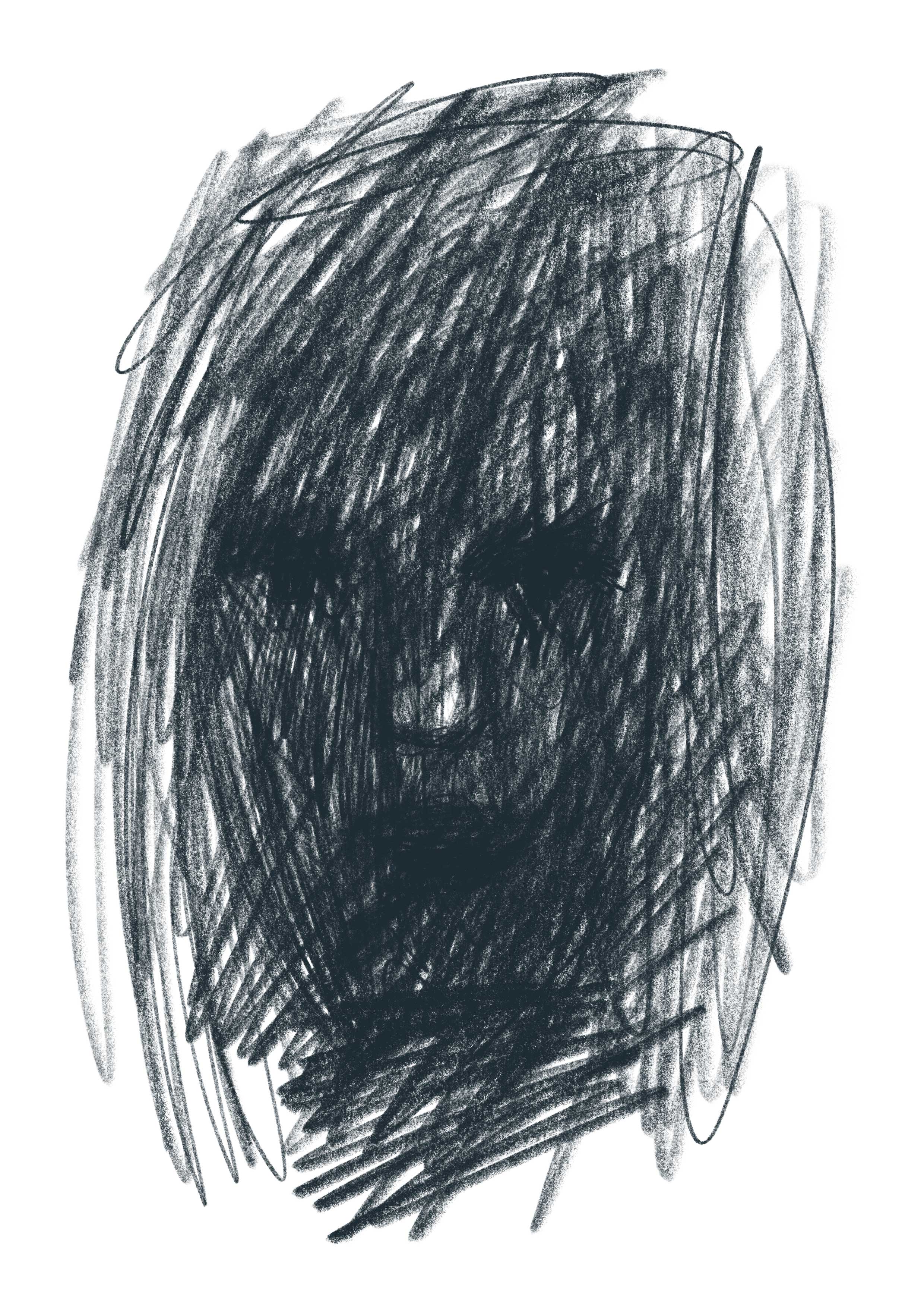
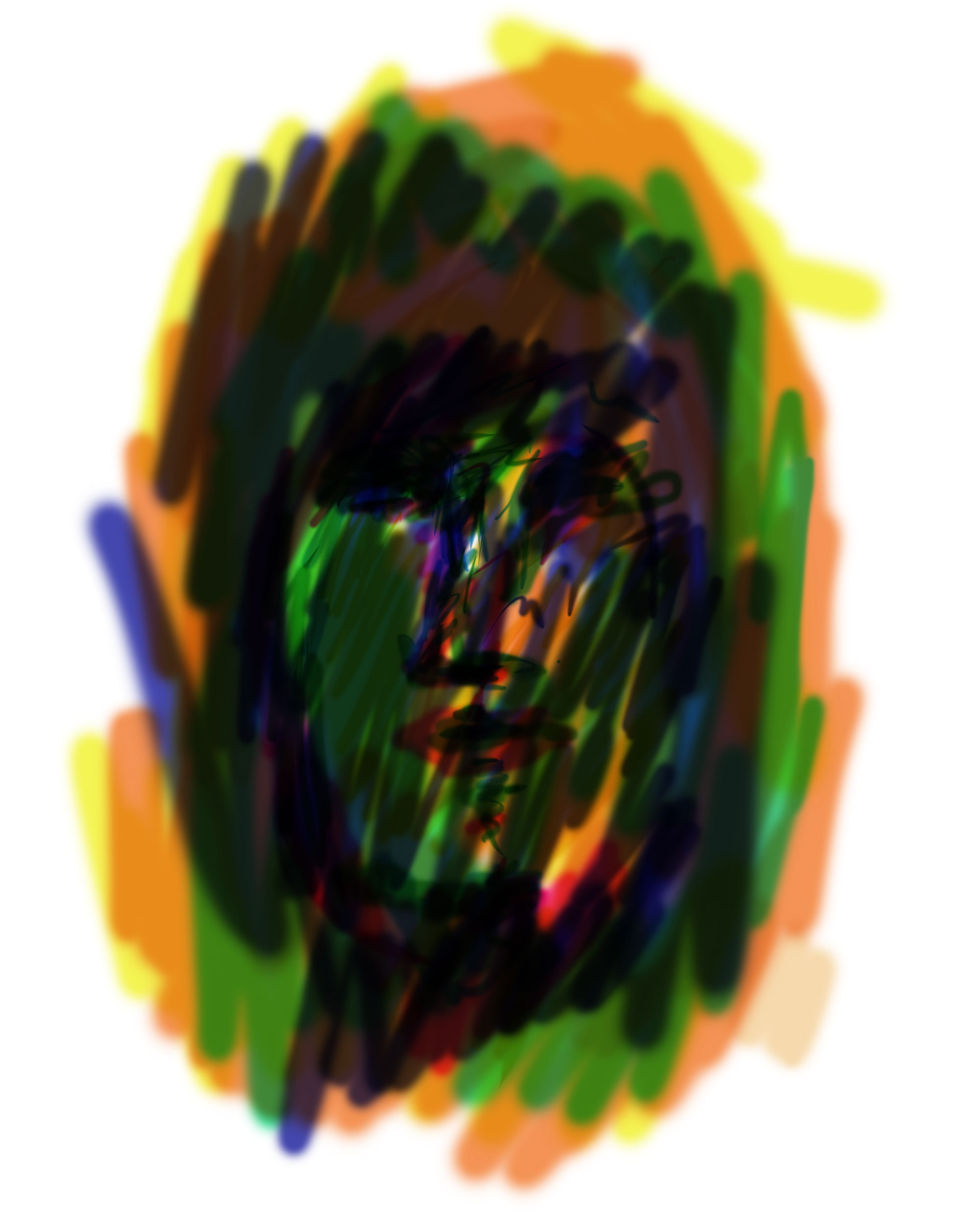
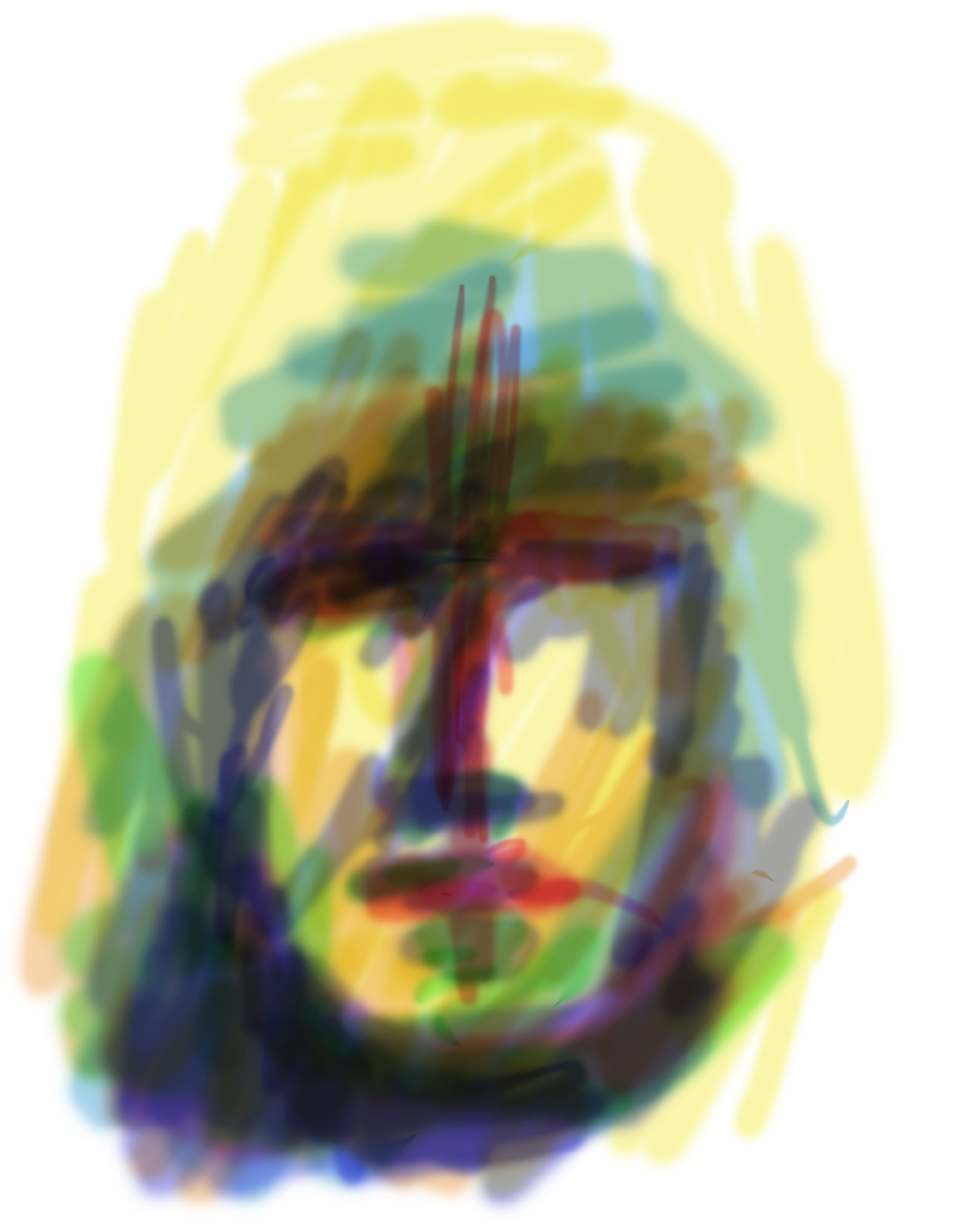
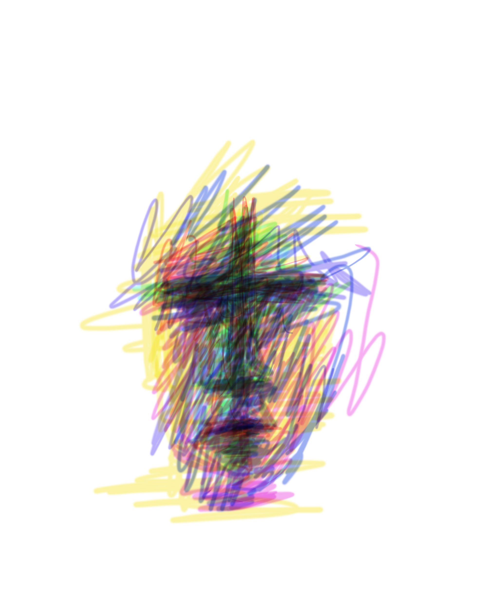
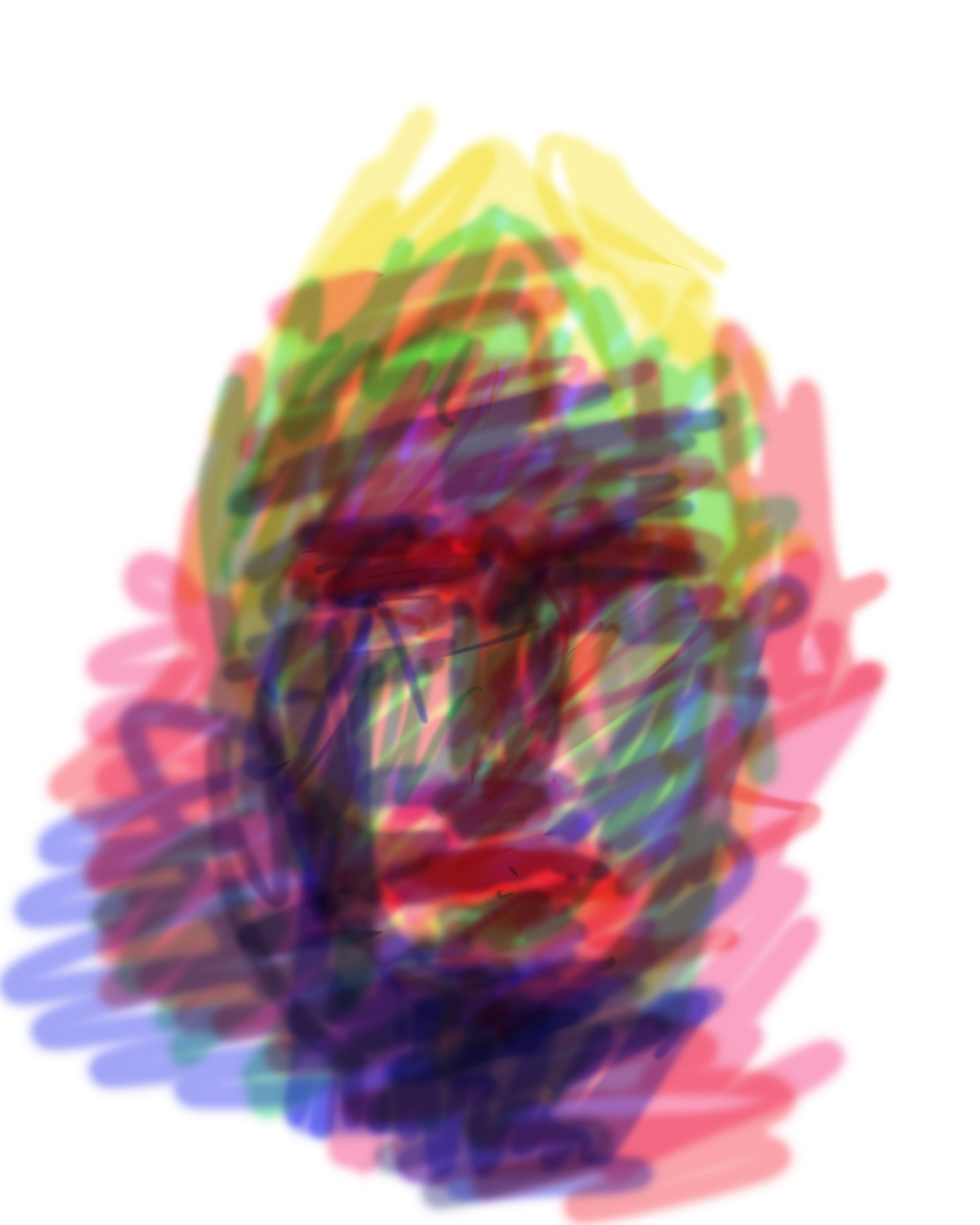
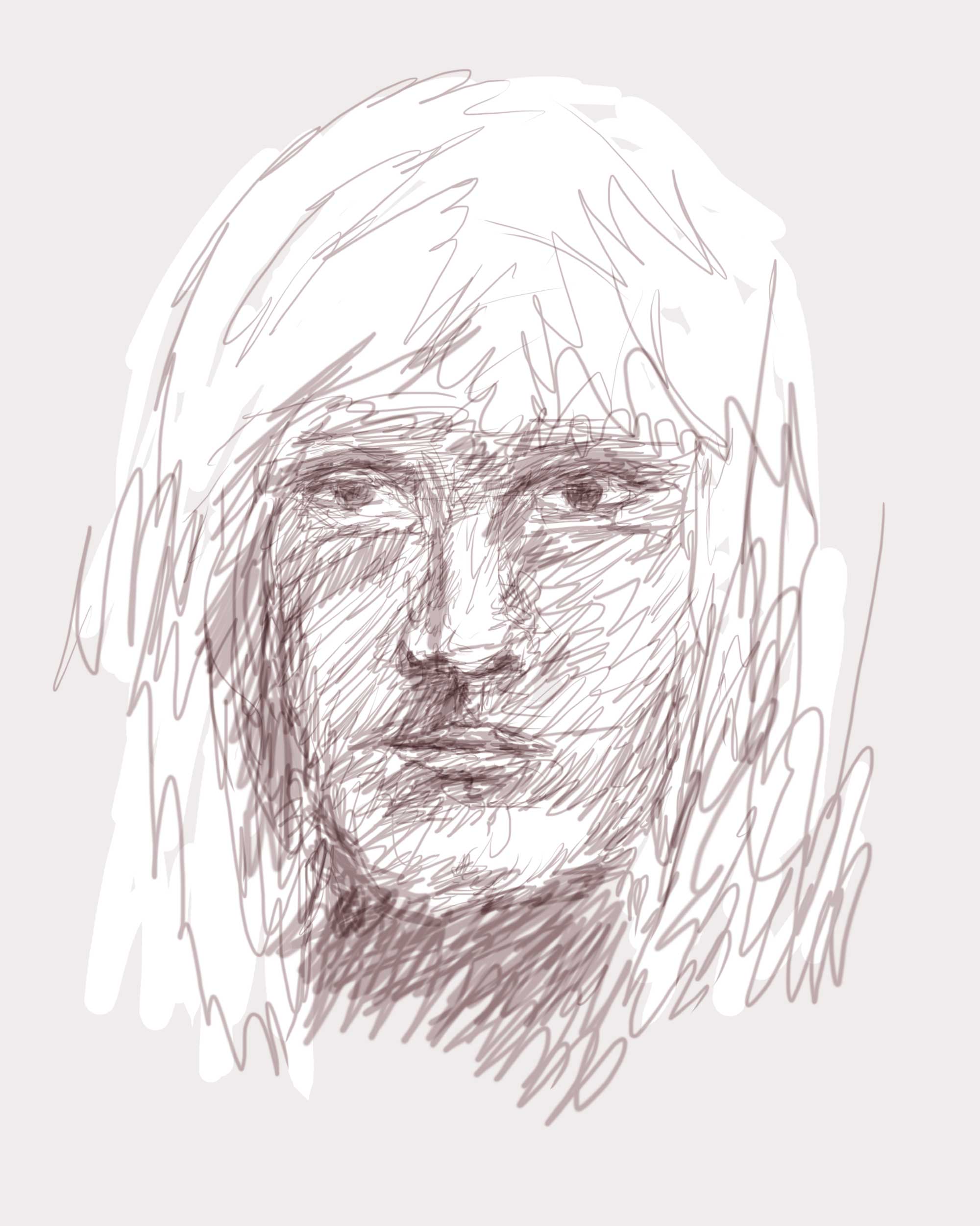
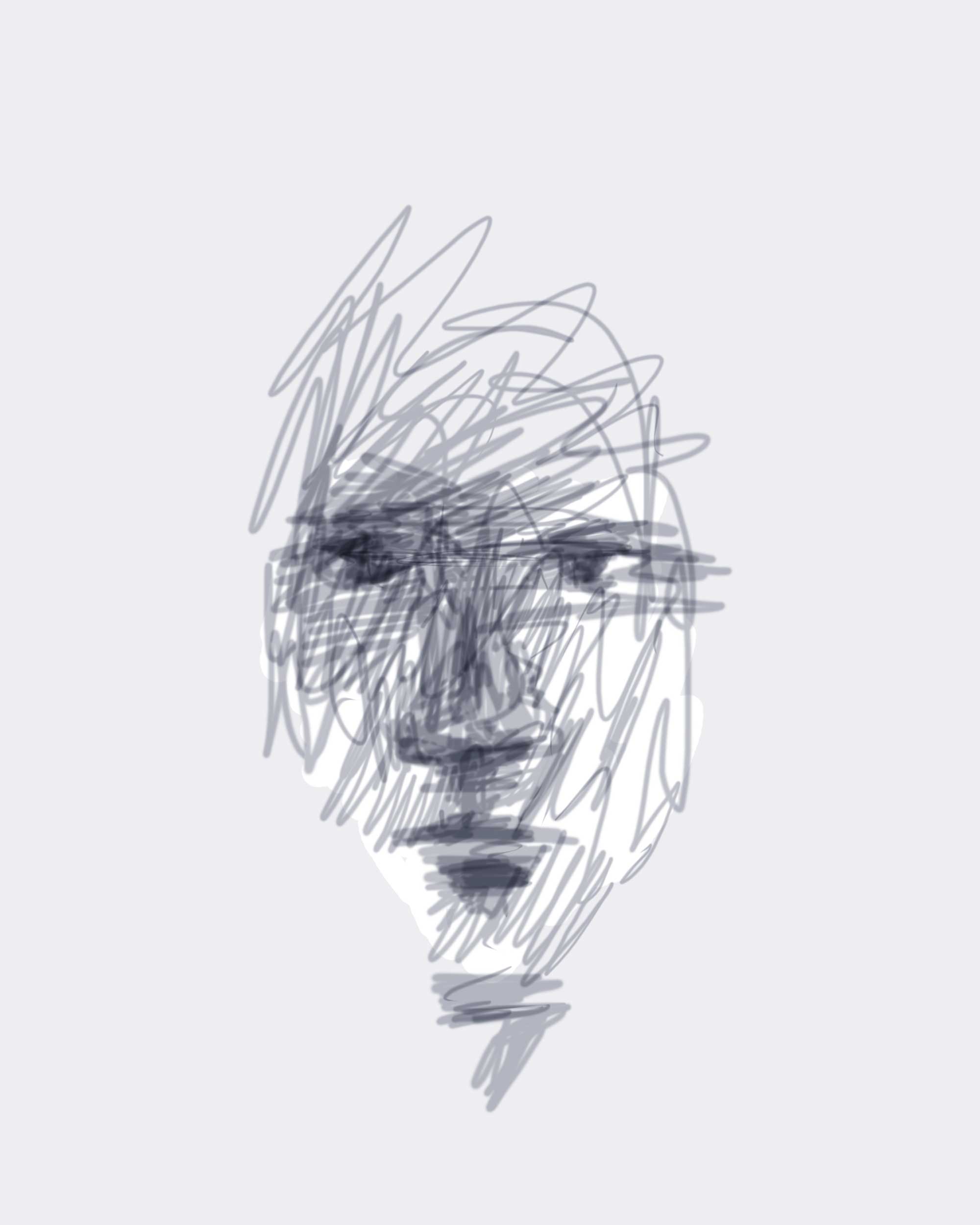
My first drawings on the iPad
Published on February 1, 2018 at 6:00 by Ellen
Categorised in: Drawing and watercolour
Leave your thoughts
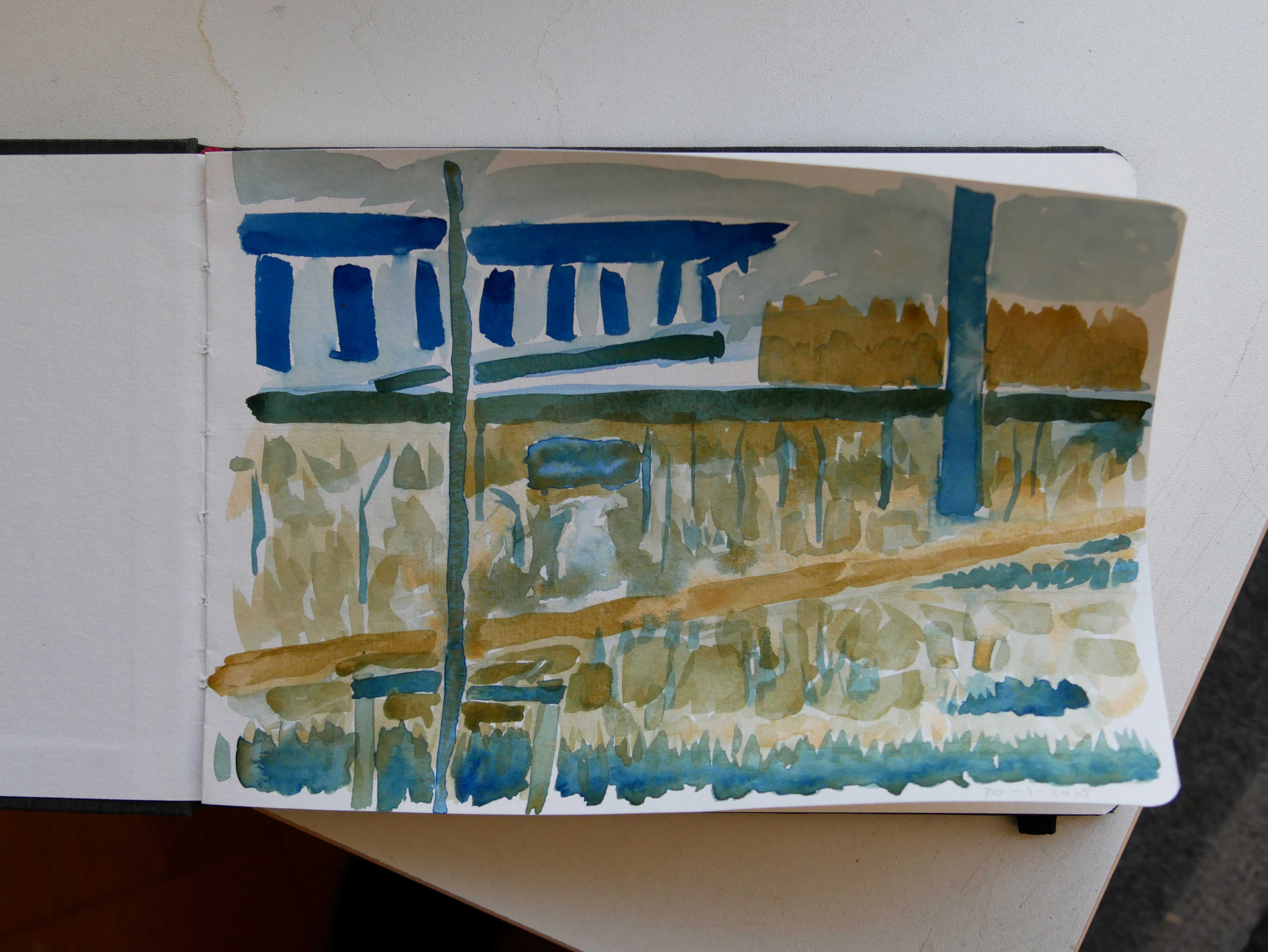
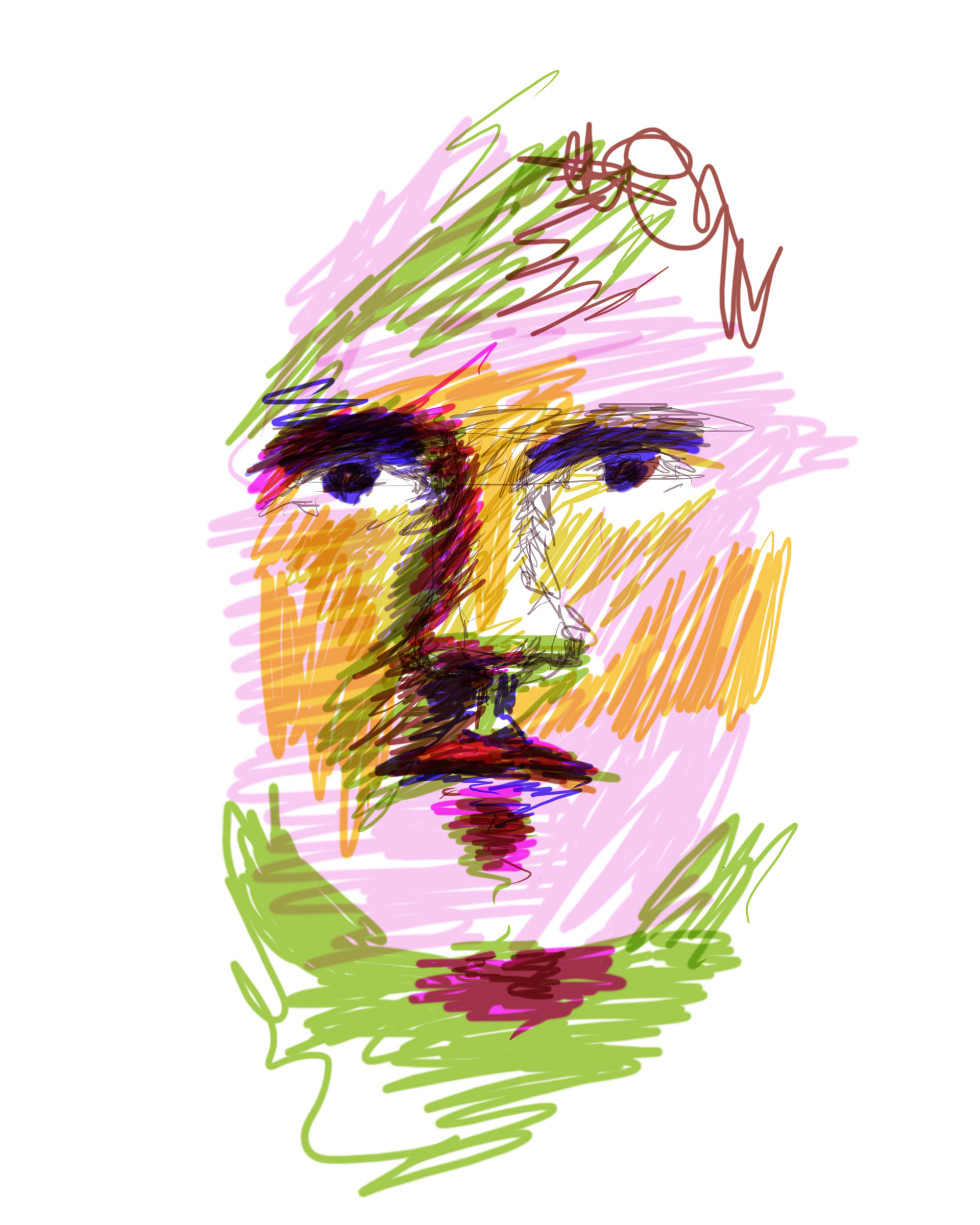
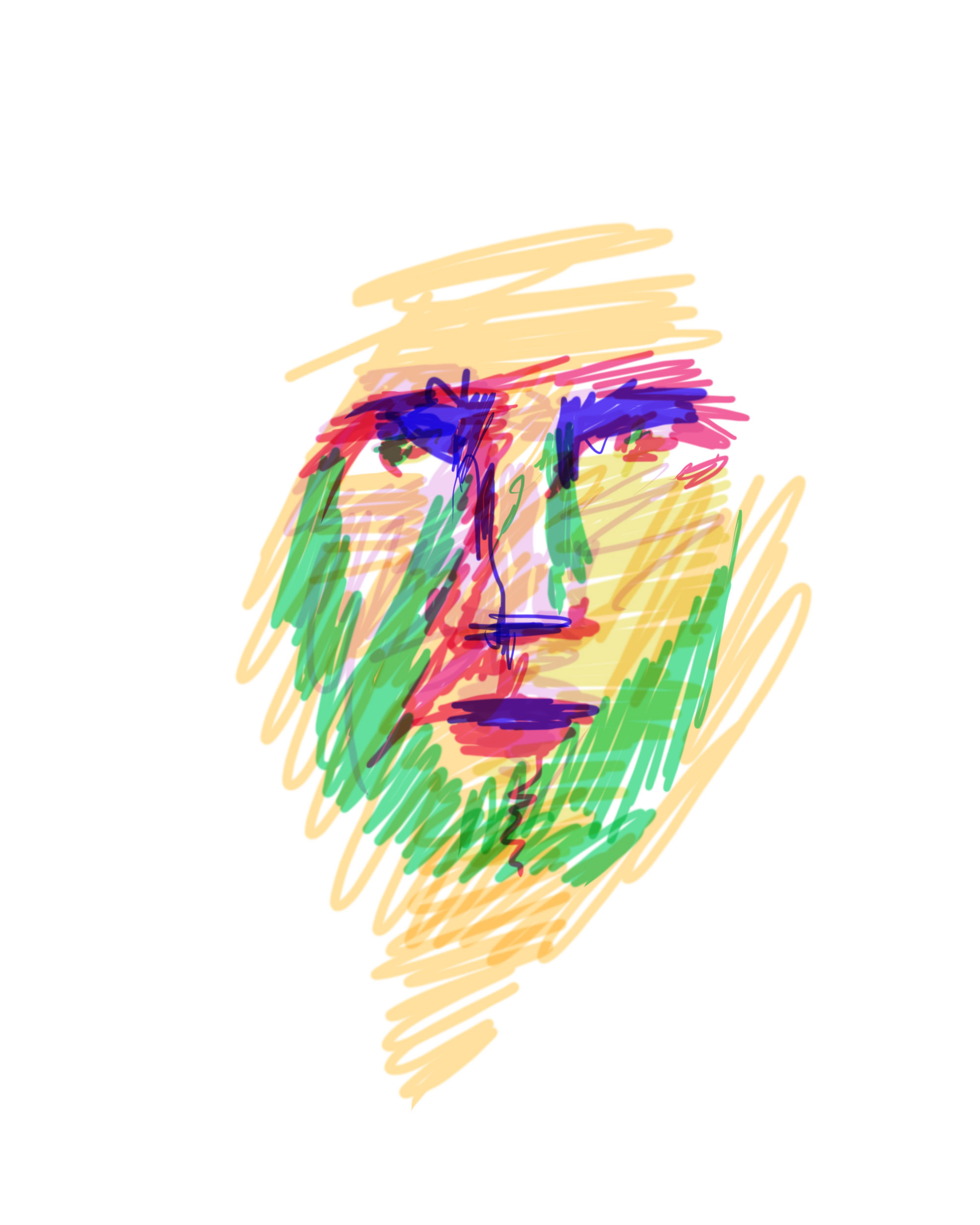
I had to think about it. I was a bit hesitant. But i did it. I took my new watercolour paints to the garden and made a watercolour painting. I had thought about it before. I knew i was going to use only two colours. Prussian blue and yellow ochre. I like limitations. I need to get to know the different paints.
The result is a sketch. A learning tool. But also a report of this hour sitting at the table and watching the area i had chosen to paint. The end result is nowhere near what i saw. Of course.
After i stopped painting i did do some work in the garden. I joined the others. A good day.
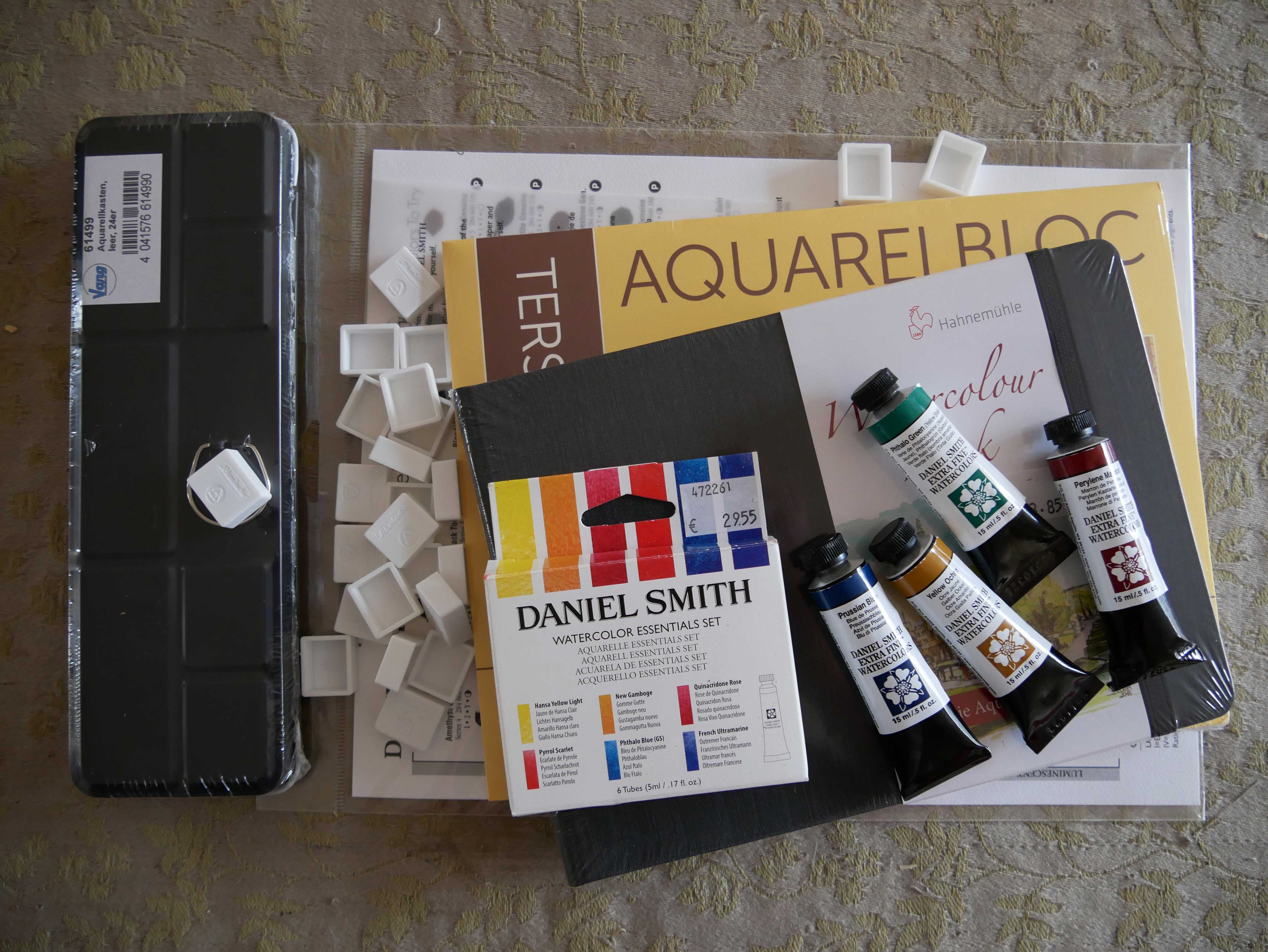
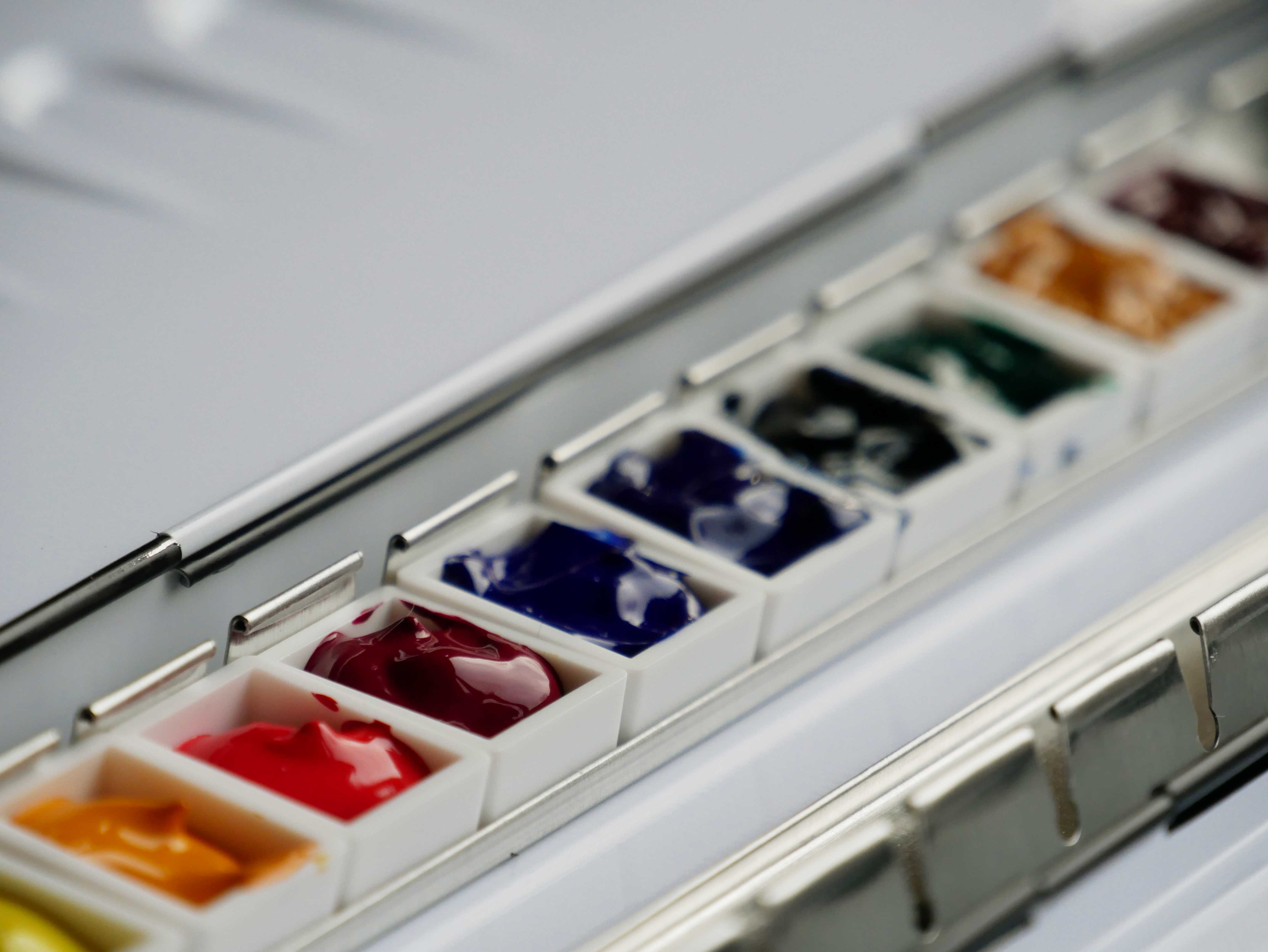
Today i bought watercolour paints, two watercolour paper books, a watercolour pan holder and empty pans.
I decided to buy Daniel Smith watercolour paint. I don’t remember seeing this brand in the early days in the 80s when i used to watercolour. I have seen many youtube clips about watercolour paints, sets and tips and how-to’s. Daniel Smith does come recommended by many different sources. Good professional watercolours.
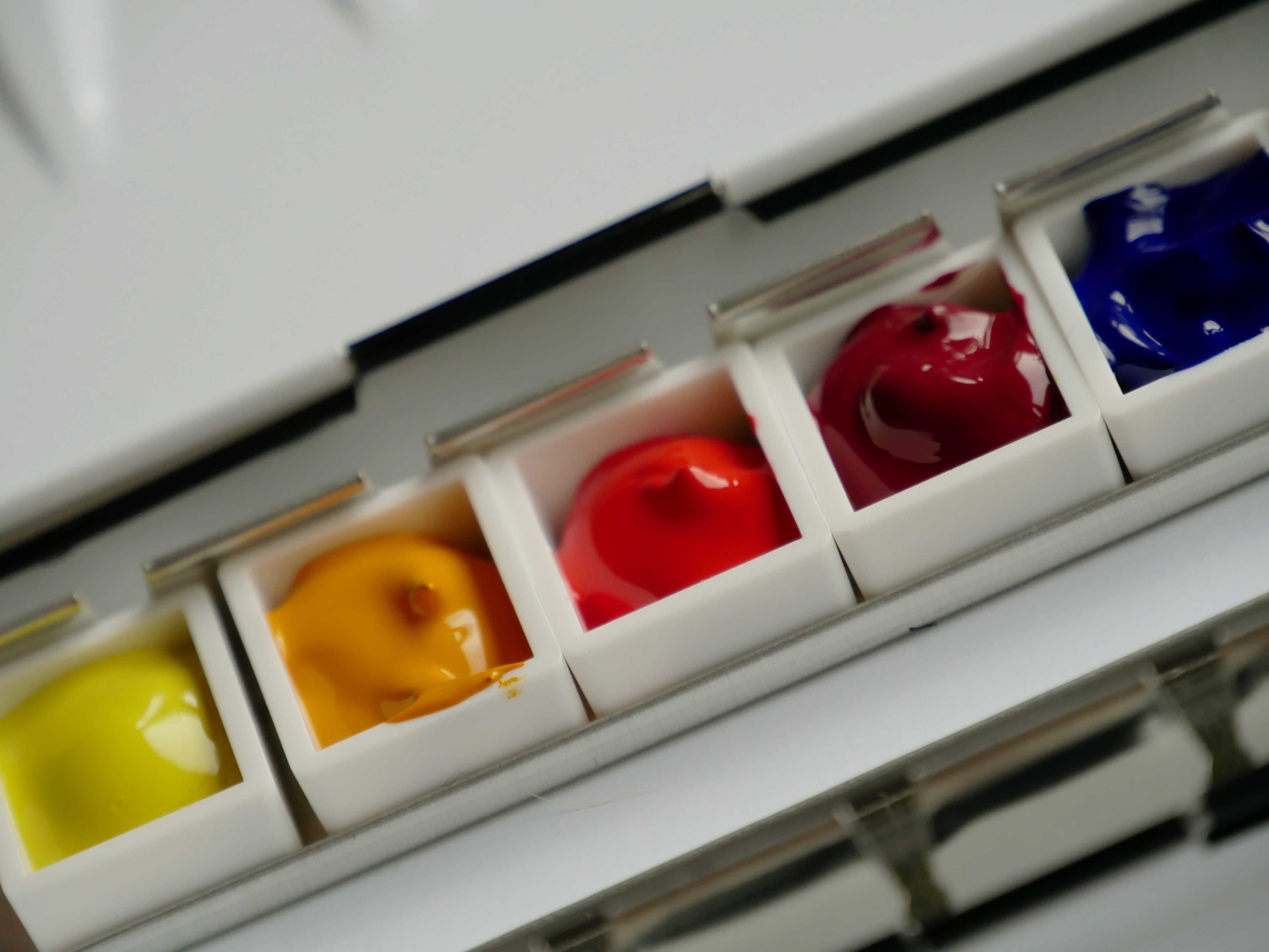
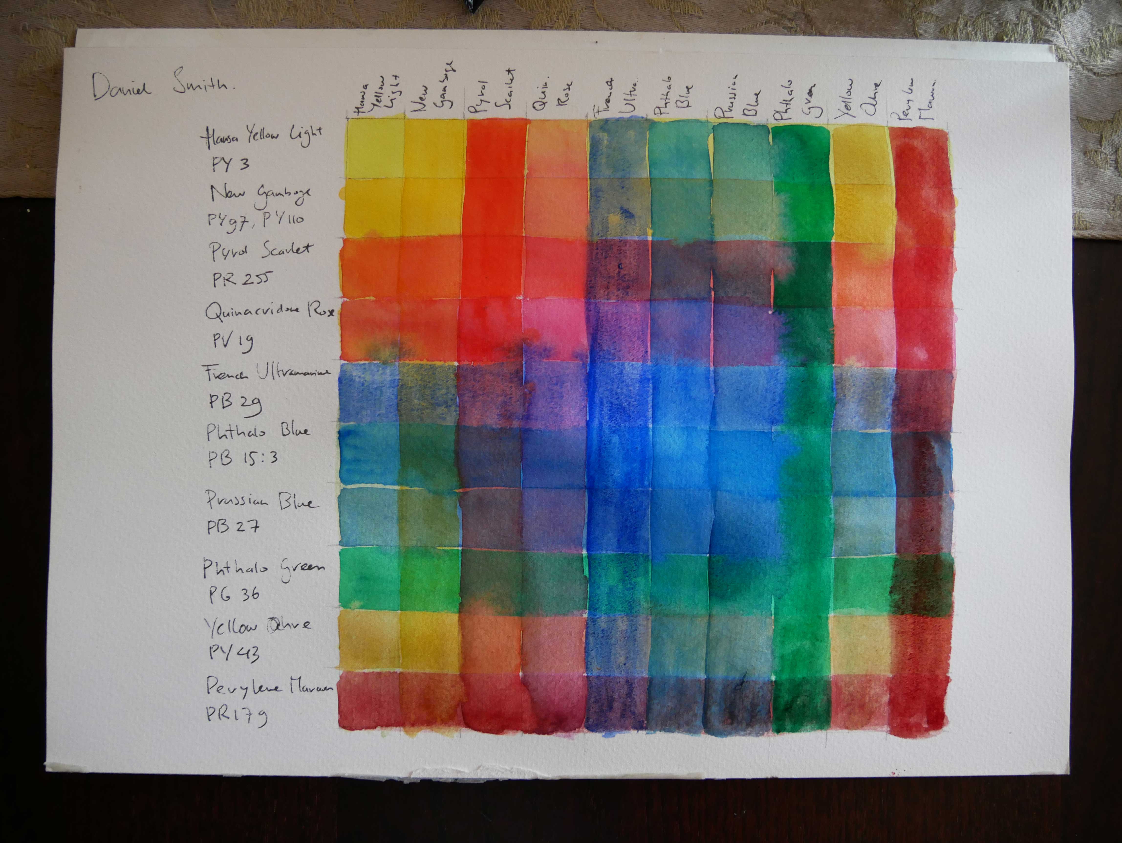
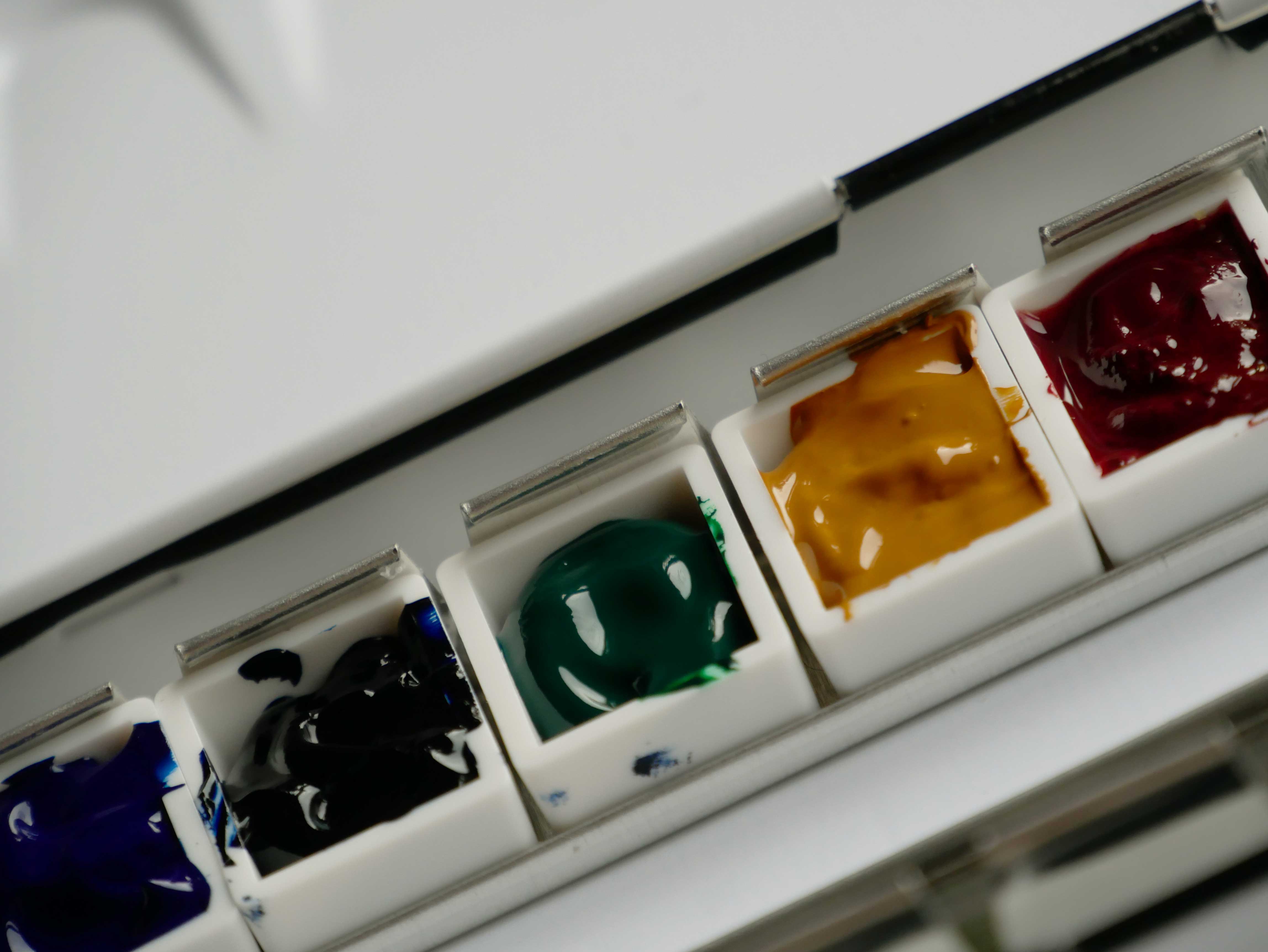
I bought the essential kit with six colours. Most of these i wanted to buy anyway. From three primary colours a warm and a cool colour. I also bought four other colours, in fifteen ml. Prussian Blue, Phthalo Green, Yellow Ochre and Perylene Maroon. Simply because with four colours i would get a Daniel Smith dot card for free. Ten colours to start with. No neutrals. With the extra green and ochre and maroon i can make darker colours. I did want to get Burnt Sienna, but that was out of stock. I will get more colours, but for now these are enough.
Only the New Gamboge is a two pigment colour. All the other colours are single pigments.
The best site i found is handprint.com. There is a huge section about watercolour paints, pigments, brushes and paper. I will need to read all the writings on this website again, there is so much to take in. There are also other parts of this website. Even a Wittgenstein part.
Recommended colours for a basic palette are the following:
Prussian blue is my favourite of the old days. It is also a good dark colour. There are several ways to make black with this palette, a green – red one and a blue – yellow one. Warm colours with the yellow ochre and perylene maroon works good too.
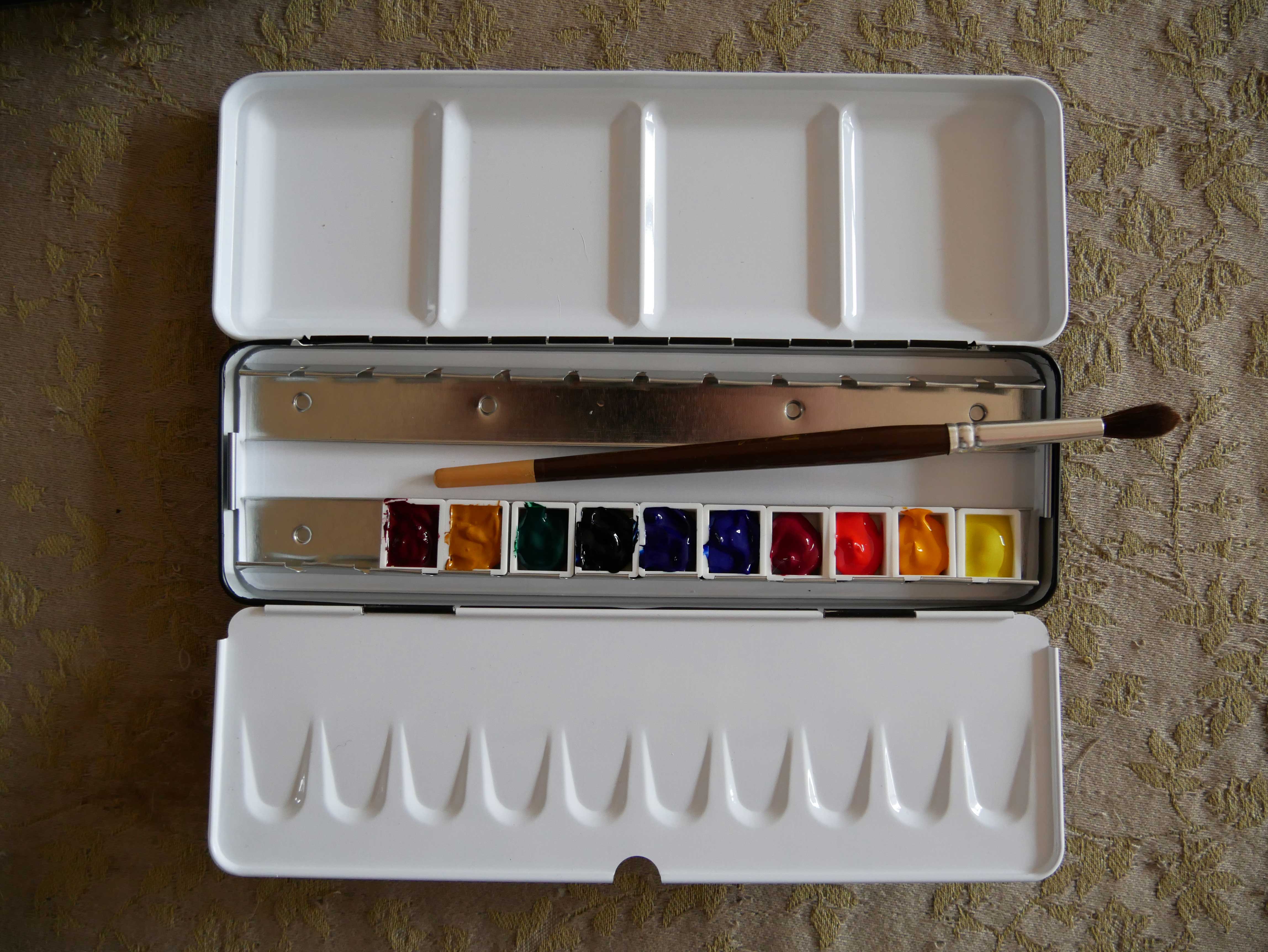
I bought a Schmincke watercolour tin. I might blend some colours eventually and put them in a separate pan. For now i don’t do that, i need time to get used to painting again.
I bought one sketchbook to take out with me. Another small block for other paintings.
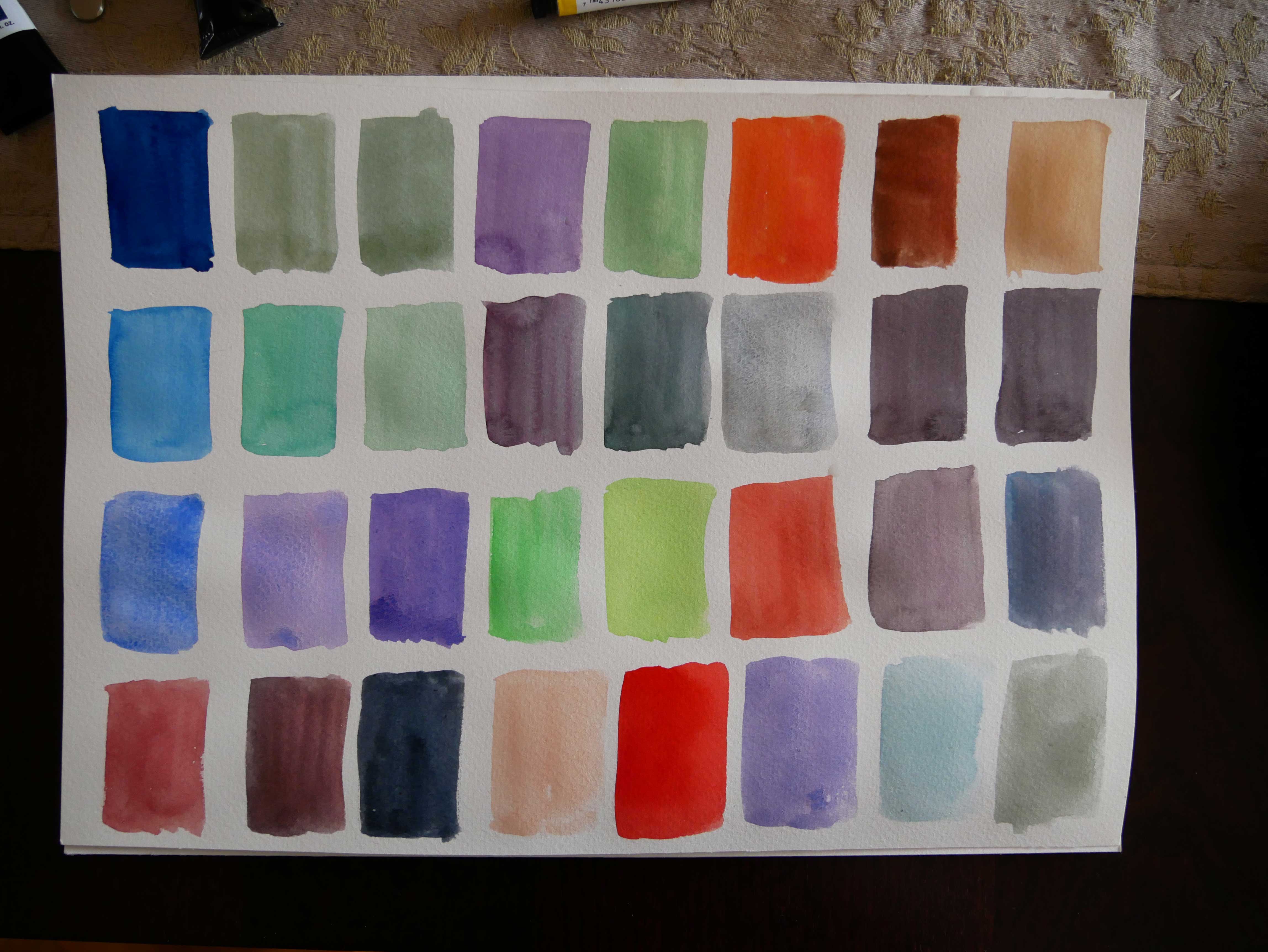
For the mixing i did today i used an old watercolour block i still had. I made one with glazes. Another paper with several mixes. I will make more of these. A colour wheel. Larger mixes of all the different colours. Neutral mixes.
And of course sketches and drawings in the garden. The main reason i bought this. Yay!


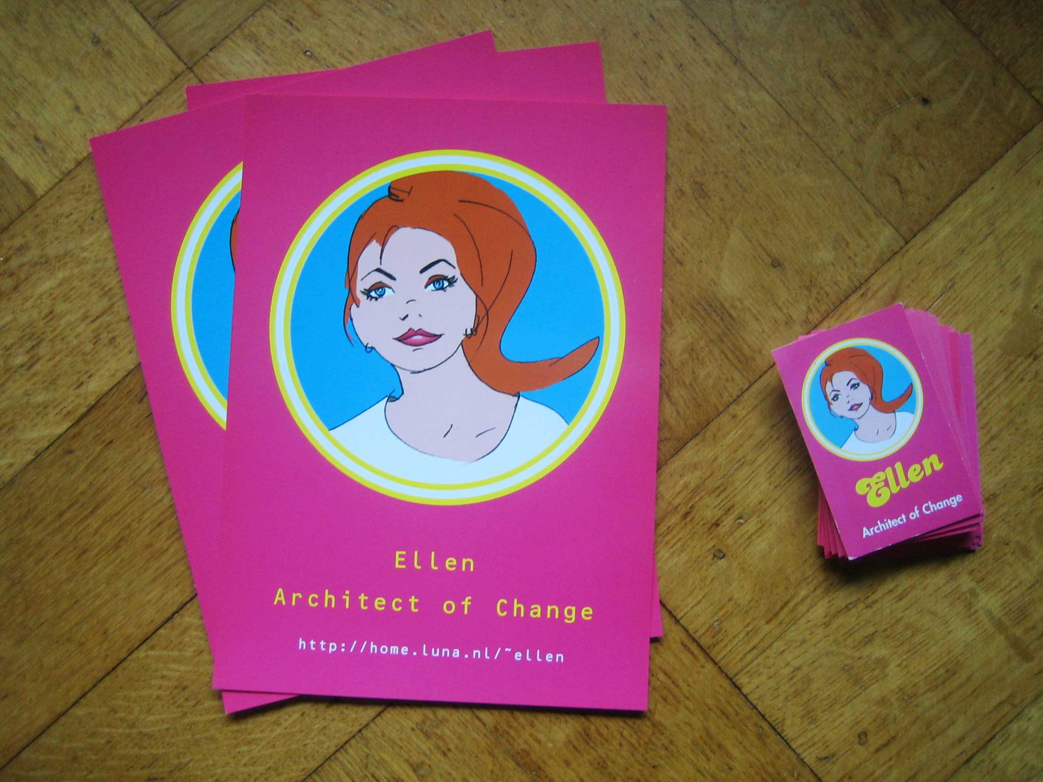
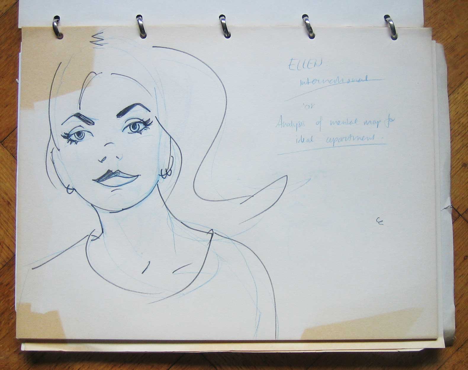
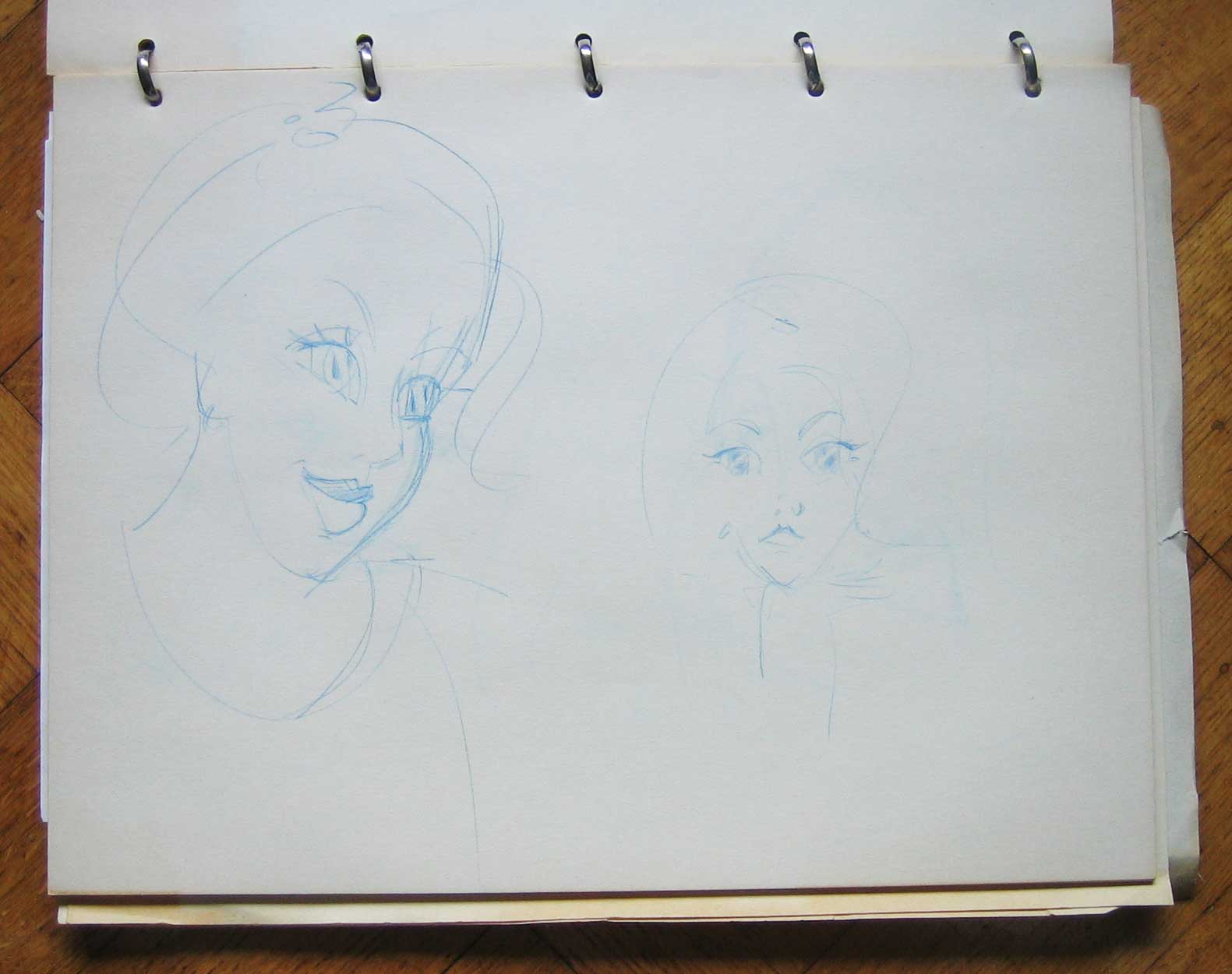
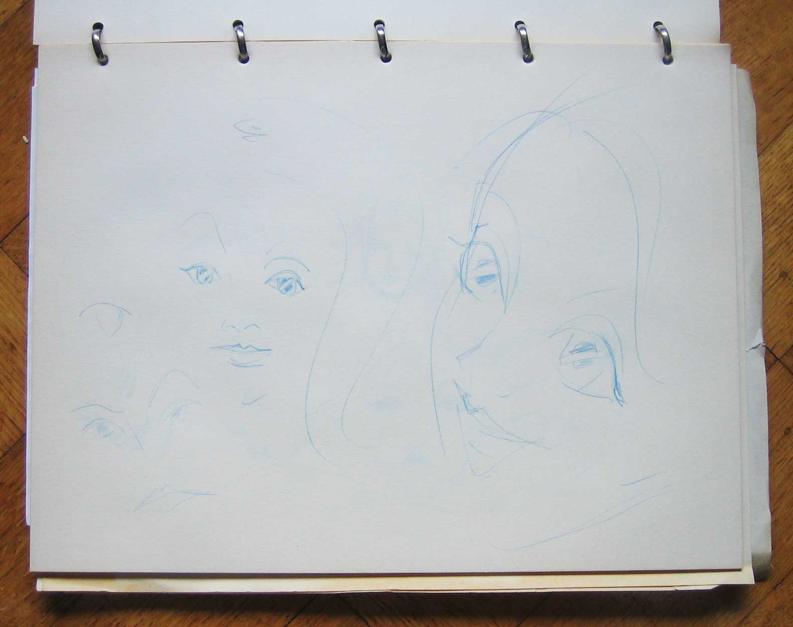
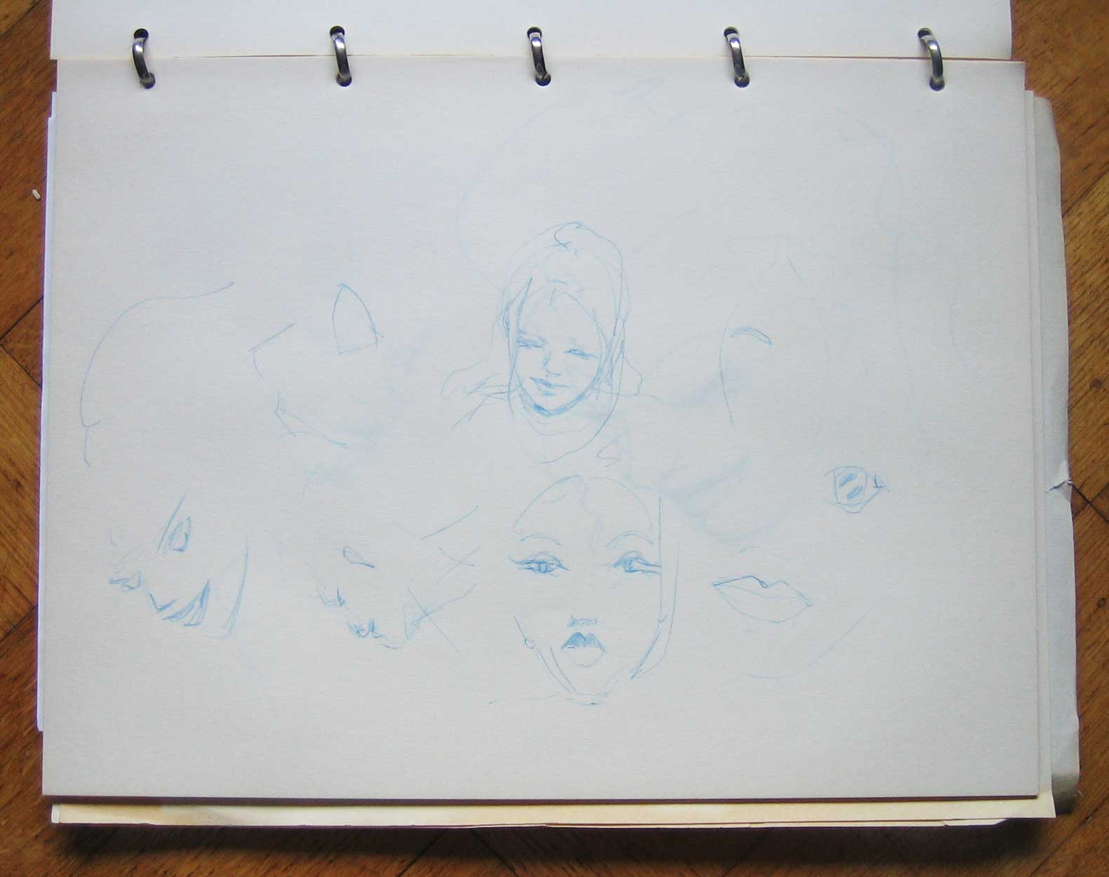
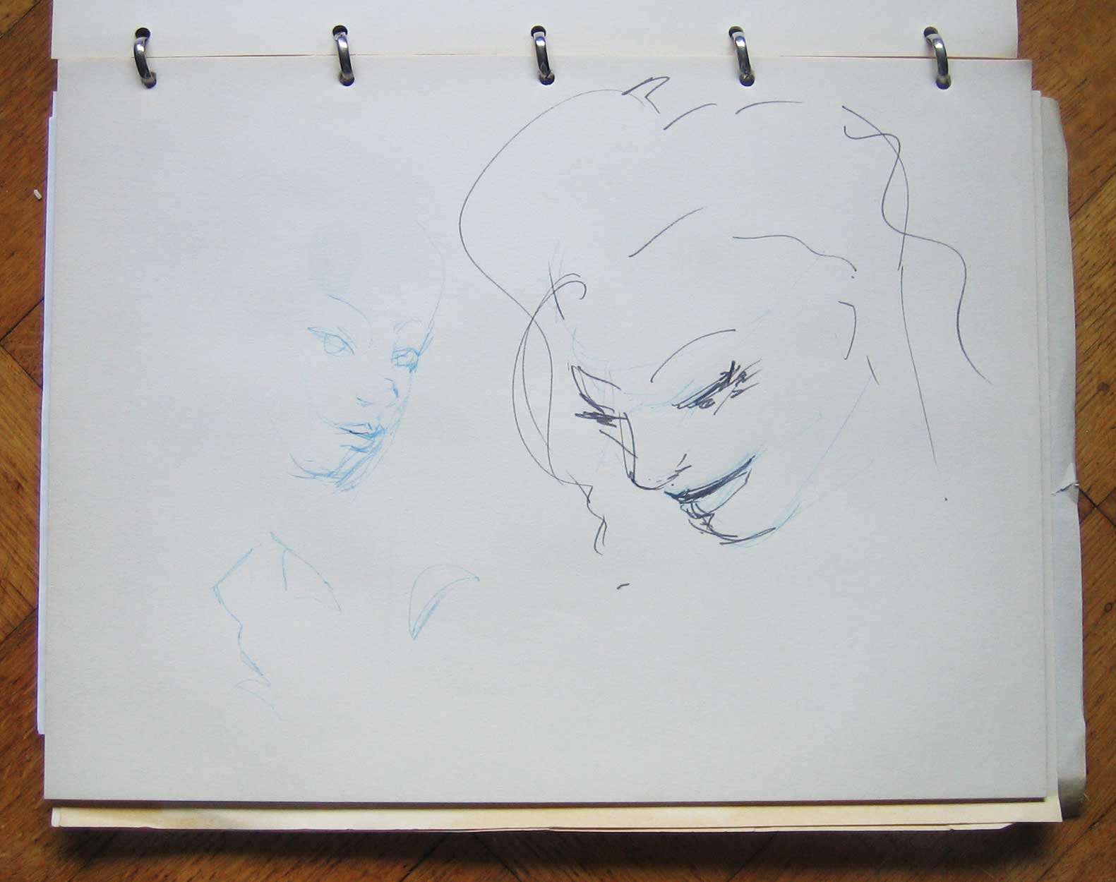
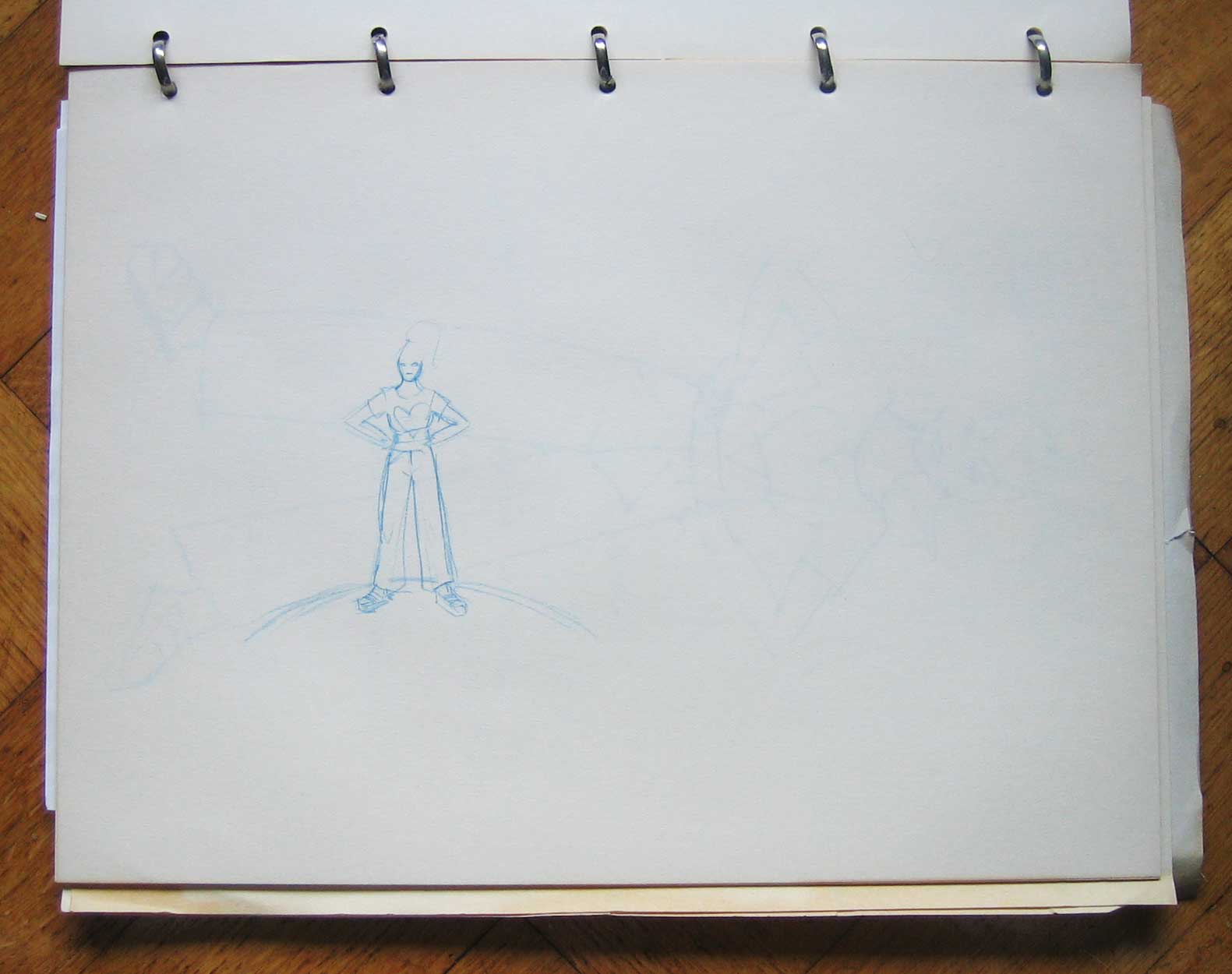
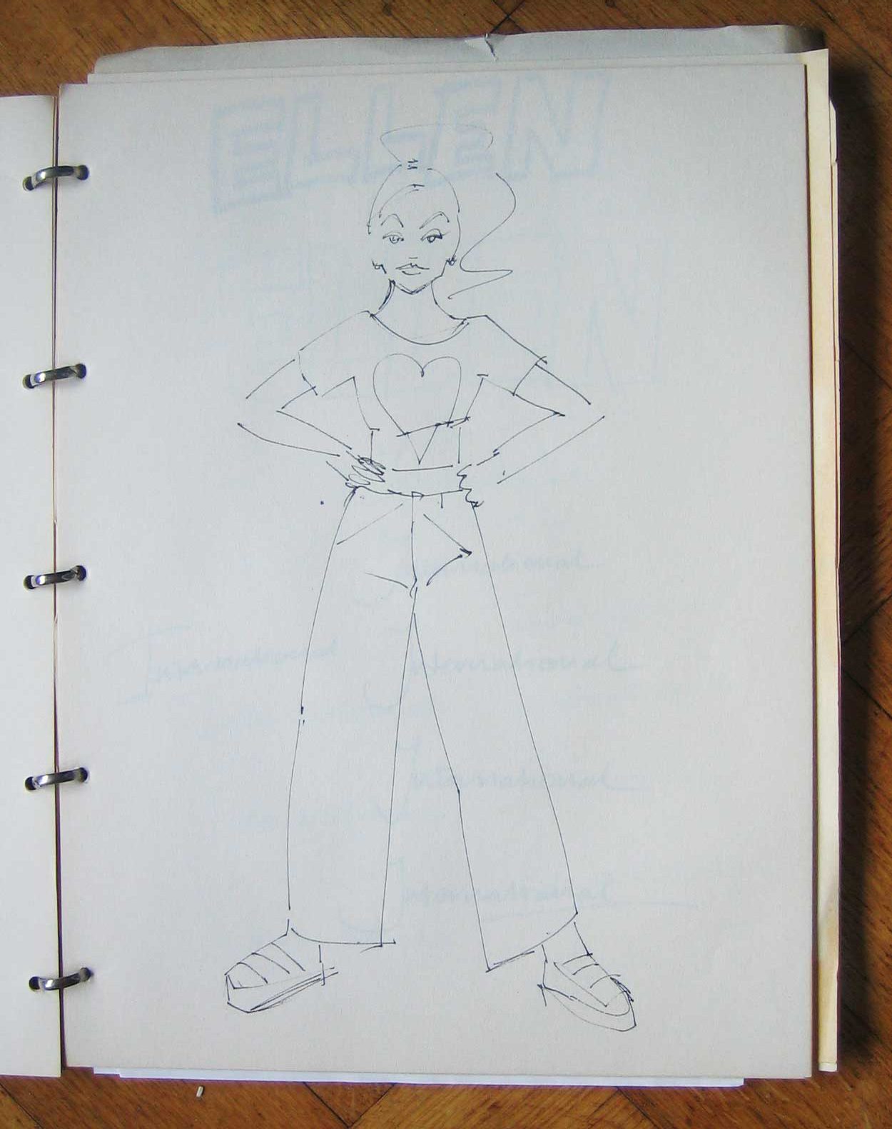
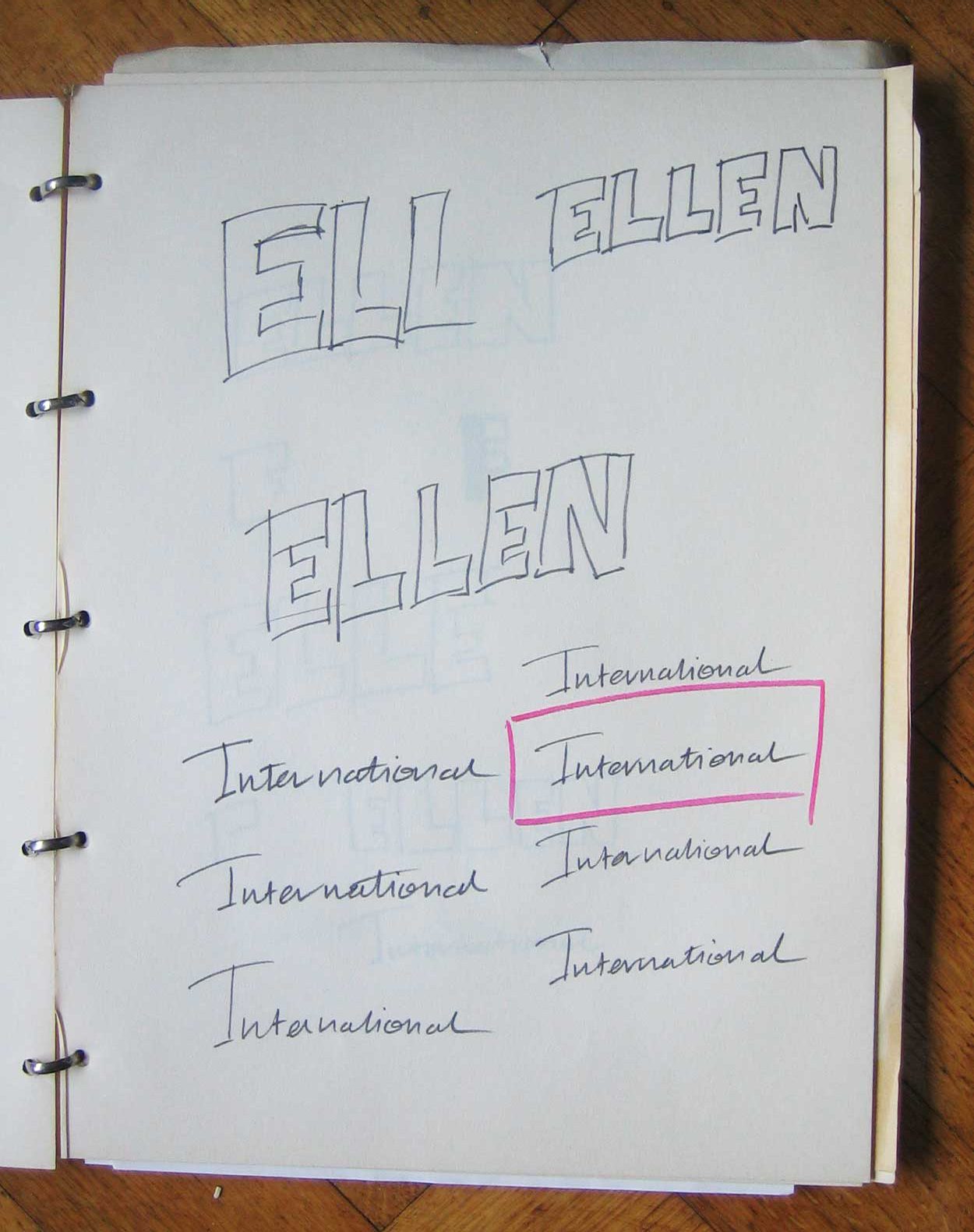
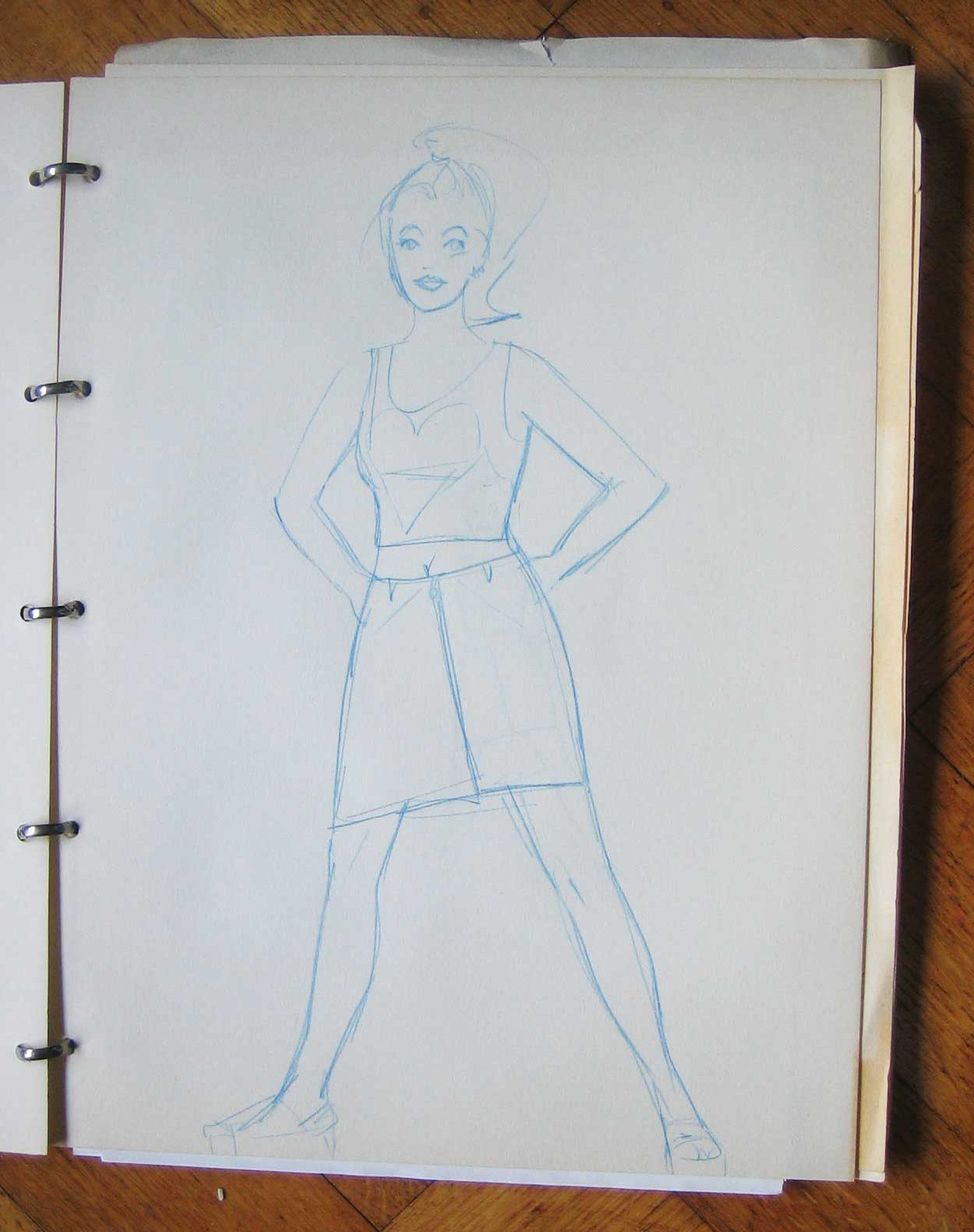
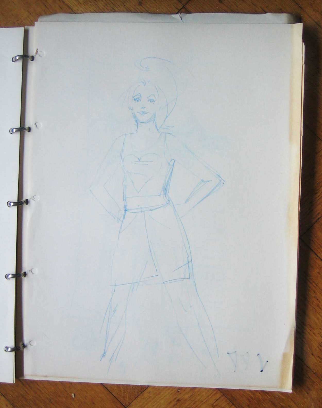
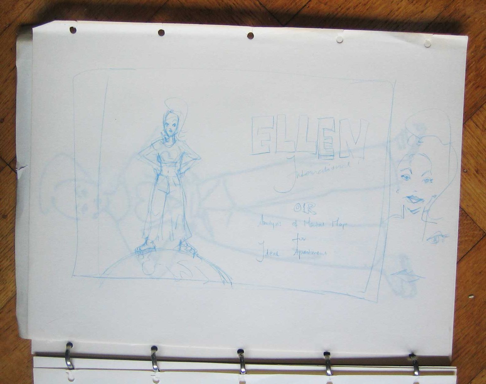
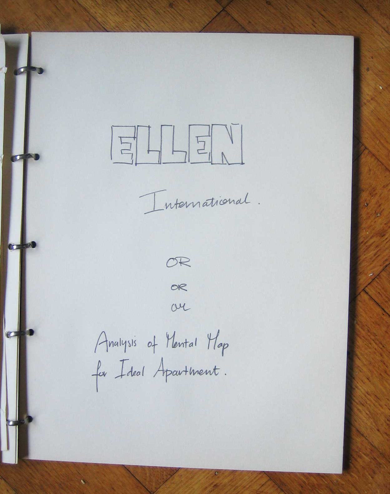
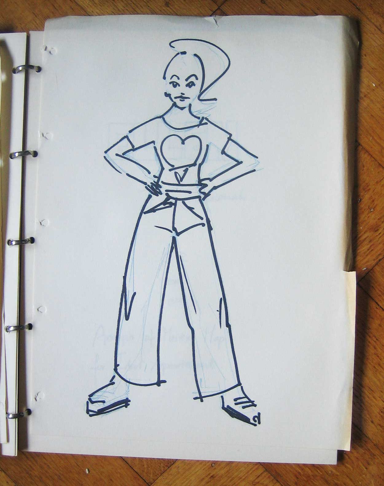
A few days ago i cleaned up the lower bit of the big closet behind my desk. I plan to do more drawing. With pencil, crayon, watercolour. Up to A3 size format. I set my old skechbooks there. I went through them. In this one there are a few important drawings. The drawing for the printed cards i still have loads of. The drawing i used for my old site as the preview page. A drawing from me standing on the world, used in homebase.


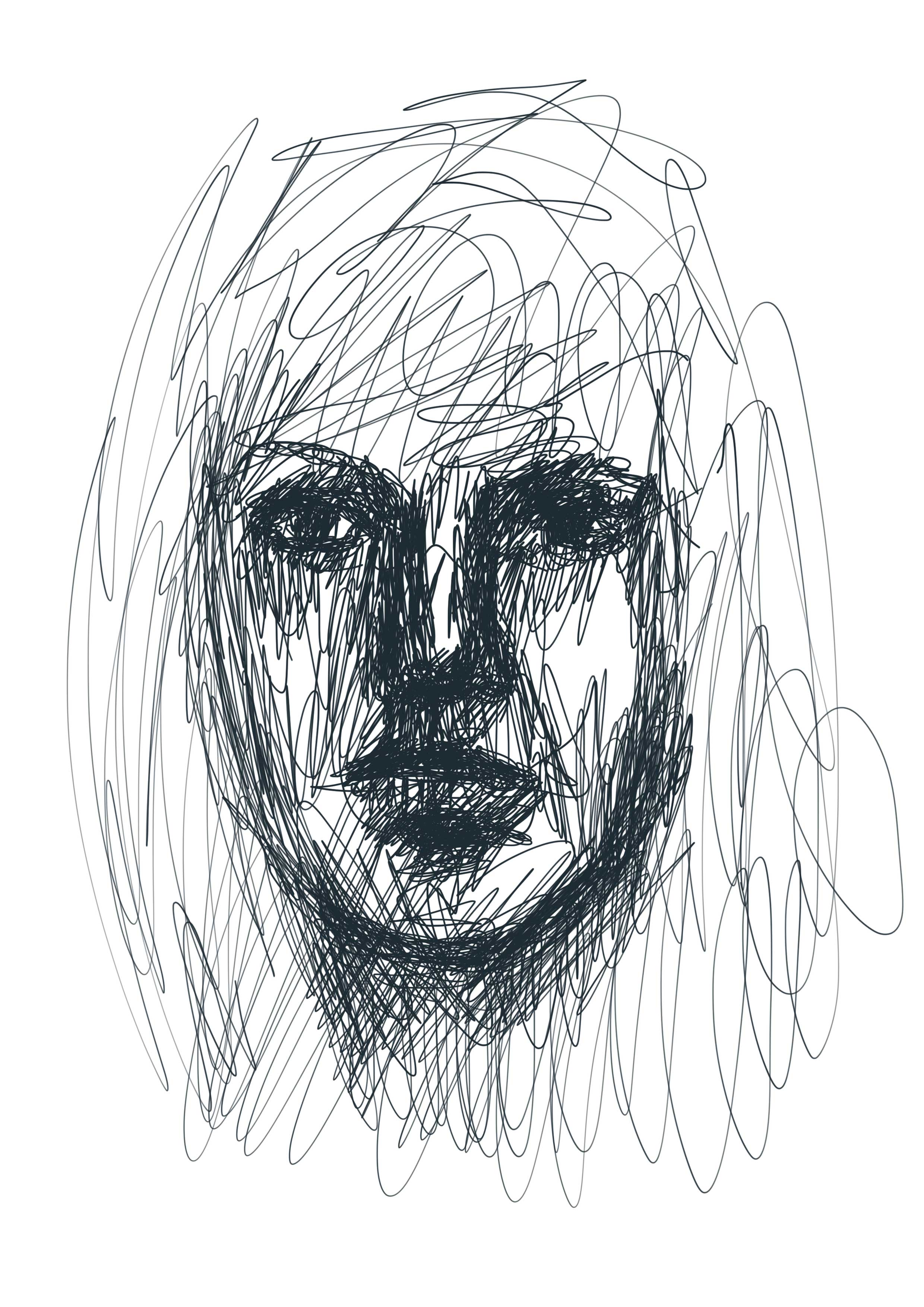
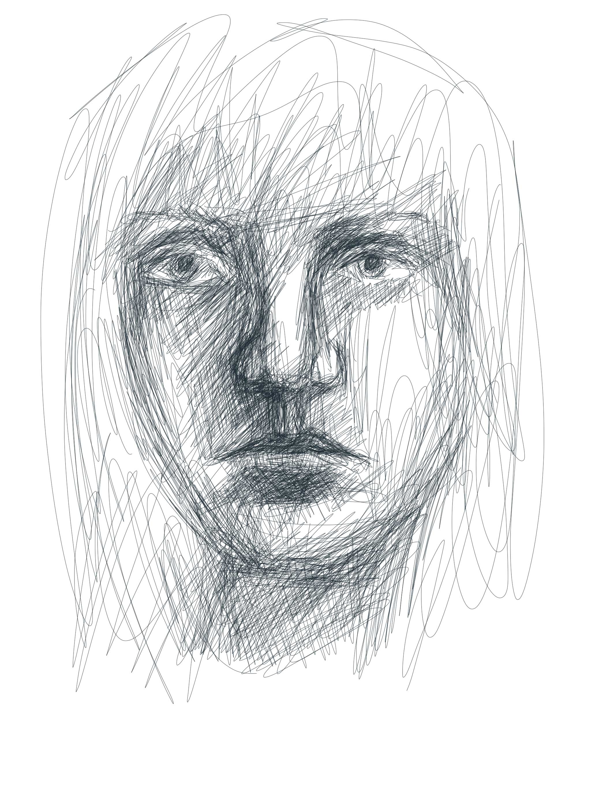
Very different drawings from now. A bit more anime style. I like em, but i don’t do drawings like these anymore. Right now, i’m happy i’m back to drawing. And photography. And video 🙂